Pôle graphisme
Contexte: Pôle graphisme de Chaumont, 2008
Format: 13×17,5 cm, 32 pages
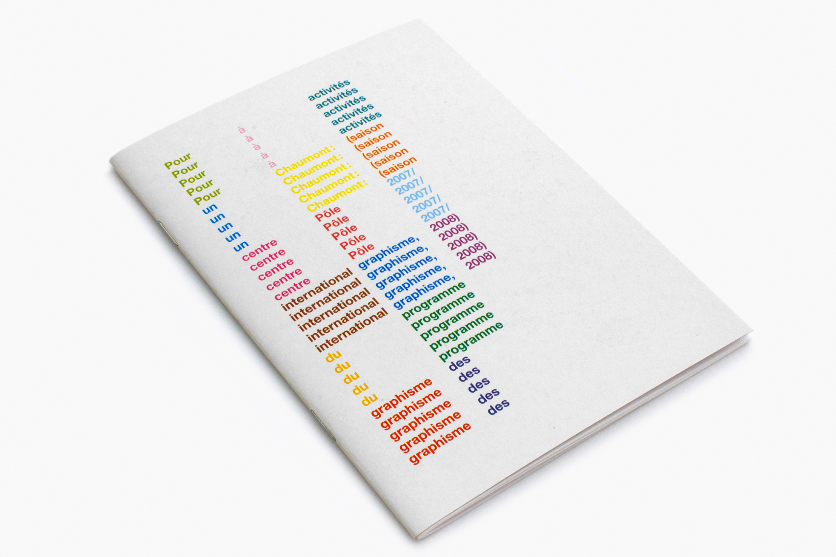
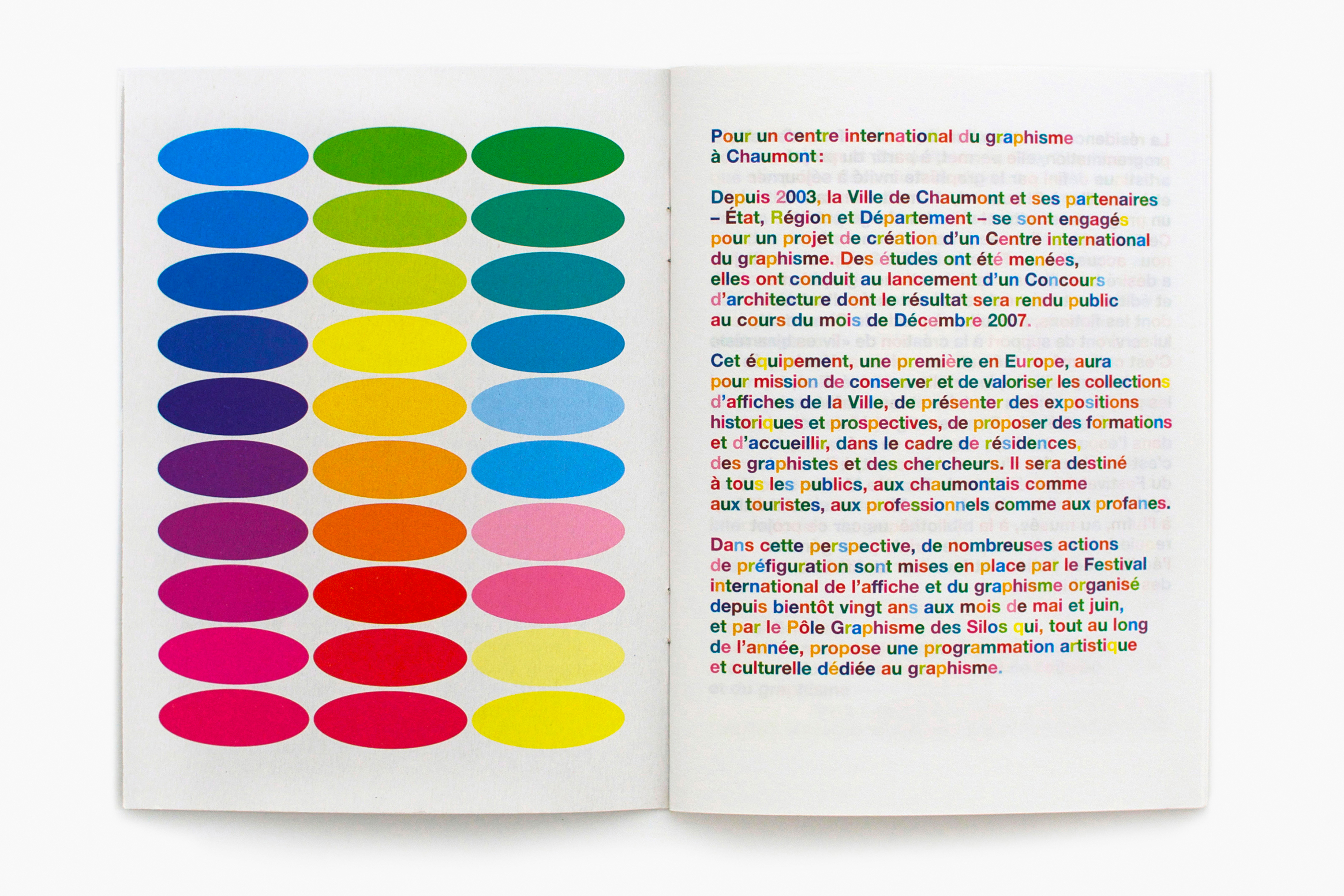
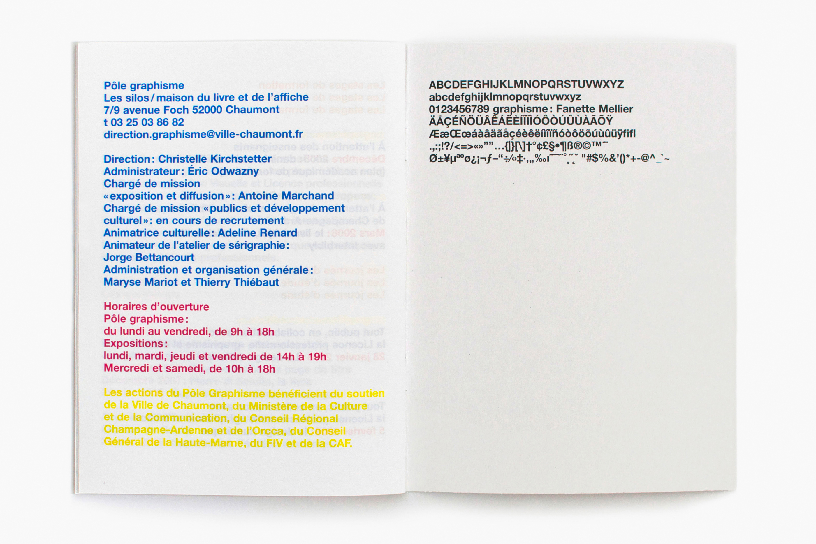
Pour la mise en page de cette brochure d’information sur les activités du Pôle graphisme, j’ai choisi de recourir à un seul caractère (Neue Helvetica), une seule graisse (medium), un seul corps (12). Seul l’usage de la couleur m’a permis de hiérarchiser les informations et de structurer la brochure. Les harmonies colorées différencient les rubriques, les titres sont matérialisés par la répétition des mots (quatre fois pour un gros titre, deux fois pour un titre secondaire), l’édito est multicolore, etc. En deuxième et troisième de couverture est présentée la panoplie des outils graphiques ayant servi à la mise en page: le caractère, et le nuancier des couleurs utilisées. Ainsi, cette brochure a une dimension expérimentale, alors même qu’elle est imprimée et fabriquée avec des moyens standards (quadrichromie sur papier offset blanc).
In designing this information brochure on the activities of the Pôle graphisme (Centre for Graphic Design), I chose to use just one typeface (Neue Helvetica), one weight (regular) and one point (12). The relative importance of the information and the structure of the brochure are conveyed purely by the use of colour. Different colours are used to highlight paragraph headings while main headings are reinforced by repetition of the words (four times for a main heading, twice for a sub-heading), the introduction is multi-coloured, etc. Displayed on the inside front and back covers is the array of graphic tools used for the brochure: the typeface and the colour chart. Thus, although printed and manufactured in a conventional way (four-colour process printing on white offset paper), this brochure has an experimental dimension.