Parc Saint Léger
Contexte: Parc Saint Léger, 2008-2014
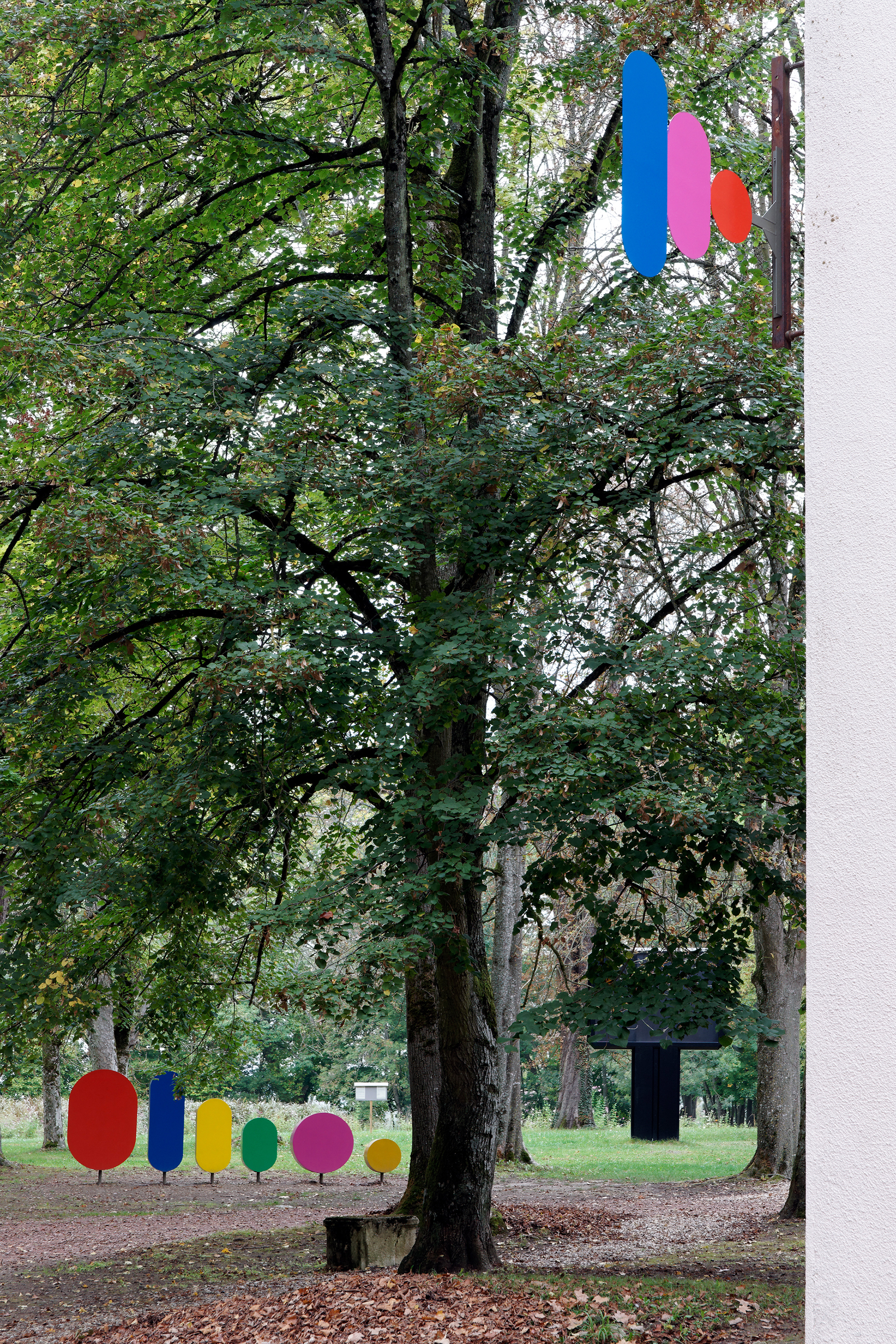
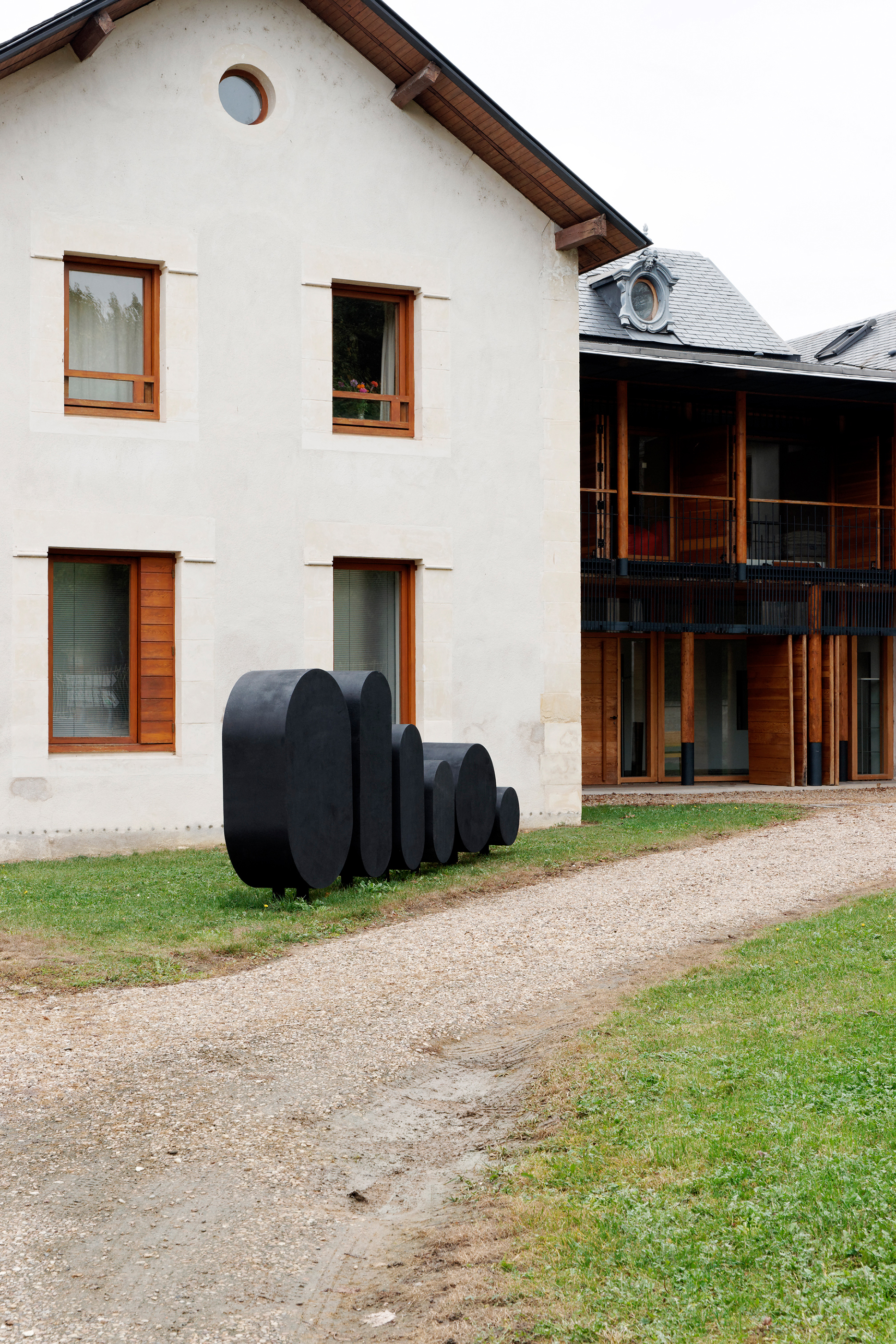
Photographies de la signalétique: Aurélien Mole
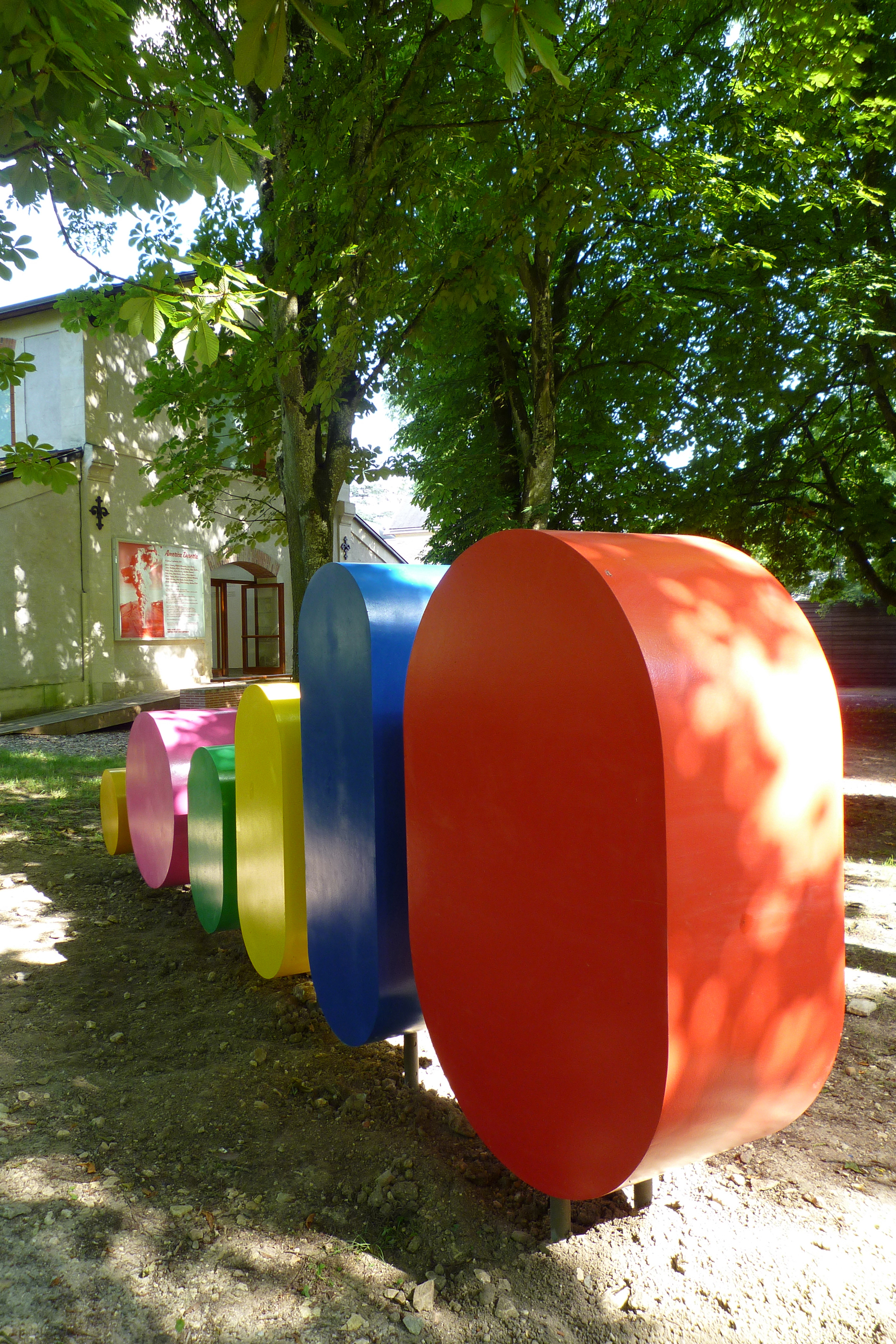
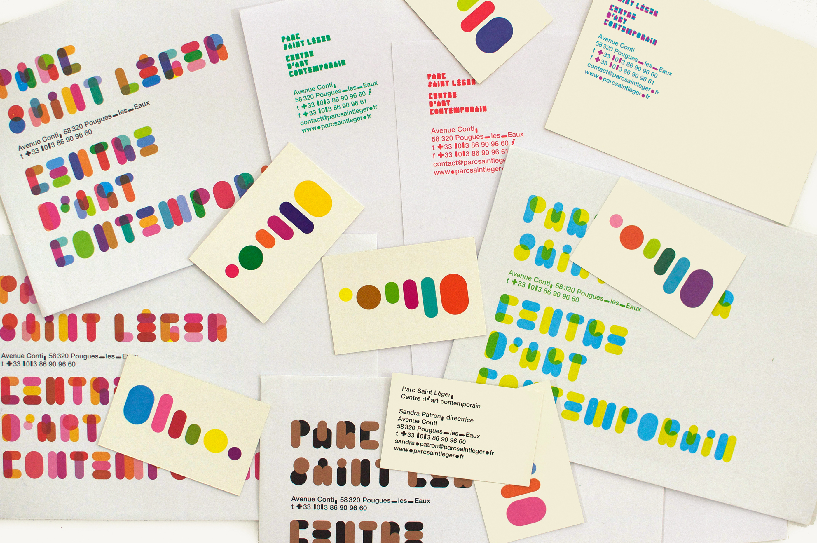
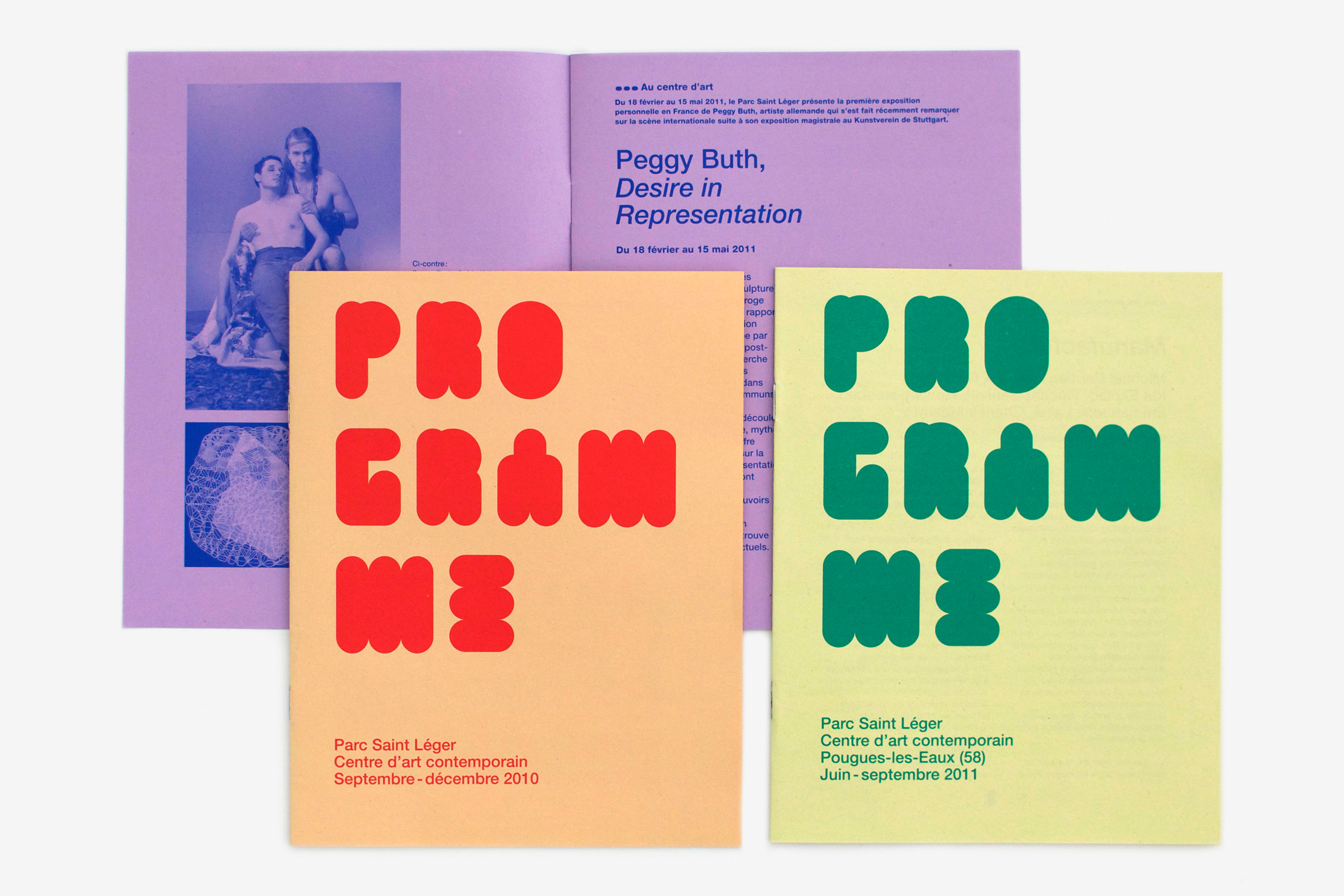
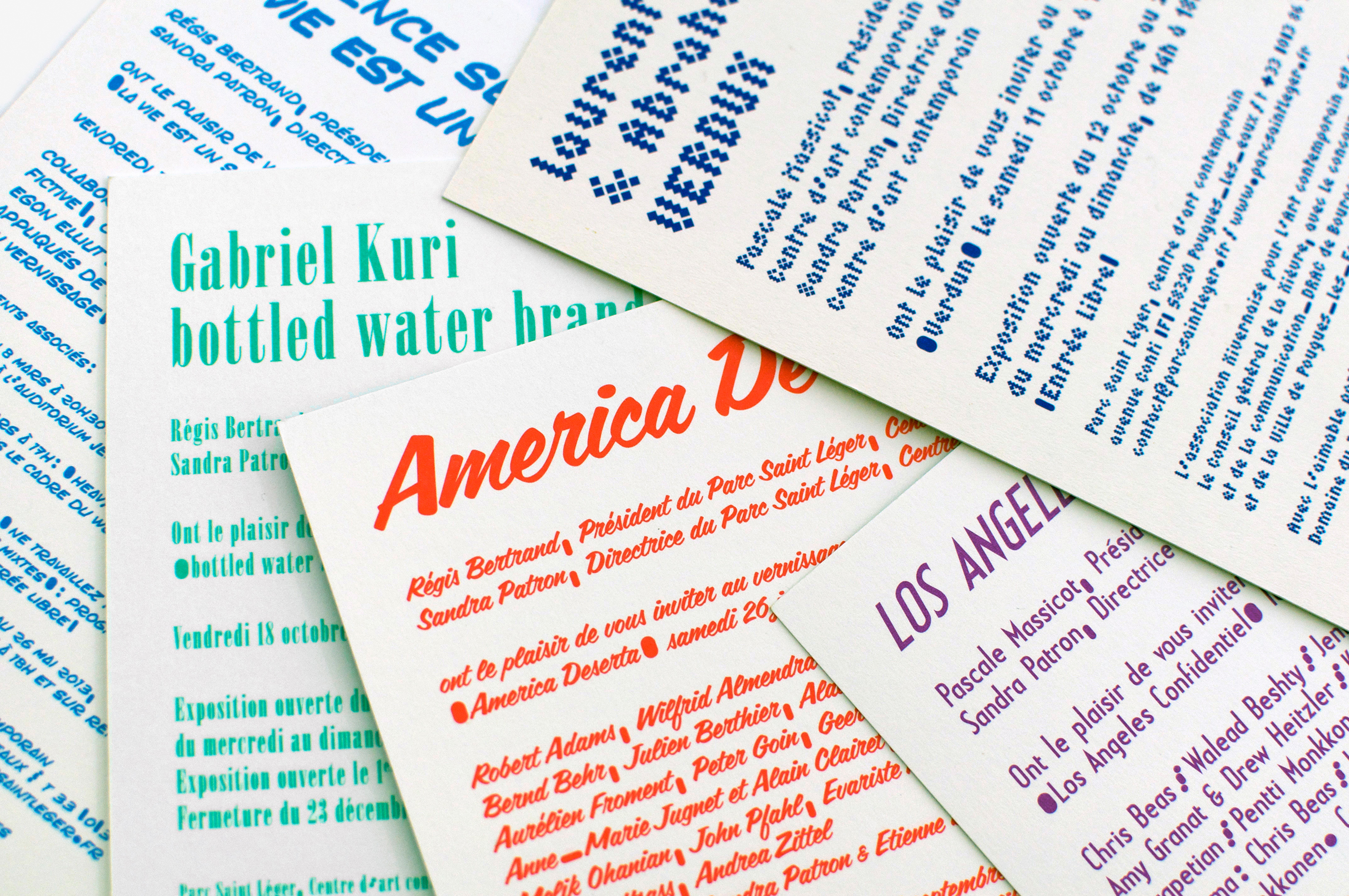
L’identité graphique du Parc Saint Léger, centre d’art contemporain, m’a permis de créer un système cohérent d’identification, qui renvoie une image aussi mouvante et innovante que sa programmation artistique. J’ai donc créé, à partir de modules rudimentaires, un système graphique évolutif. Avec cette boîte à outils succincte, ont été construits l’alphabet, les typogrammes, la signalétique et les enseignes du Parc Saint Léger. Le typogramme n’est pas figé, il fonctionne sur 5 lignes ou sur 3 lignes, en monochrome, bichromie ou multicolore. Tout en restant étonnamment lisibles, les versions couleur laissent apparaître l’architecture des lettres, et peuvent être réinventées à l’infini, à l’image d’une proposition artistique en mouvement. La signalétique comprend 2 grandes enseignes en volume (une en couleurs et une noire) et plusieurs panneaux rétro éclairés, dont l’affichage évolue au fil de la programmation.
In designing the graphic identity of the Parc Saint Léger center for Contemporary Art, I was able to create a coherent system of identification inspired by an image as moving and innovative as the centre’s artistic programme. Starting from very simple modules, I created an evolving graphic system. From this limited set of tools emerged the alphabet, typograms, signage and logos for the Parc Saint Léger. The typogram is flexible, working on 5 lines or 3, in monochrome, bichrome or polychrome. The coloured versions, while remaining remarkably easy to read, allow the architecture of the letters to be seen and can be indefinitely reinvented, just like a dynamic artistic venture. The signage consists of 2 large 3-D logos (one in colour and one in black) and several backlit panels, the display on which changes according to the programme.