Bastard Battle
Contexte: Éditions Dissonances/Pôle graphisme de Chaumont, 2008
Impression: Snel graphics
Description: 12×16 cm, 112 pages
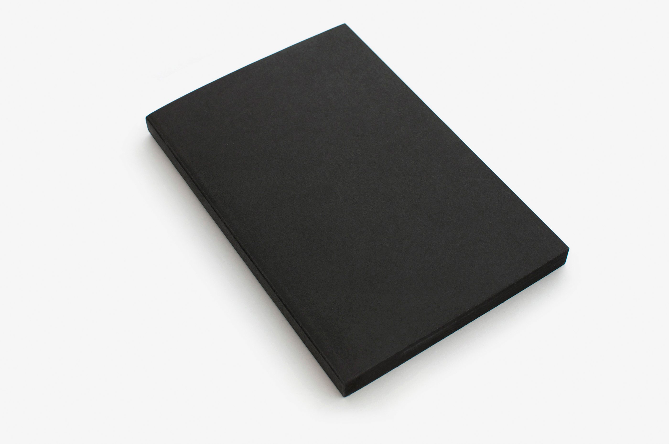
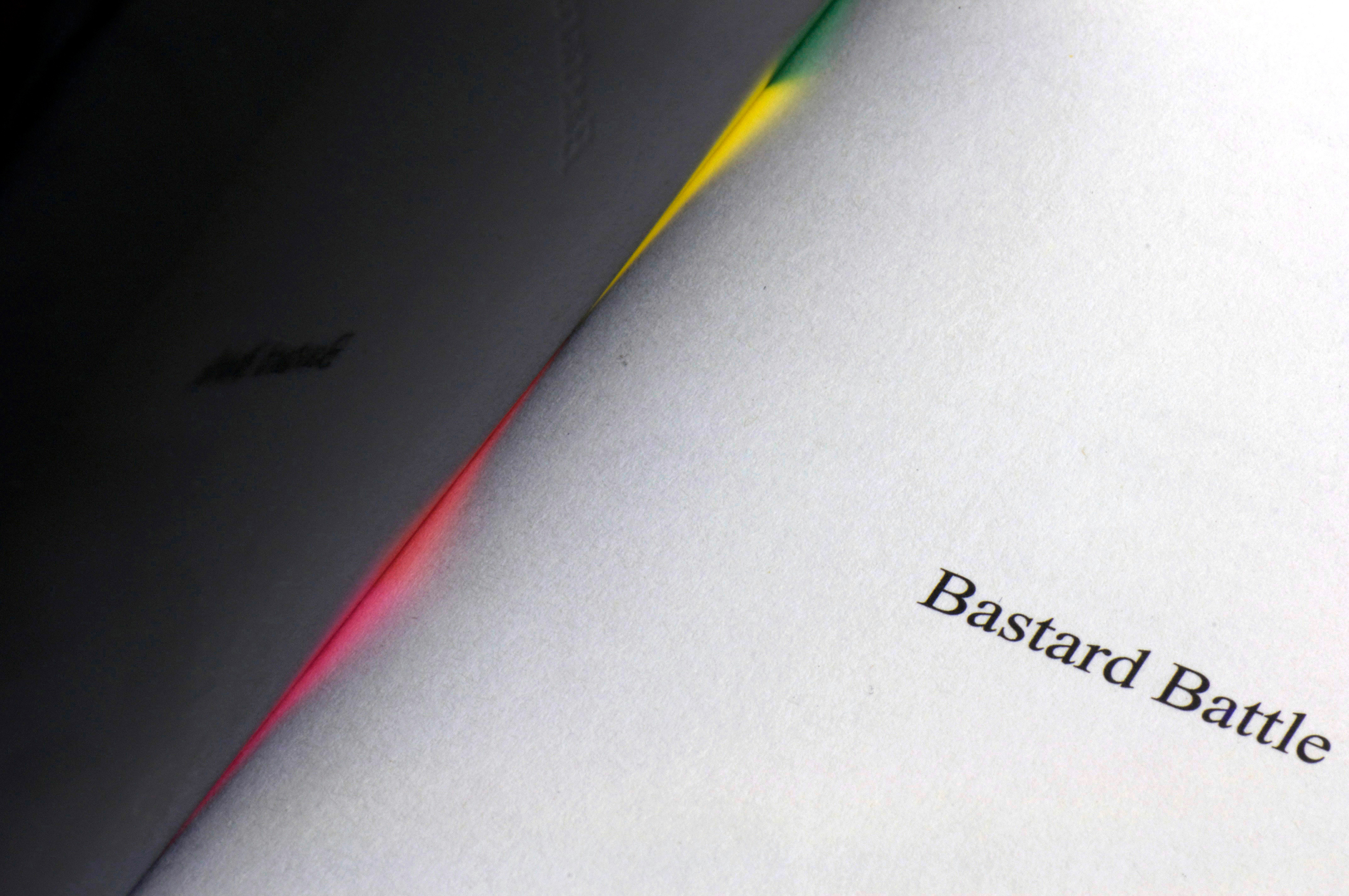
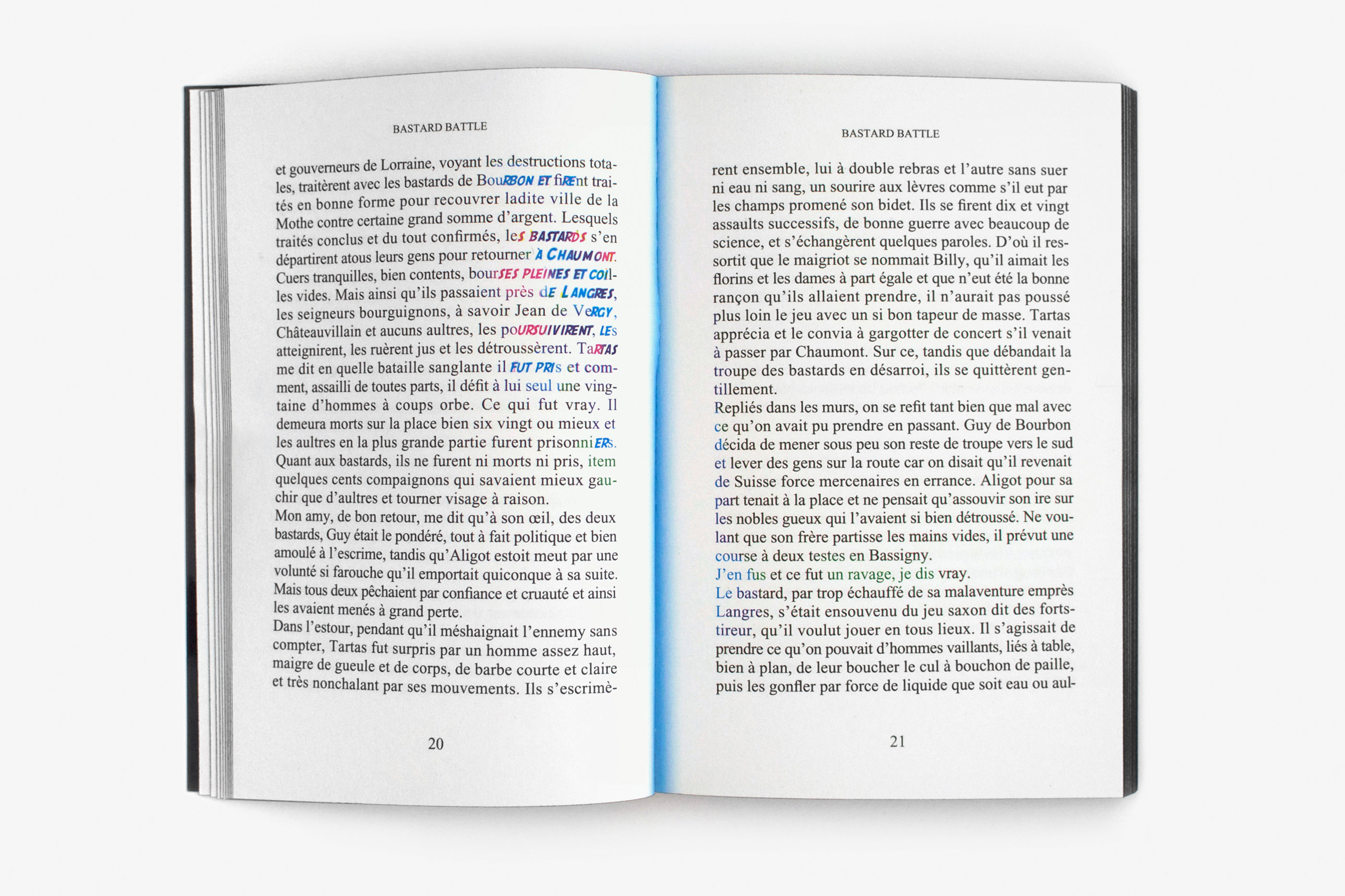
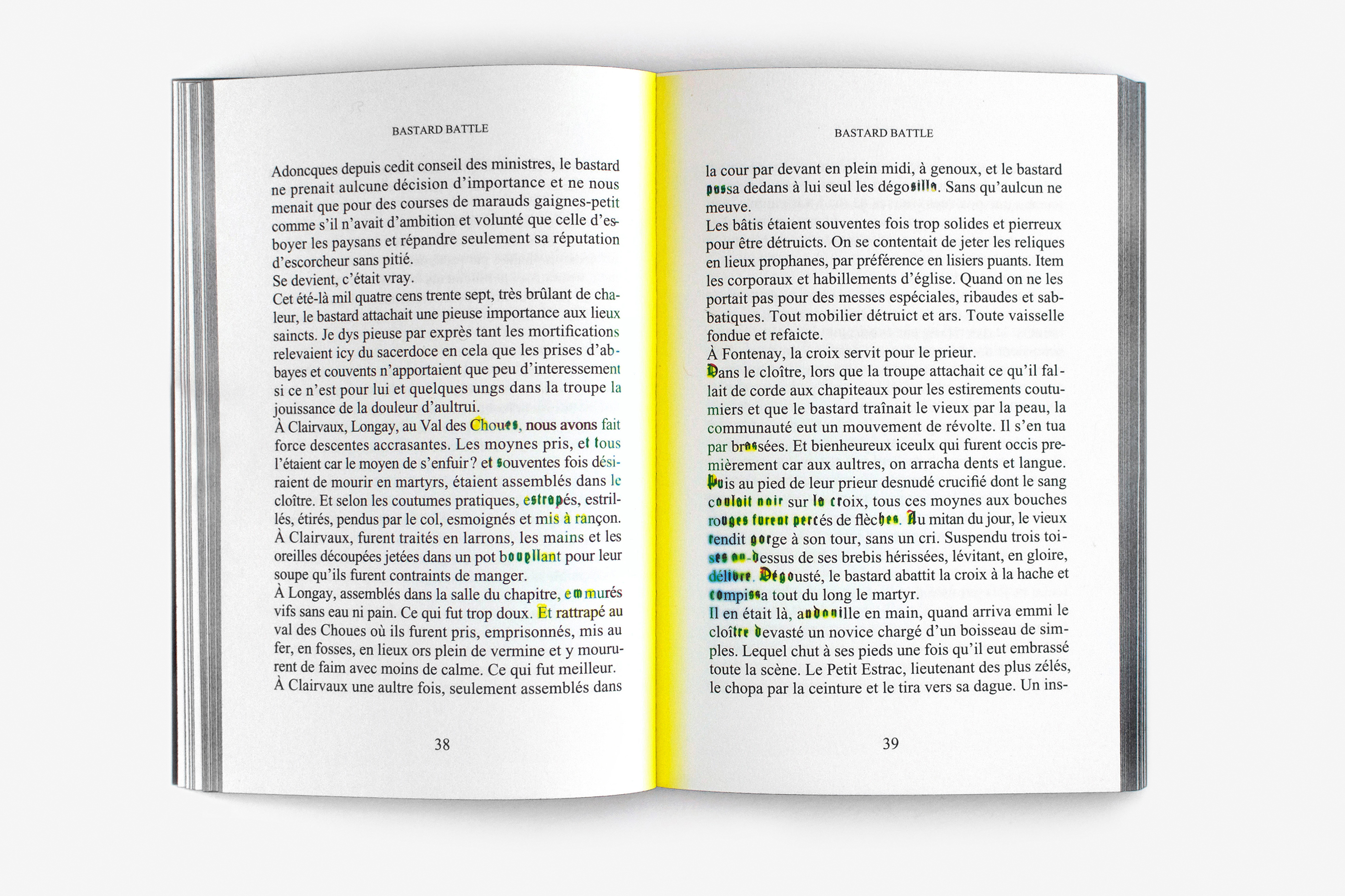
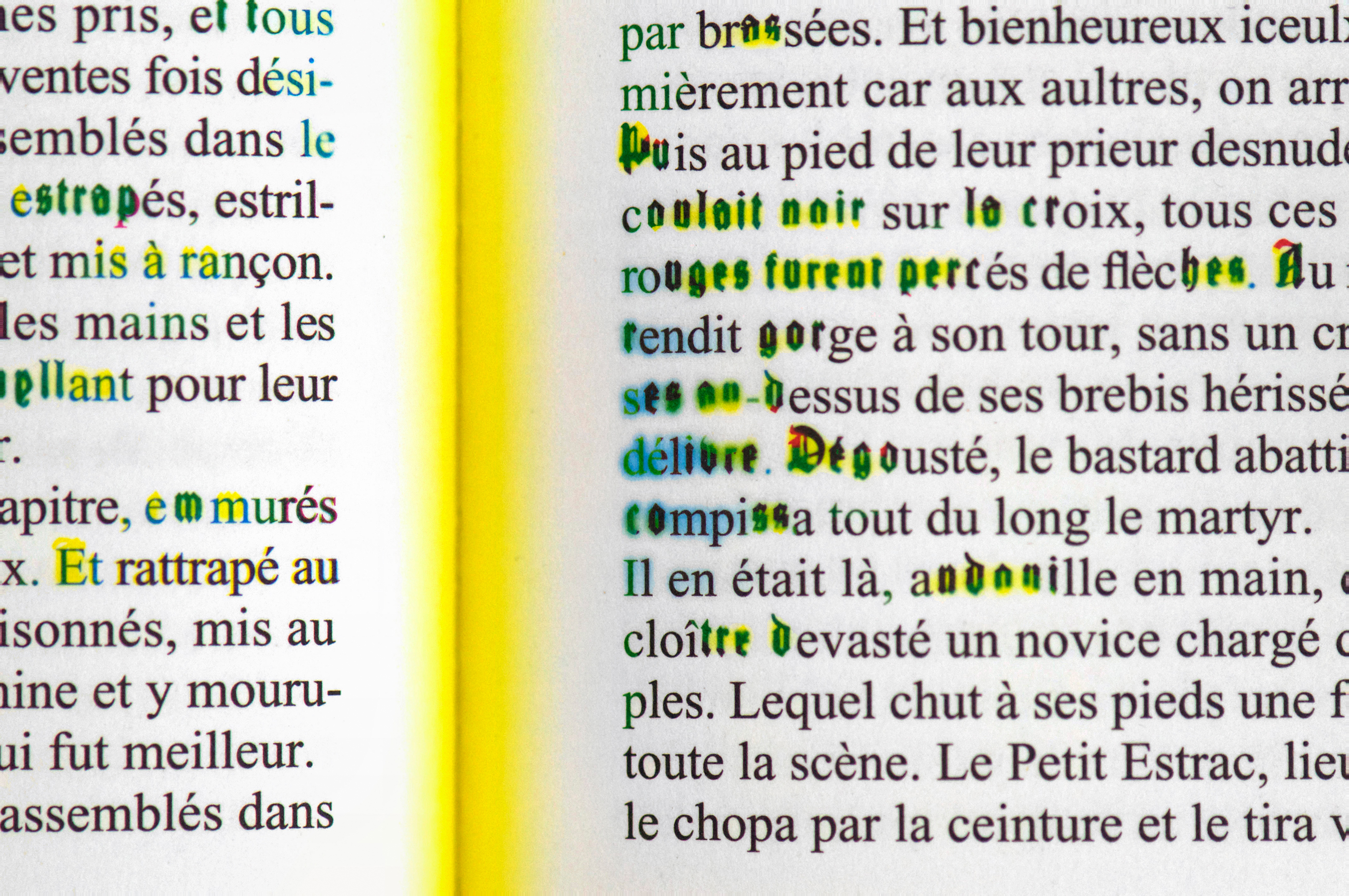
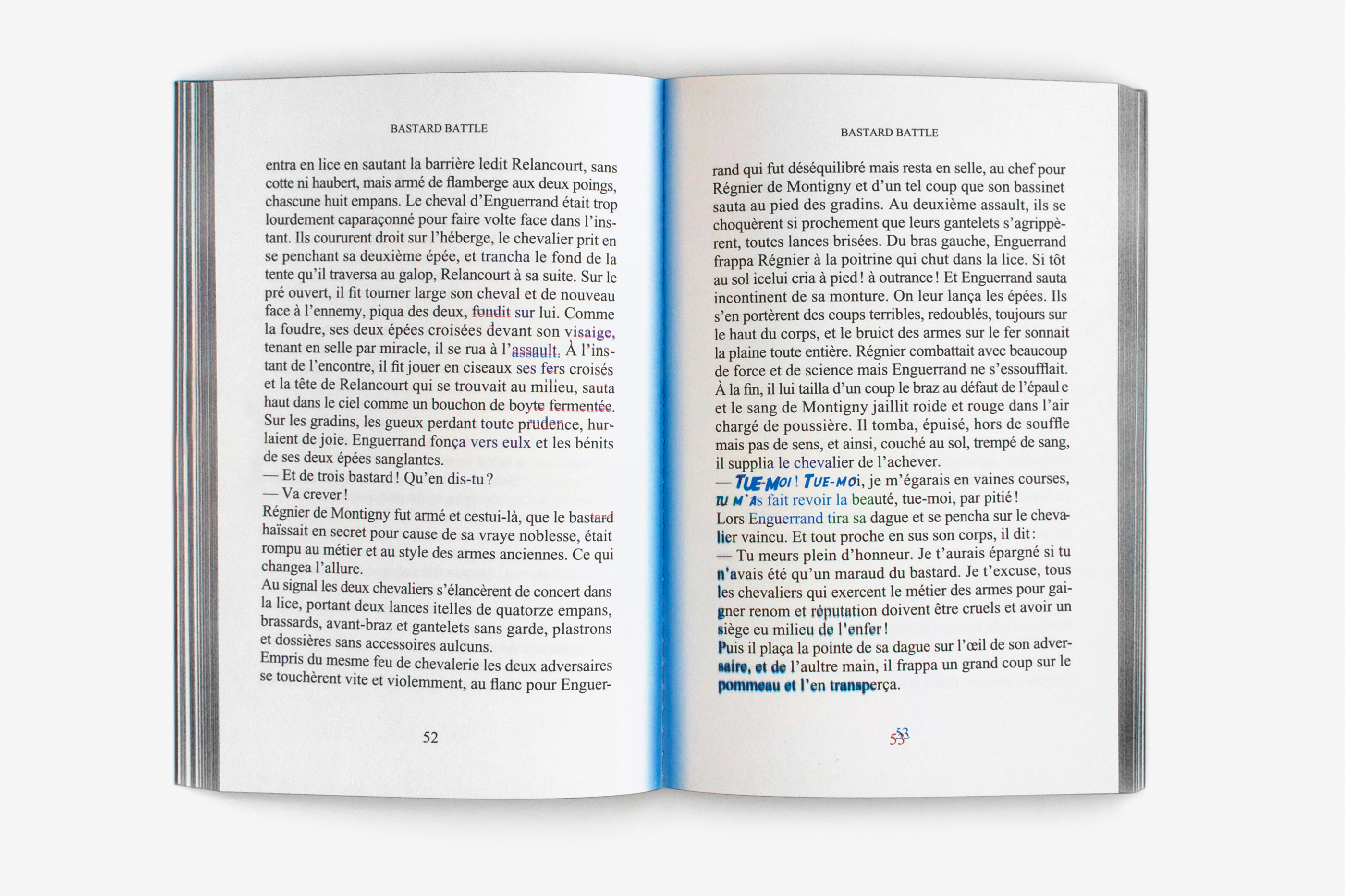
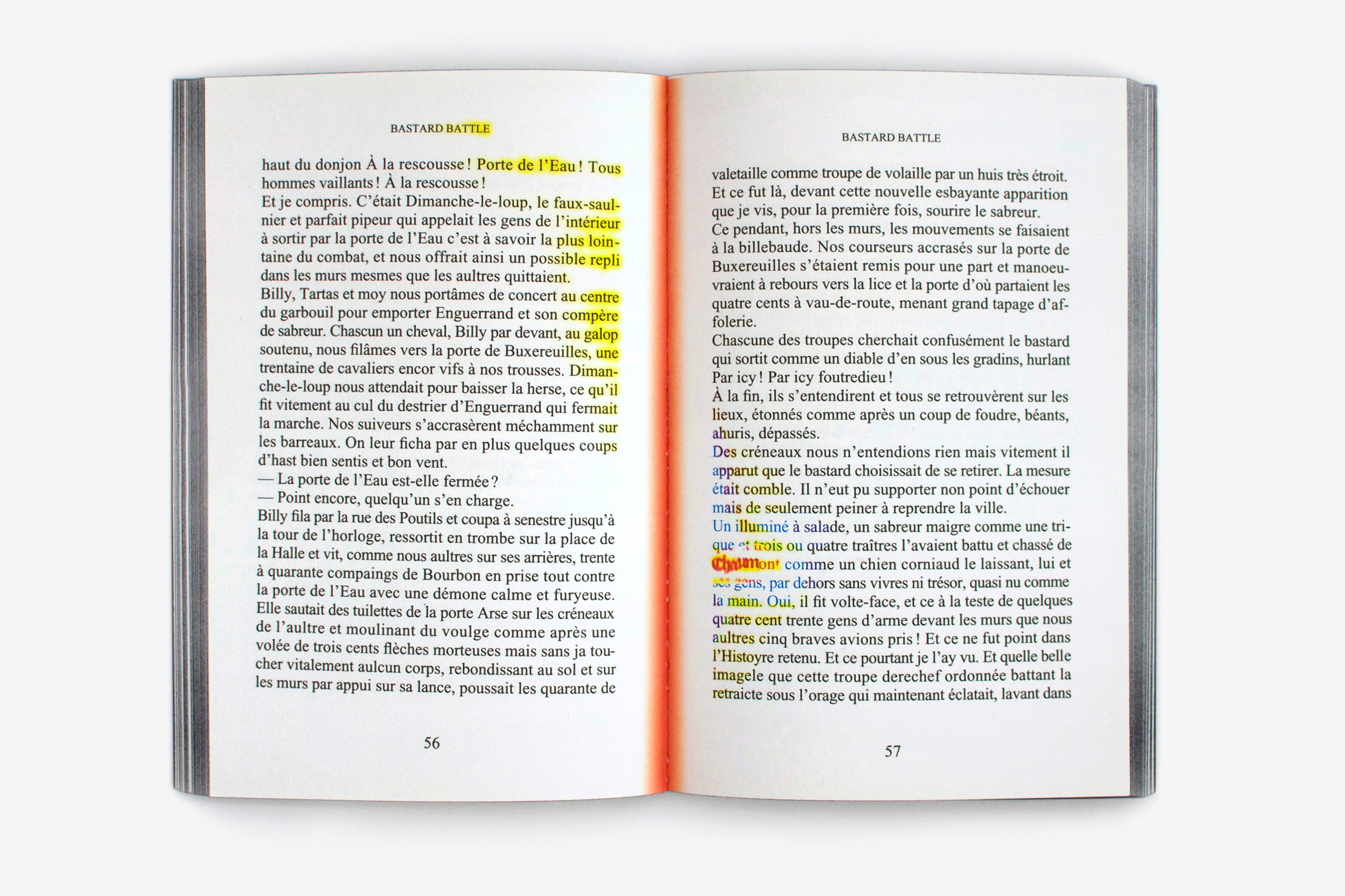
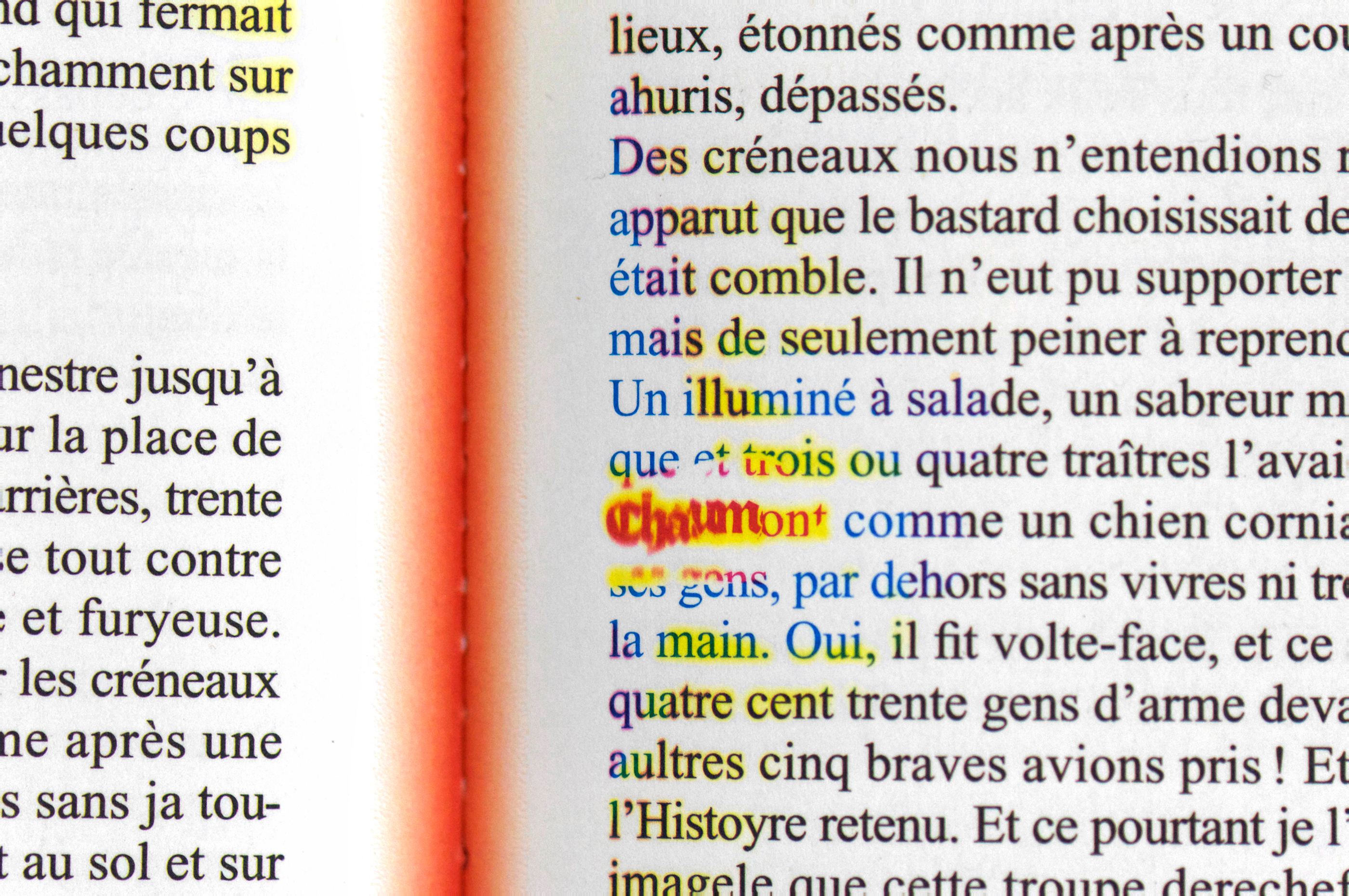
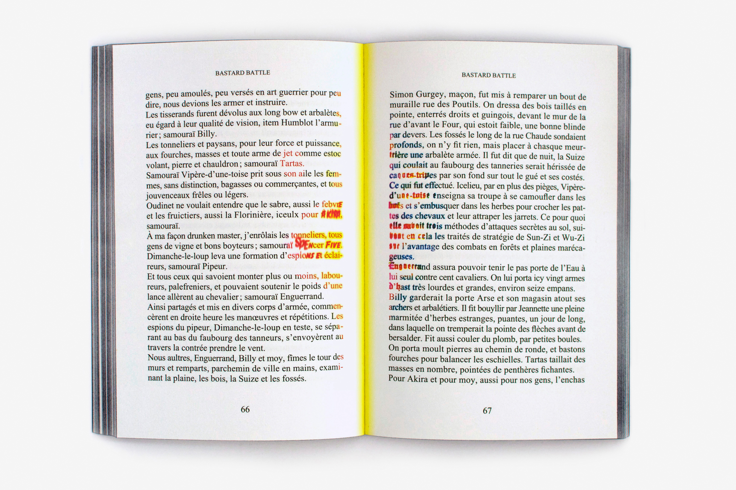
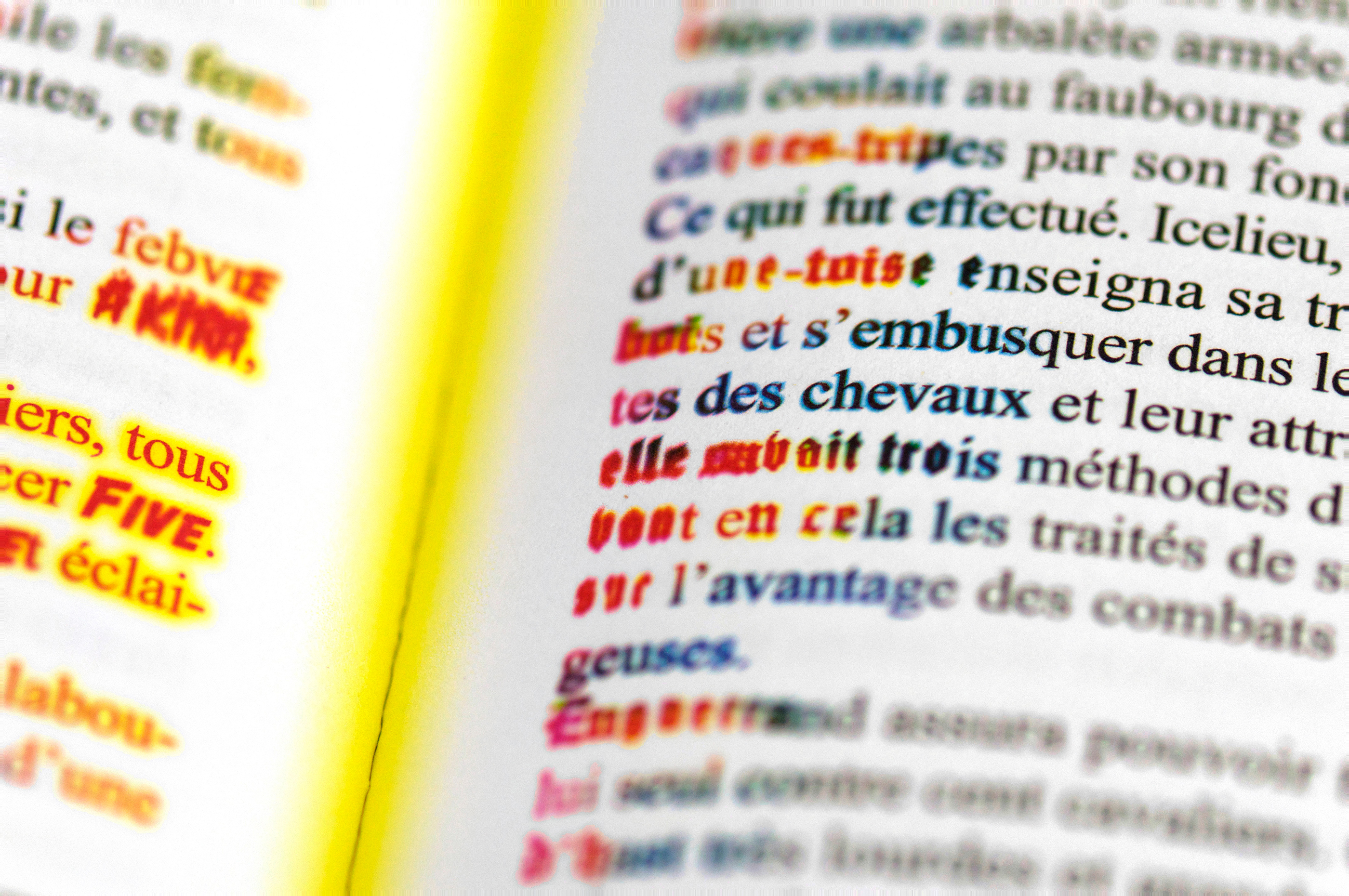
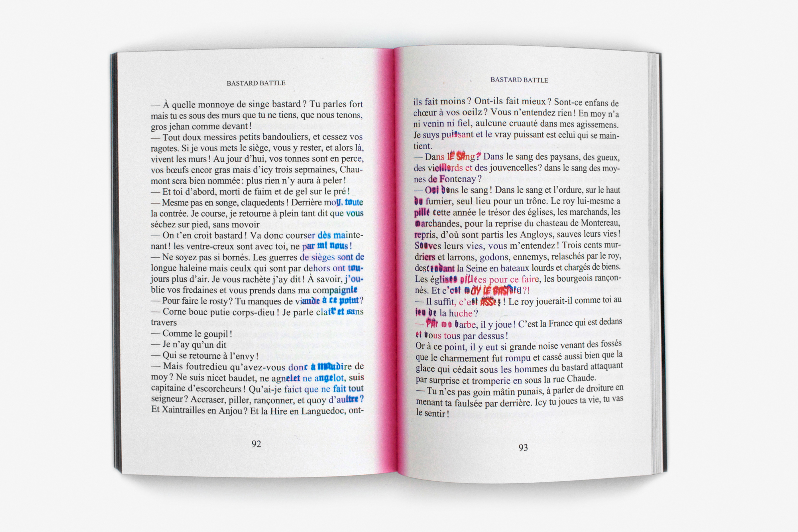
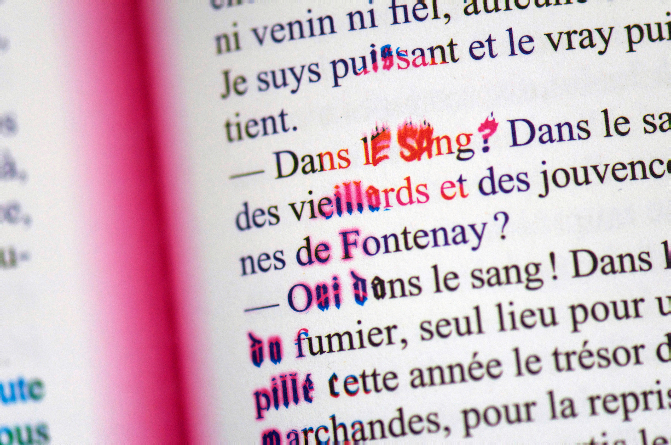
Ce texte, écrit par Céline Minard dans le cadre de ma résidence à Chaumont, est imprégné de références historiques et culturelles: manuscrits du moyen-âge, kung-fu, mangas, etc. Afin d’éviter la redondance, je me suis concentrée sur la dimension ovniesque de l’écriture, son énergie hallucinante. J’ai travaillé chaque double page dans l’idée que le texte était «incarné», en intervenant sur la matière typographique, à partir du centre des doubles pages… Le noir du texte formé par la surimpression de trois tons directs (rose, jaune, bleu), subit des mutations qui suivent le rythme du récit, et vont crescendo. Pour cela, j’ai modifié chacune des trois couches colorées et introduit des variations typographiques, plastiques et colorées, liées au sens du récit. Il en résulte la curieuse impression d’une énergie partant du cœur du livre, se propageant au rythme du récit et venant lutter avec la structure classique de l’ouvrage. Les interventions ne sont pas systématiques: fluides, diffuses ou violentes, elles semblent émerger du texte lui-même. Étant donné que le format, les matériaux et la mise en page sont empruntés au livre de poche, j’ai souhaité qu’il n’y ait pas à proprement parler d’image de couverture, mais un «objet couverture». D’aspect extérieur, le livre s’apparente plutôt à une forme noire abstraite. Le relief du titre apparait très légèrement, comme un fantôme.
This text, written during the period of my residence in Chaumont, is full of historical and cultural references: medieval manuscripts, kung-fu, manga, etc. So as to avoid repetition, I concentrated on the alien dimension of the writing and its hallucinatory energy. I approached each double page spread with the idea that the text was “embodied”. Starting from the point where the double pages meet, I made adjustments to the typographic content… The black of the text formed by the overprinting of three spot colours (pink, yellow and blue) undergoes mutations that follow the rhythm of the narrative, gradually increasing in intensity. For this, I modified each of the three coloured layers and introduced typographical variations, both of form and colour, linked to the events of the story. The effect is to give a curious impression of energy emerging from the heart of the book, expanding with the rhythm of the narrative and challenging the classic structure of the work. The modifications are not systematic: fluid, diffuse or violent, they seem to arise from the text itself. In view of the fact that the format, materials and layout are those of a paperback book, I preferred not to have a cover picture but rather a “cover object”. From the outside, the book looks more like a black abstract shape. The title, in relief, is almost imperceptible, like a ghost.