The French Paradox
Contexte: Éditions Analogues, 2011
Impression de la jaquette: Lézard Graphique
Description: 15,5×24 cm, 176 pages
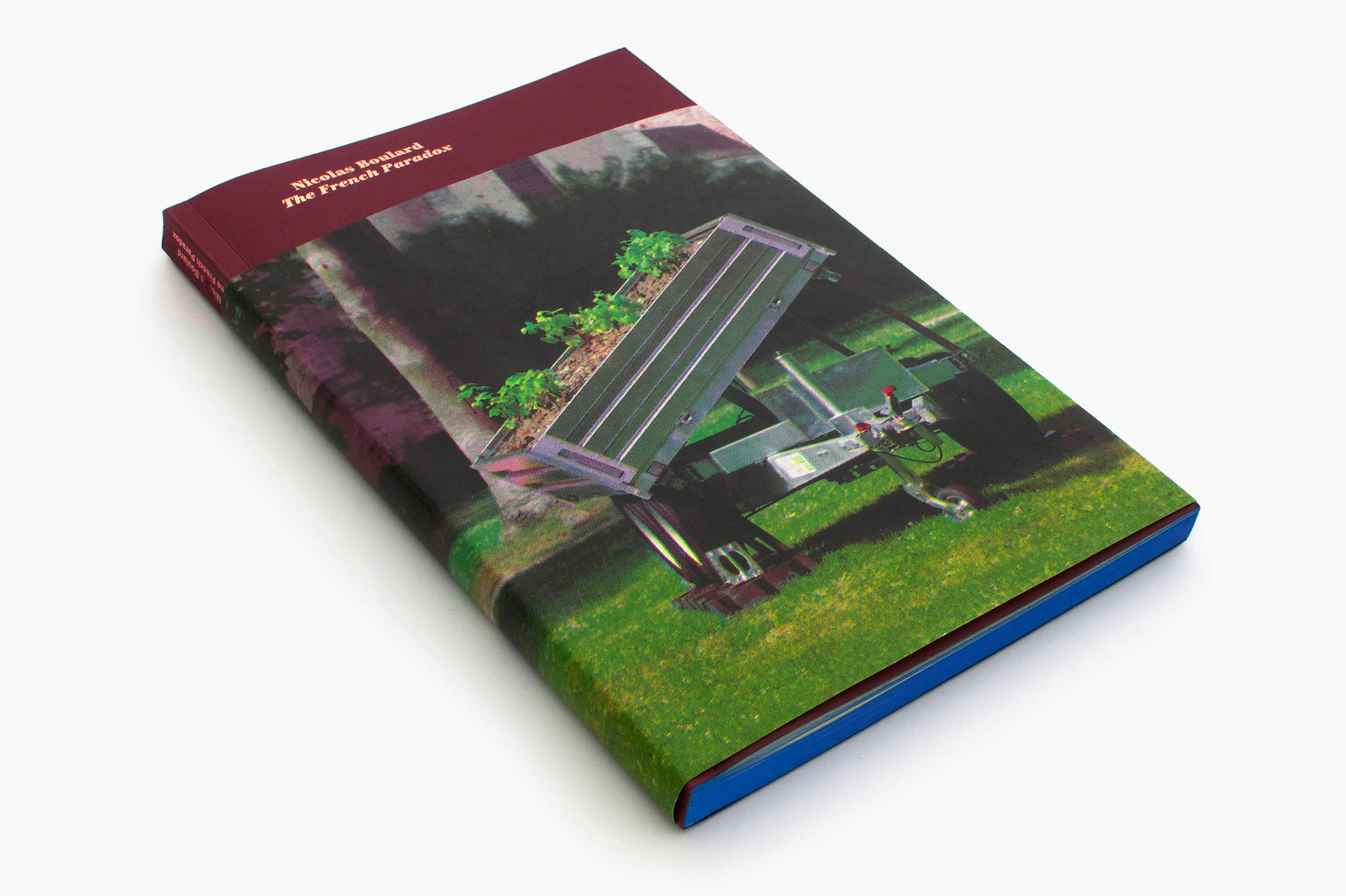
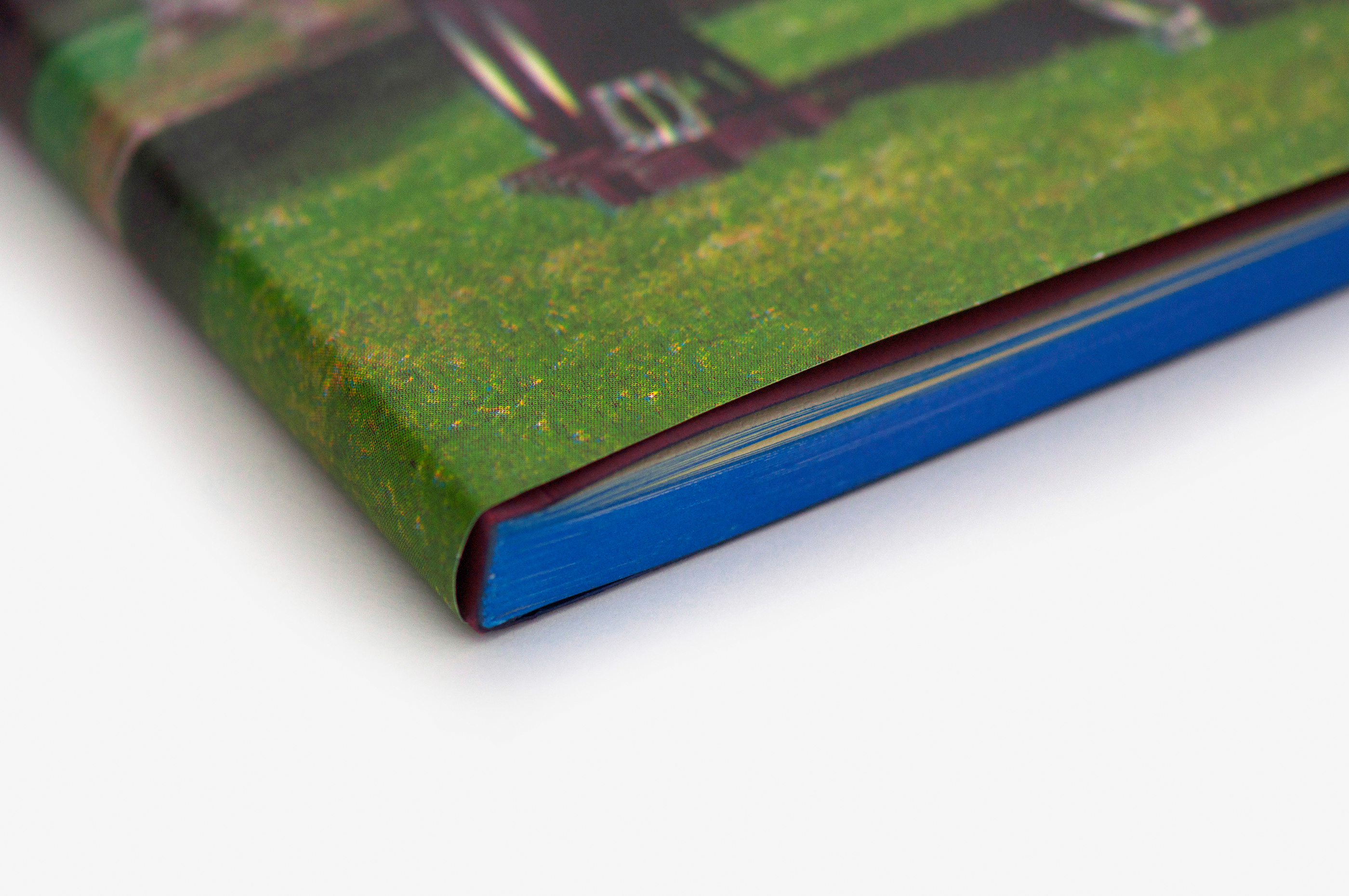
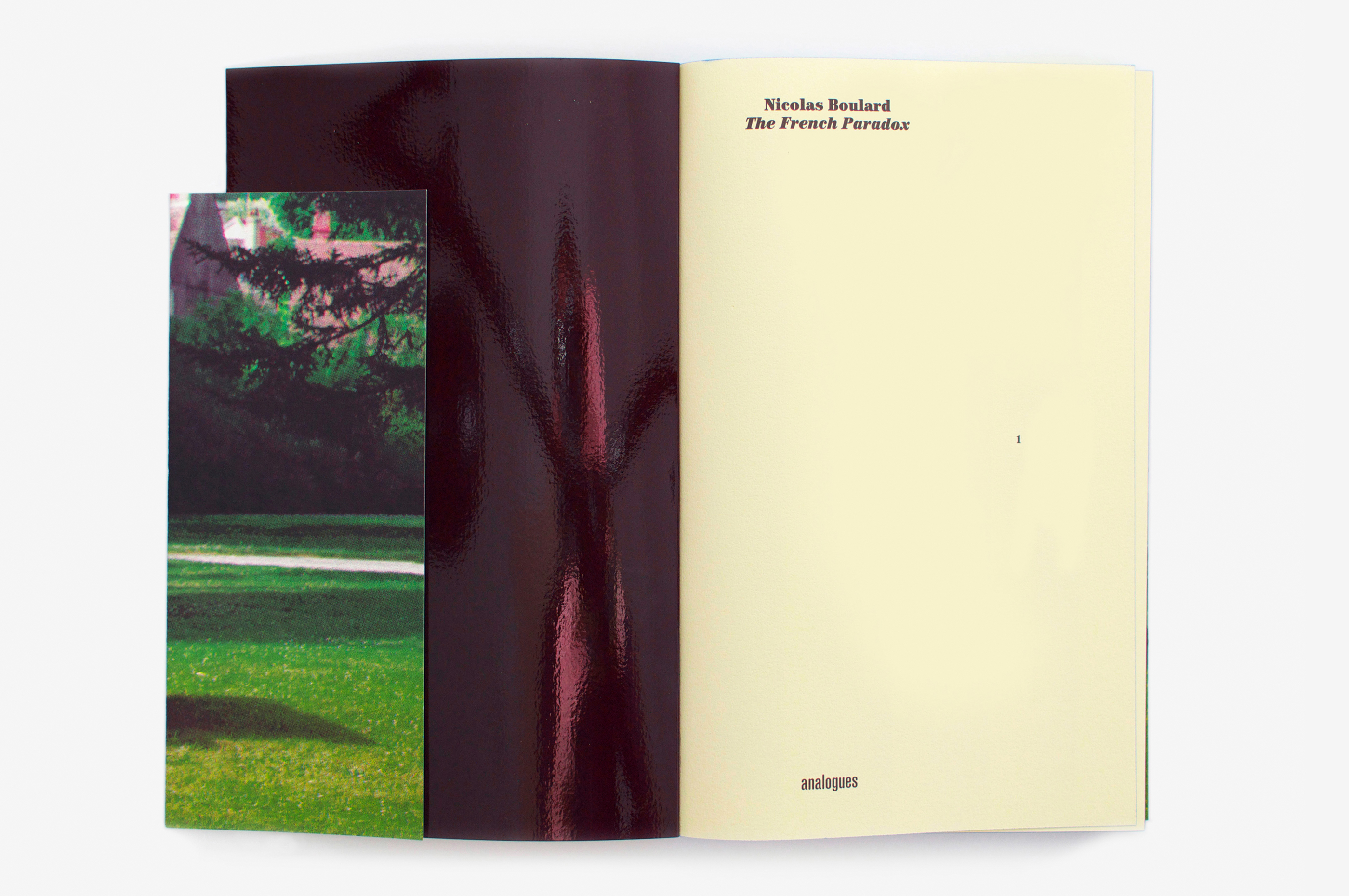
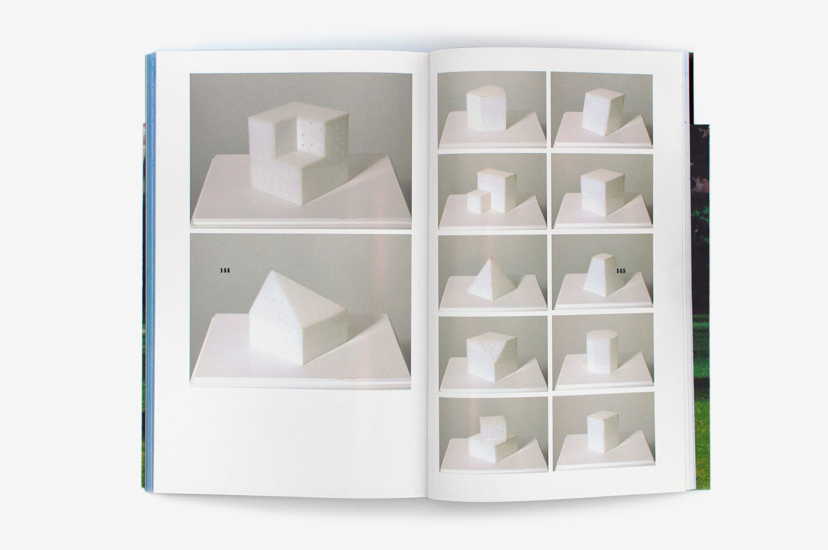
Nicolas Boulard, artiste singulier et polymorphe, s’est fait connaître notamment par son travail artistique sur le vin, étant lui-même issu d’une famille de vigneron. Nous avons travaillé en collaboration étroite pour la mise en forme de son premier catalogue monographique. J’ai souhaité que le graphisme ait un lien subtil avec le monde viticole qui imprègne son travail. La jaquette montre une œuvre phare: un intrigant clos de vigne mobile qui voyage entre différents lieux d’exposition. Sérigraphié avec un mélange d’encres choisies avec l’artiste et variant au fil du tirage, chaque exemplaire est unique. La carte de couverture est teintée dans la masse, et son verso brillant rappelle par son intensité la robe du vin. La tranche bleue est un clin d’œil au sulfate de cuivre («bouillie bordelaise») pulvérisé pour traiter les vignes, un parallèle bibliophilique. Le premier cahier est imprimé sur un papier crème martelé, servant habituellement aux étiquettes de vin. Suit un parcours dans les œuvres, partant d’un monochrome noir en verre pour aller vers un monochrome blanc en sucre. La pagination, à une place inhabituelle, se surimprime aux textes et aux images. Tantôt agaçante, tantôt camouflée, elle agit comme une mouche. À l’image de cet artiste provocateur!
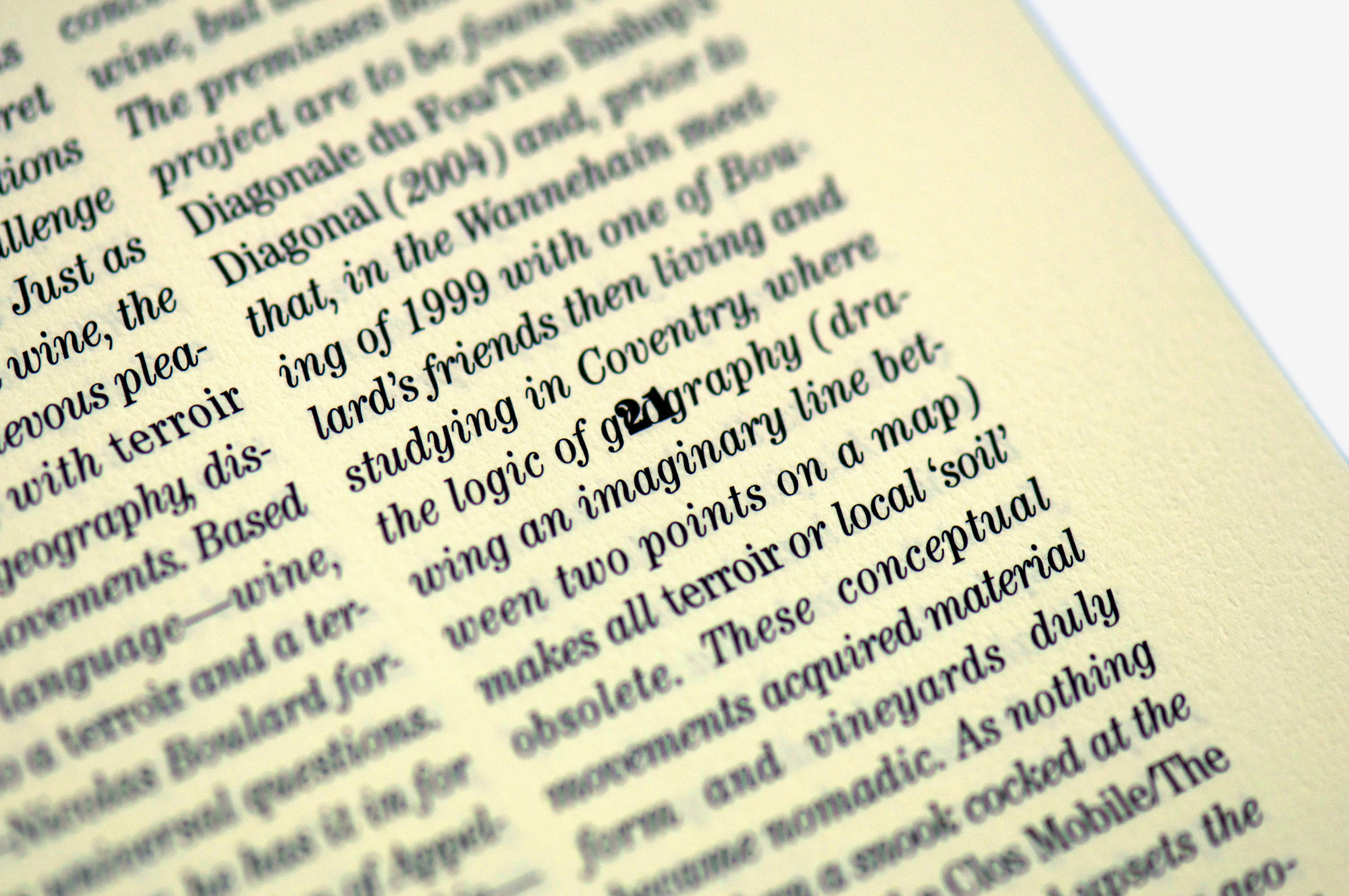
Nicolas Boulard, a singular and multifaceted artist, became known, in particular, for his artistic work with wine, himself from a family steeped in the tradition of winemaker. We worked in close collaboration on the design of his first monographic catalog. I wanted the graphic design to provide a subtle connection to the world of wine, which permeates his work. The jacket displays an essential piece: an intriguing mobile vine garden capable of traveling to different places, to optimize exposure. Screen-printed with a mixture of inks selected together with the artist, which varied as the print run progressed, each copy is unique. The book cover has a glossy back that takes its intensity from the dark color of the wine. The blue slice is a reference to the “Bordeaux mixture” sprayed to treat the vines, a bibliophile parallel. The first part of the book was printed on cream-colored, hammered paper, usually used for wine labels. In these works, there’s a path to follow, from a glass black monochrome to a white sugar monochrome. The page numbers occupy an atypical space, printed over the text and images. At times annoying, sometimes camouflaged, it disturbs the reader much like a nettlesome fly, once more reflecting this truly provocative artist!