
Série Graphique
Contexte: Cnap/Canopé, 2015
Impression: Art & Caractère
Description: 21×29,7, 48 pages + 5 affiches 59,4×84 cm
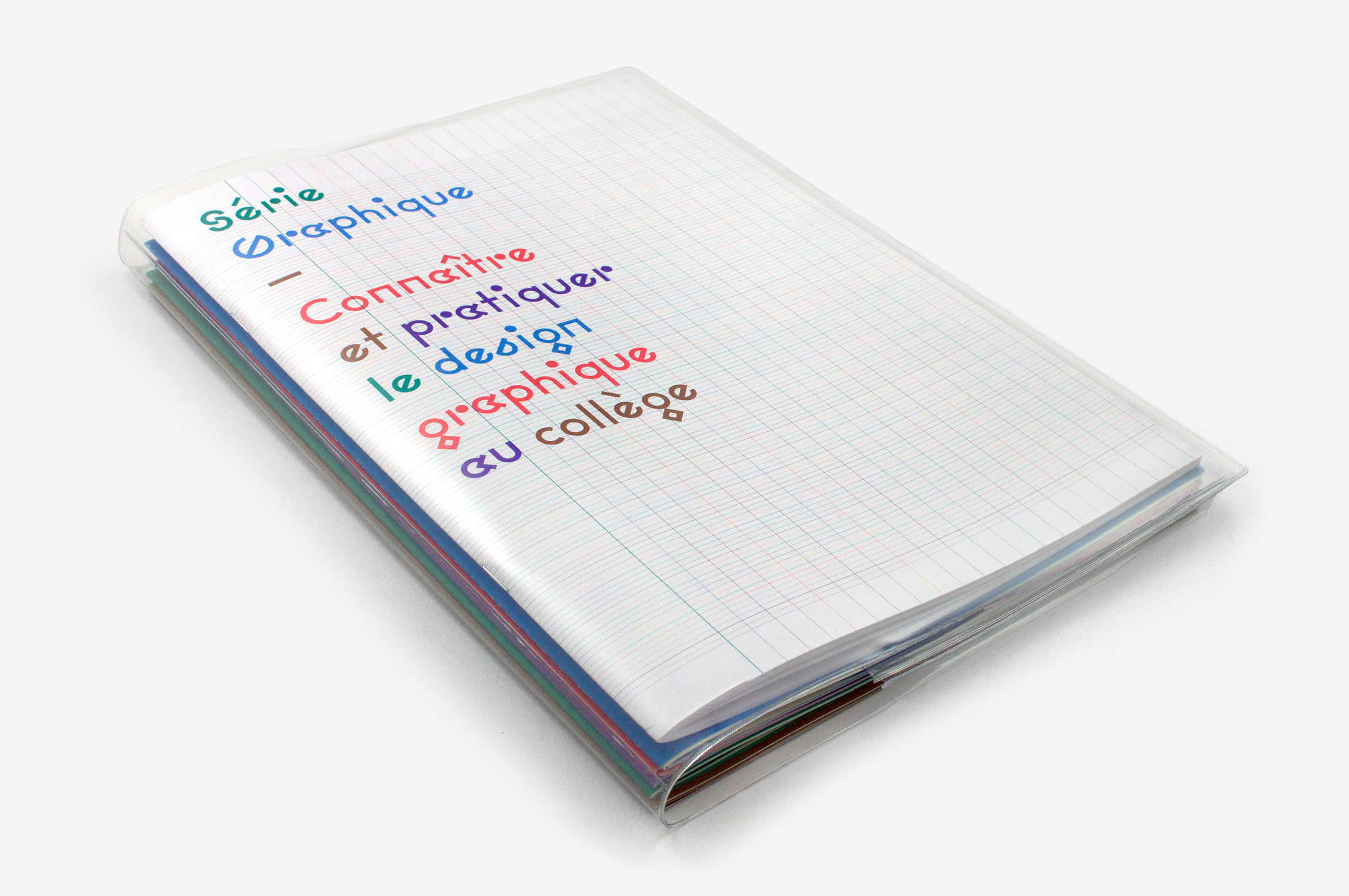
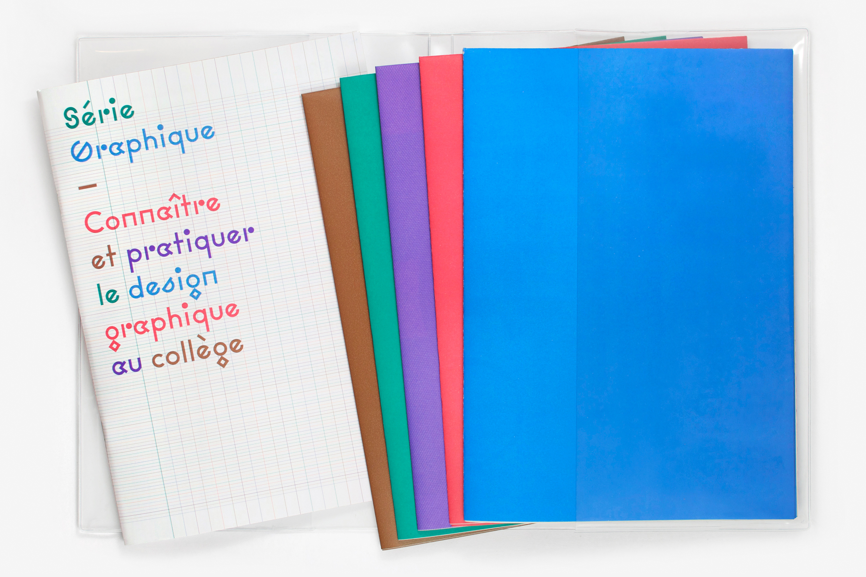
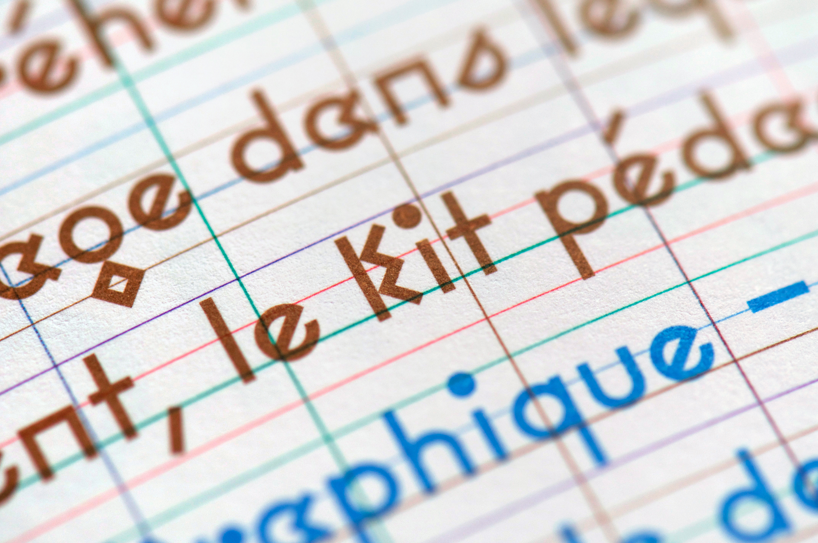
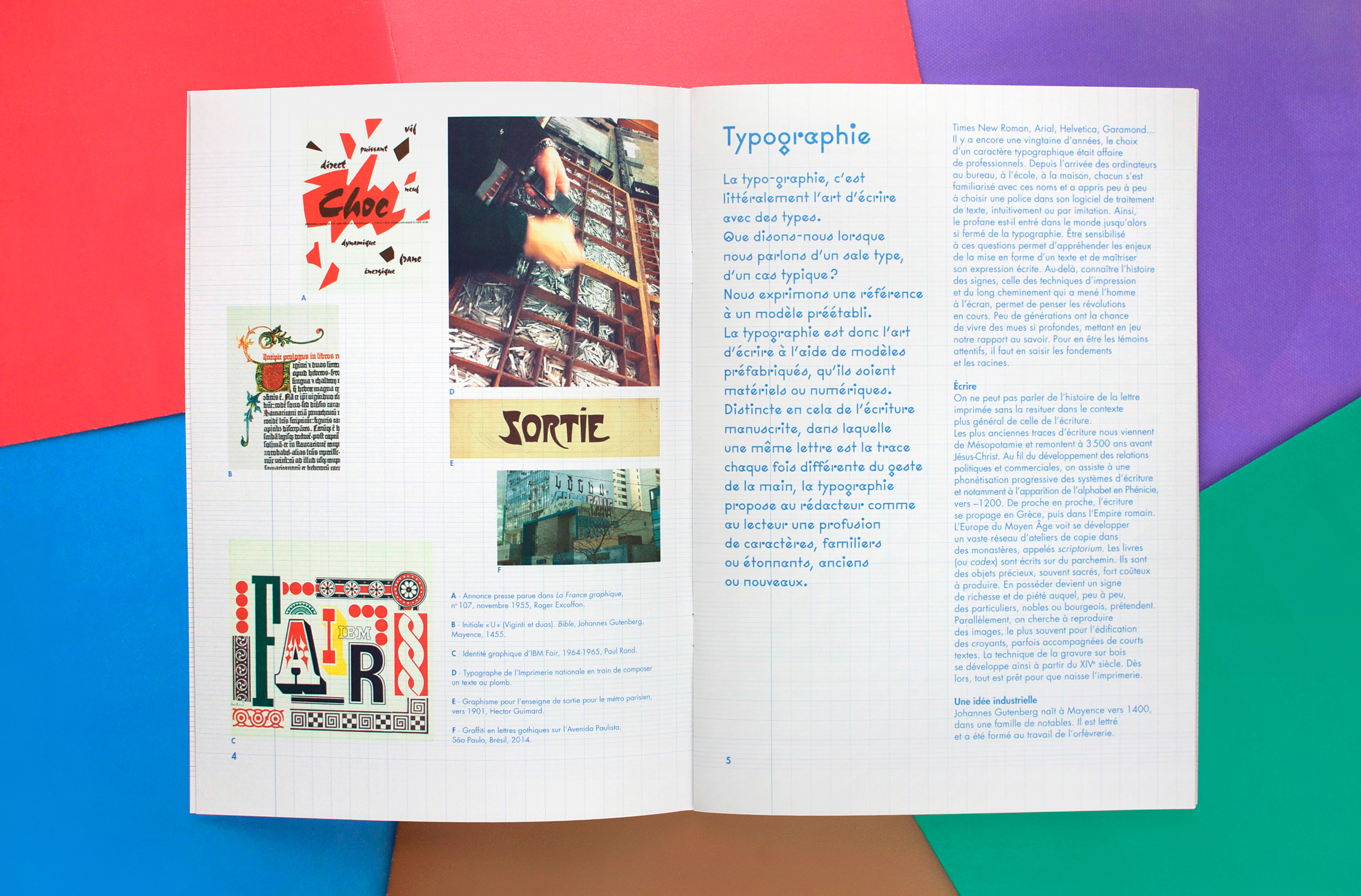
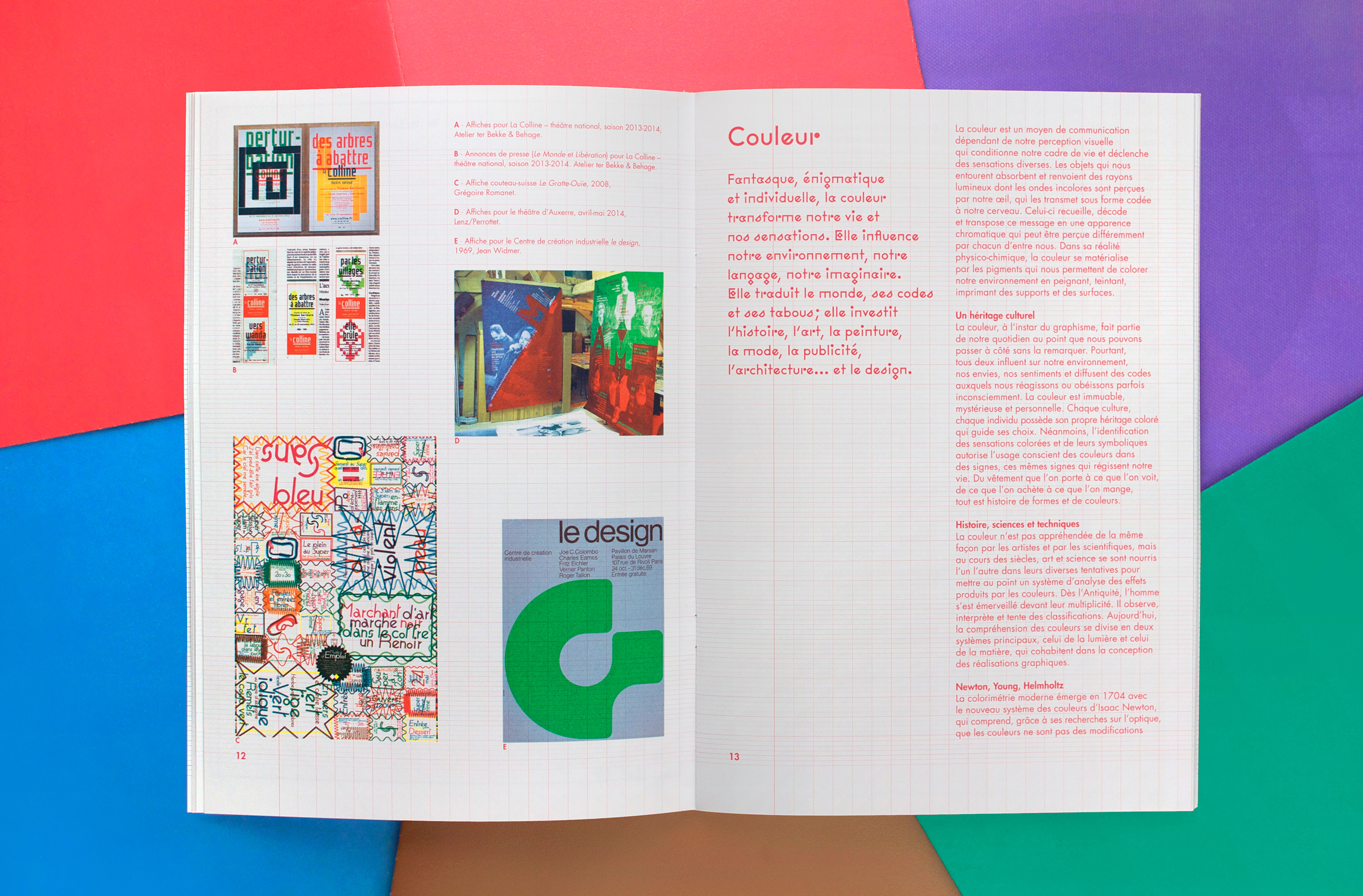
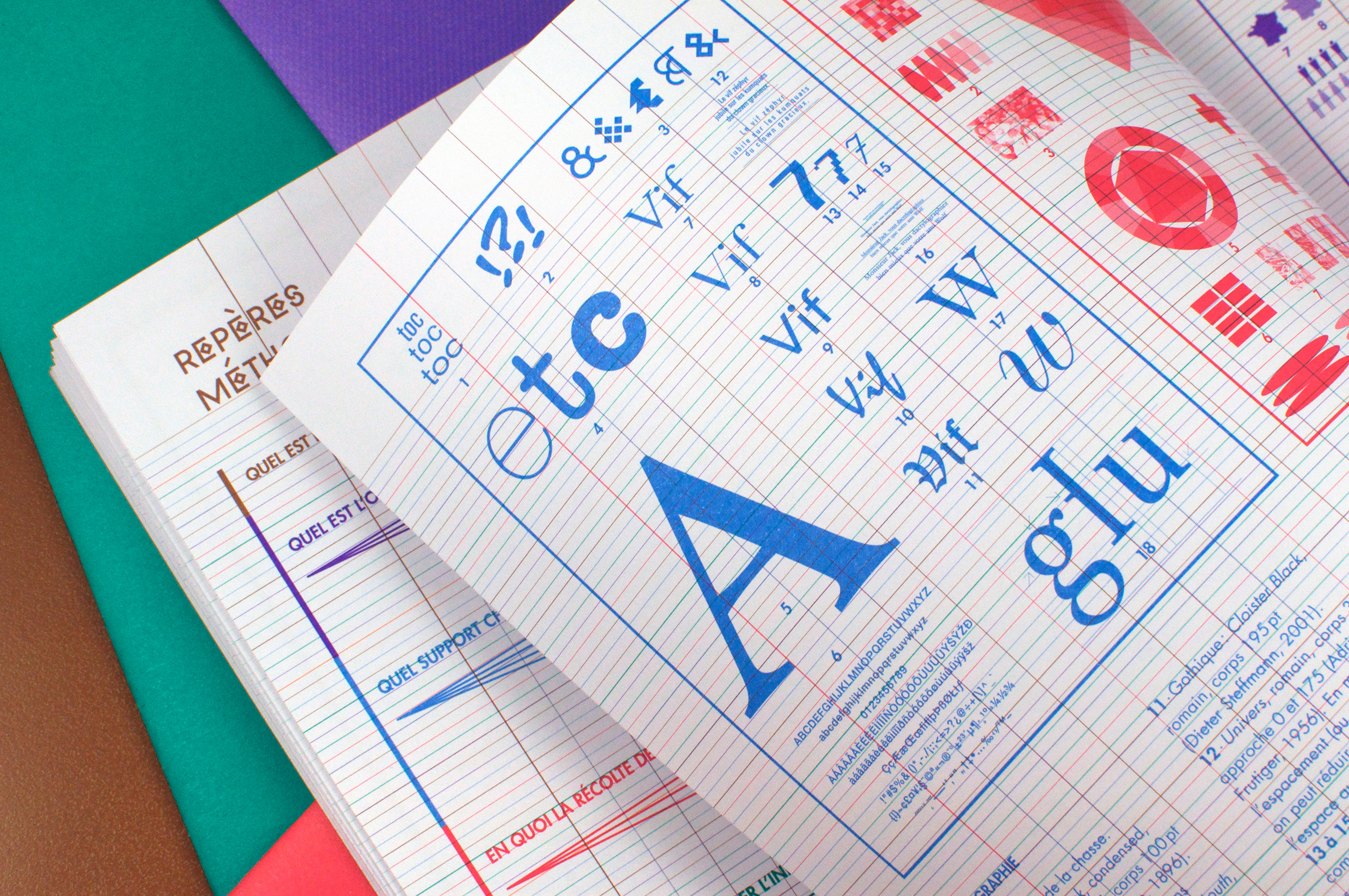
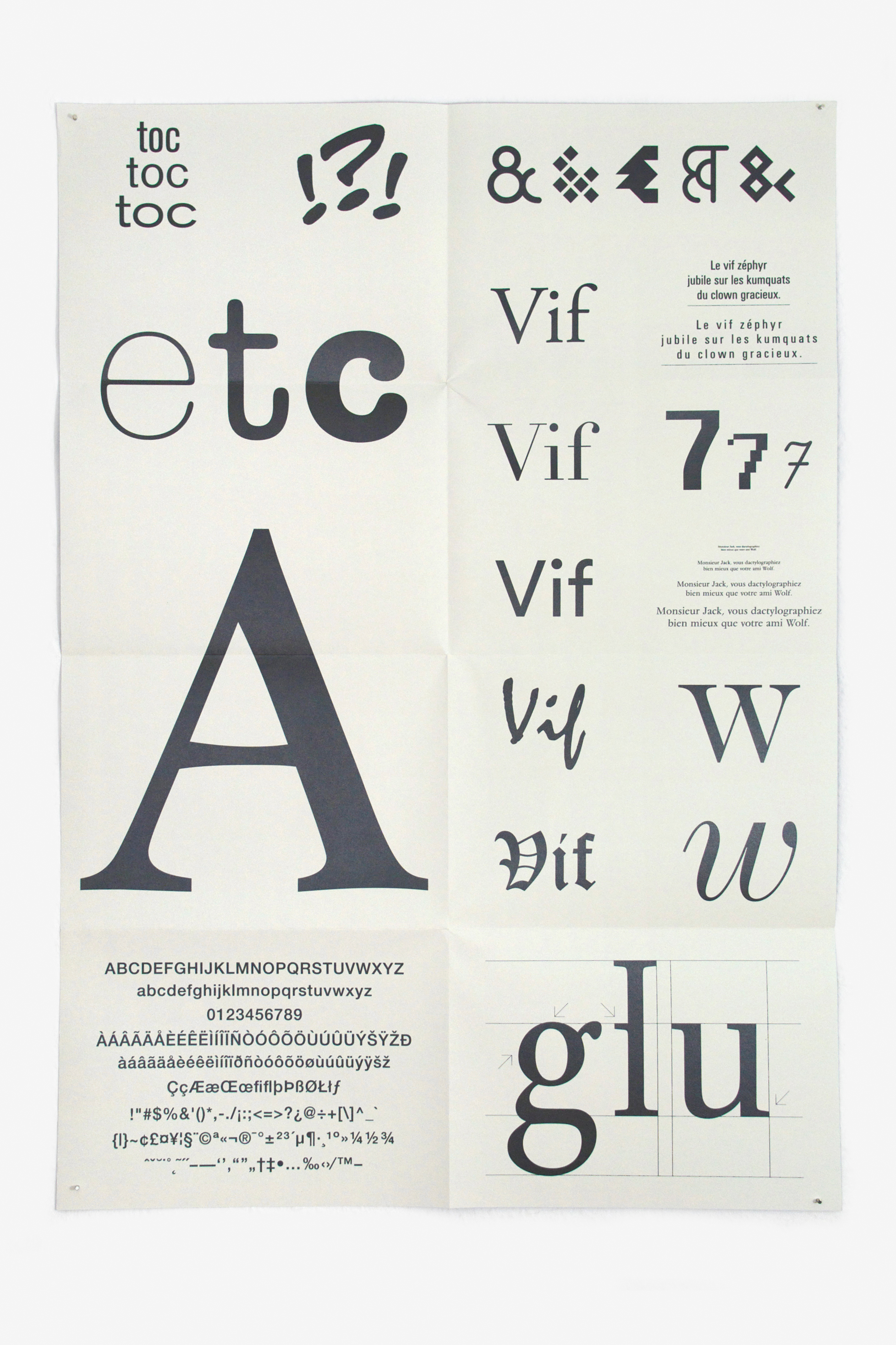
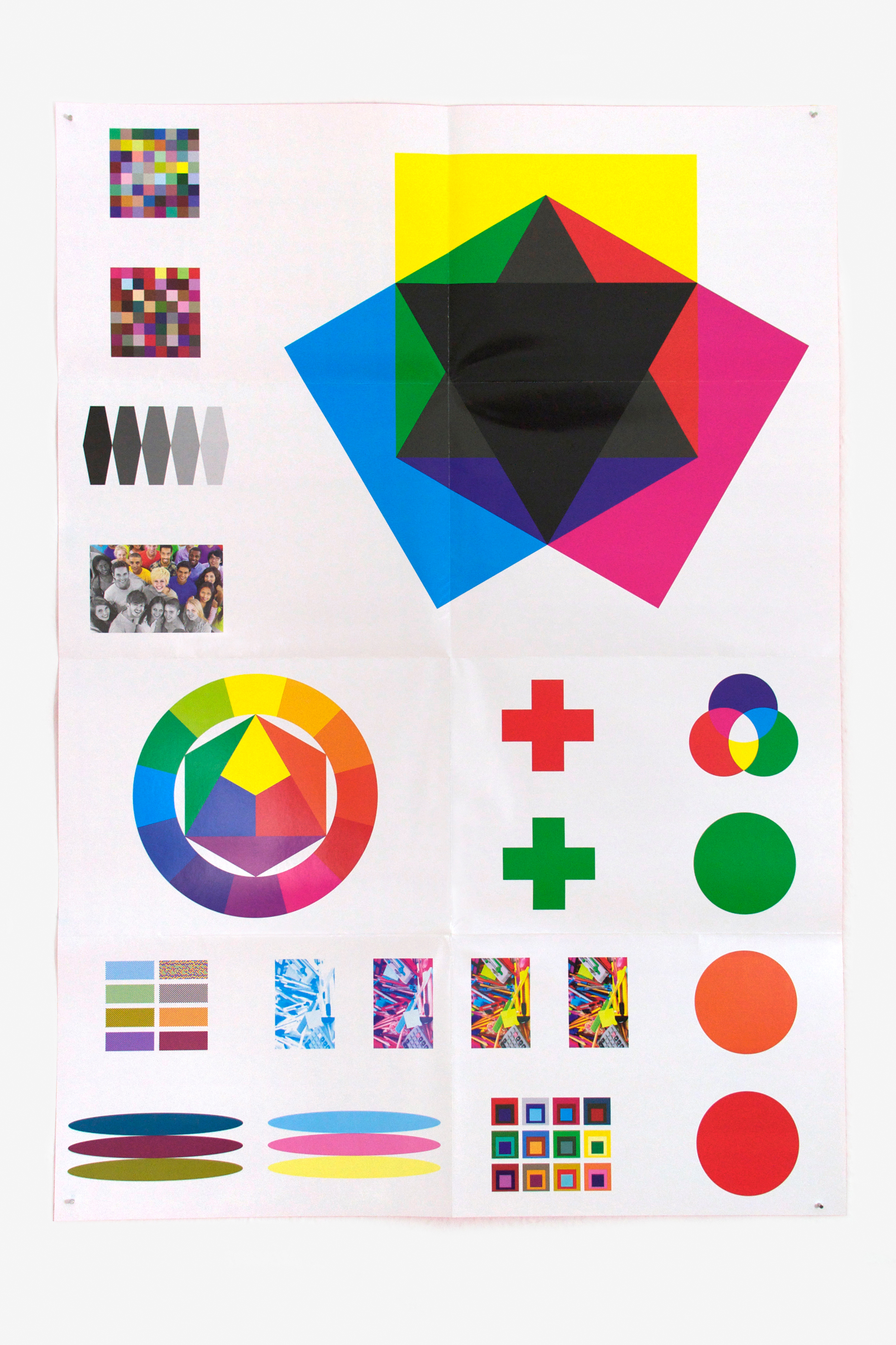
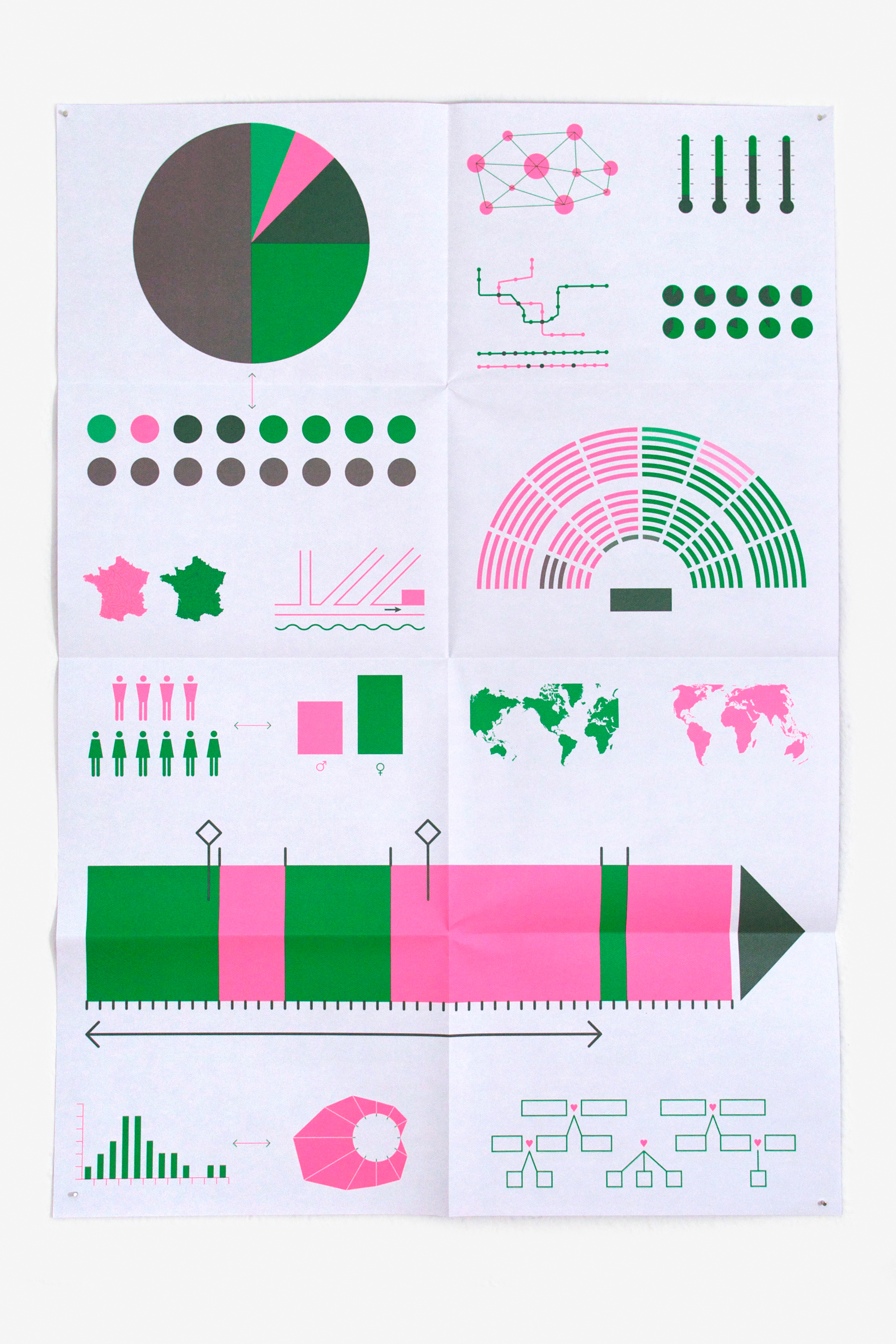
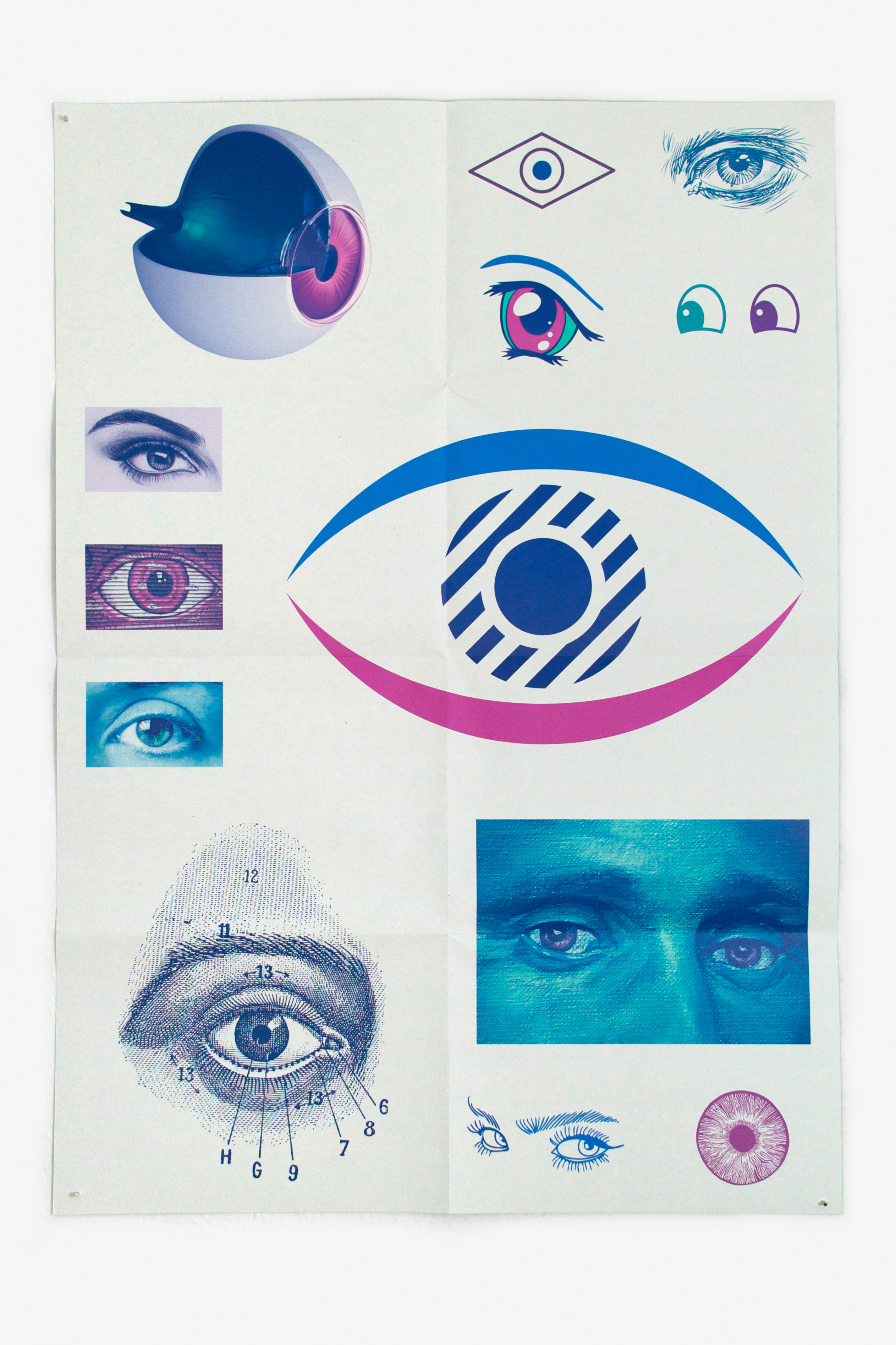
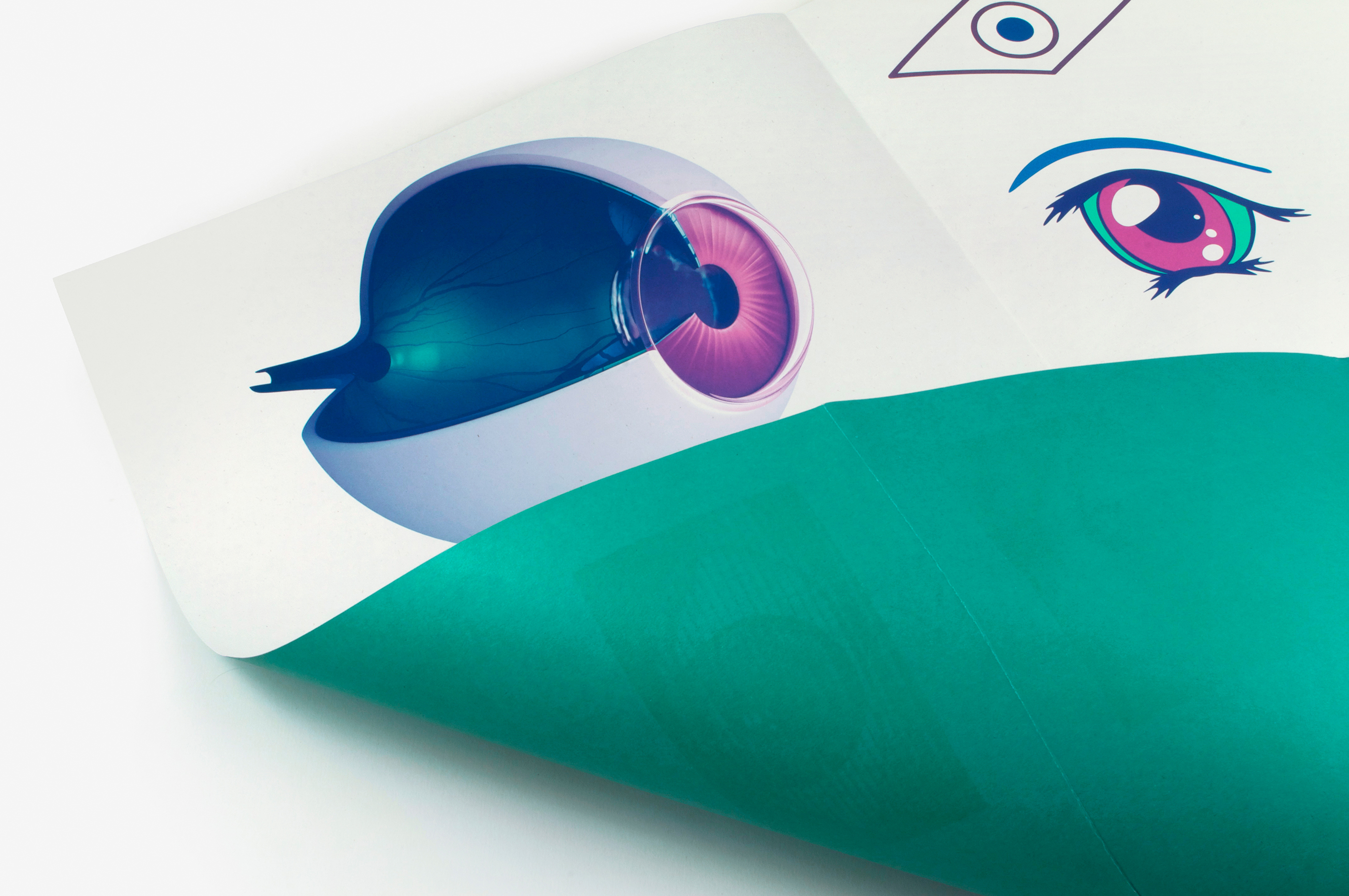
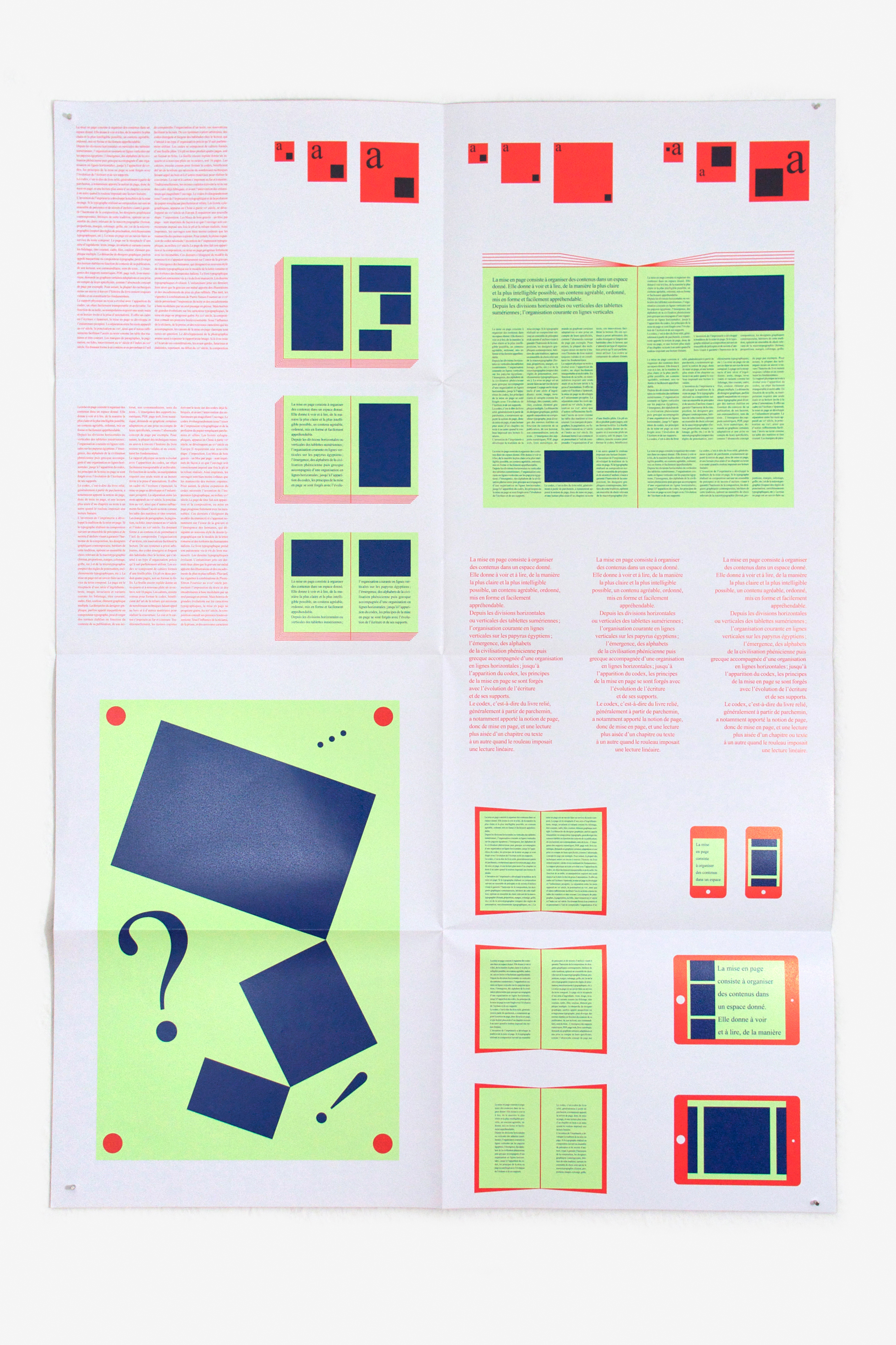
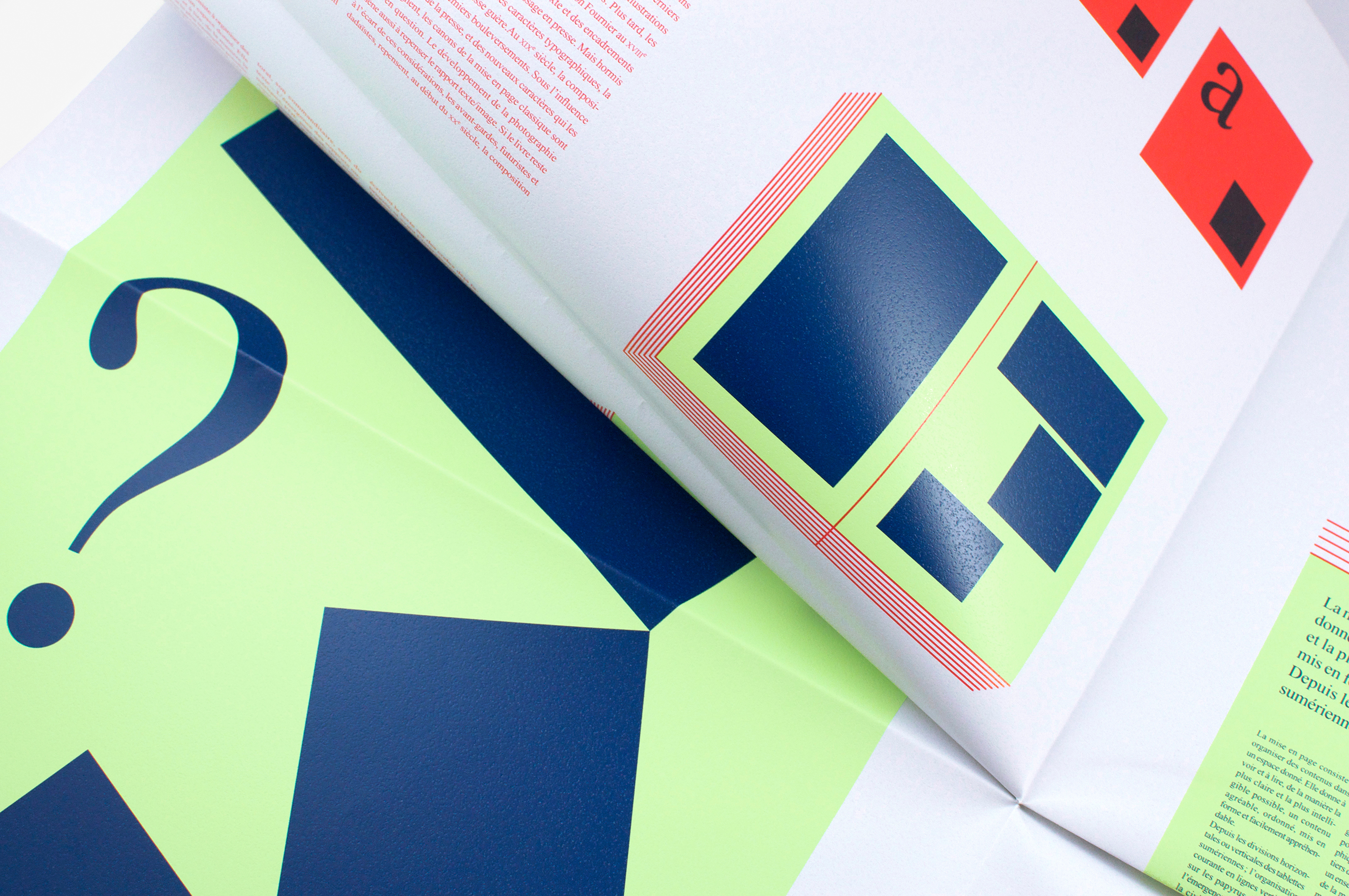
Ce kit pédagogique, réalisé par le Centre national des arts plastiques et édité par le réseau Canopé, propose aux collégiens de découvrir le design graphique. Il a été conçu en collaboration avec un groupe de travail composé de professionnels de la pédagogie et du graphisme. J’ai participé à sa conception et j’en ai dessiné la forme. Il comprend des ressources historiques, scientifiques ou techniques, ainsi que des pistes pédagogiques, qui permettent aux enseignants de sensibiliser les élèves de façon transversale à l’importance du design graphique dans notre environnement quotidien. Le kit est conçu en deux parties. D’une part, un livret à l’usage des enseignants comprend des textes et des ressources documentaires sur les sujets suivants: Typographie, Couleur, Visualisation de données, Image et Mise en page. D’autre part, cinq affiches, destinées à être épinglées en classe, présentent ces thématiques aux élèves. L’ensemble est contenu dans un protège-cahier transparent qui donne à voir l’articulation colorée de ces différents objets, en cela le kit «fait image». Le livret est quadrillé par les fameuses lignes Seyes, qui guident depuis des décennies l’écriture des collégiens à la manière d’une «grille de mise en page». Cette grille devient un terrain de jeu graphique multicouleur, sans conditionner la mise en page du texte qui s’y inscrit en décalage. Les différentes parties du livret sont traitées en monochrome, ce qui permet de les distinguer immédiatement. L’iconographie est imprimée en six tons directs. La typographie de titrage, dessinée spécifiquement pour le projet, est librement inspirée du dessin original du Futura de Paul Renner. Les lettres sont composées de formes associées (en kit!), qui peuvent être décomposées de manière ludique. Les cinq affiches (dont l’aplat de couleur au verso correspond au thème dans le livret, afin d’être distingués pliées) se présentent comme des planches didactiques. Une articulation visuelle expose la richesse de chaque thème et laisse entrevoir sa complexité. Le caractère simplifié et archétypal (parfois factice) des éléments graphiques, et l’absence de légendes (qui figurent cependant dans le livret) sont une invitation à échanger avec les élèves. Le papier ainsi que les couleurs d’impression diffèrent pour chaque affiche, laissant entrevoir en filigrane le graphisme comme un outil sensible.
This teaching kit, produced by the Centre national des arts plastiques and published by the Réseau Canopé, is designed to introduce graphic design to schoolchildren. It was created in collaboration with a working group of professionals from the fields of education and graphic design. I was involved from the beginning and designed it. It includes historical, scientific and technical resources as well as multi-disciplinary teaching hints to help teachers raise the students’ awareness of the importance of graphic design in our daily lives. The kit consists of two parts. One, a teacher’s booklet, contains texts and documentary resources on the following subjects: Typography, Colour, Data visualisation, Images and Layout. The other consists of five posters presenting these themes, intended for display in the classroom. The whole thing is contained in a transparent cover that allows the colour arrangement of these different objects to show through, giving the kit its own “image”. The pages of the booklet are printed with the famous Seyes ruled lines (French ruling) that have guided the handwriting of schoolchildren for decades in the manner of a “layout grid”. This grid becomes a multi-coloured graphic playground without influencing the layout of the text which ignores the lines. The different parts of the booklet each have their own colour, making them instantly recognisable. The images are printed in six spot colours. The typeface for the headings, designed specifically for this project, is a free adaptation of the original design by Paul Renner for Futura. The letters are composed by combining forms (the pieces of a kit!) that can be taken apart and reassembled. The five posters (the coloured backs of which correspond to the themes in the booklet so that they can be told apart when folded) have the appearance of educational illustrations. The arrangement of the visuals displays the richness of each theme and hints at their complexities. The deceptively simple and archetypical character of the graphic elements and the absence of captions (which do, however, appear in the booklet) are an invitation to discussion with the pupils. Not only the colours but also the types of paper differ from poster to poster, giving a glimpse of the subtleties available to graphic design.