
Matisse Paires et séries
Contexte: Éditions du Centre Pompidou, 2011
Description: 24×28 cm, 288 pages
Mise en page réalisée avec Béatrice Delas
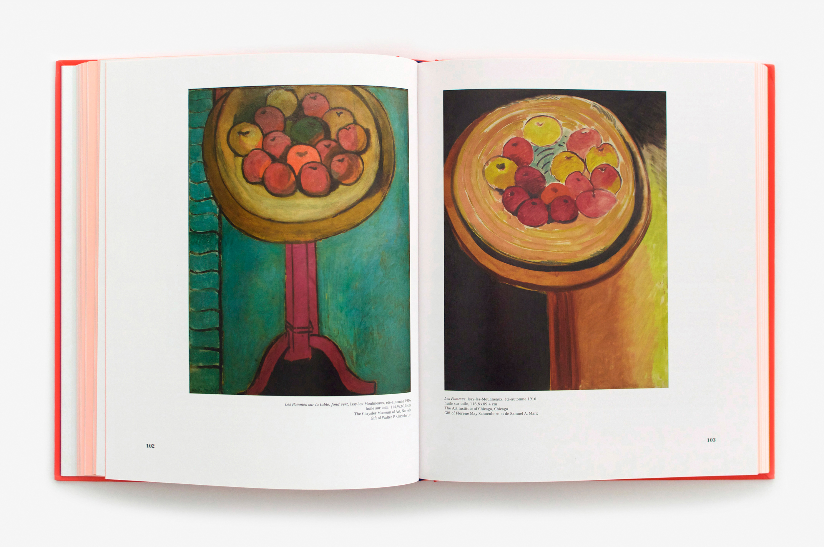
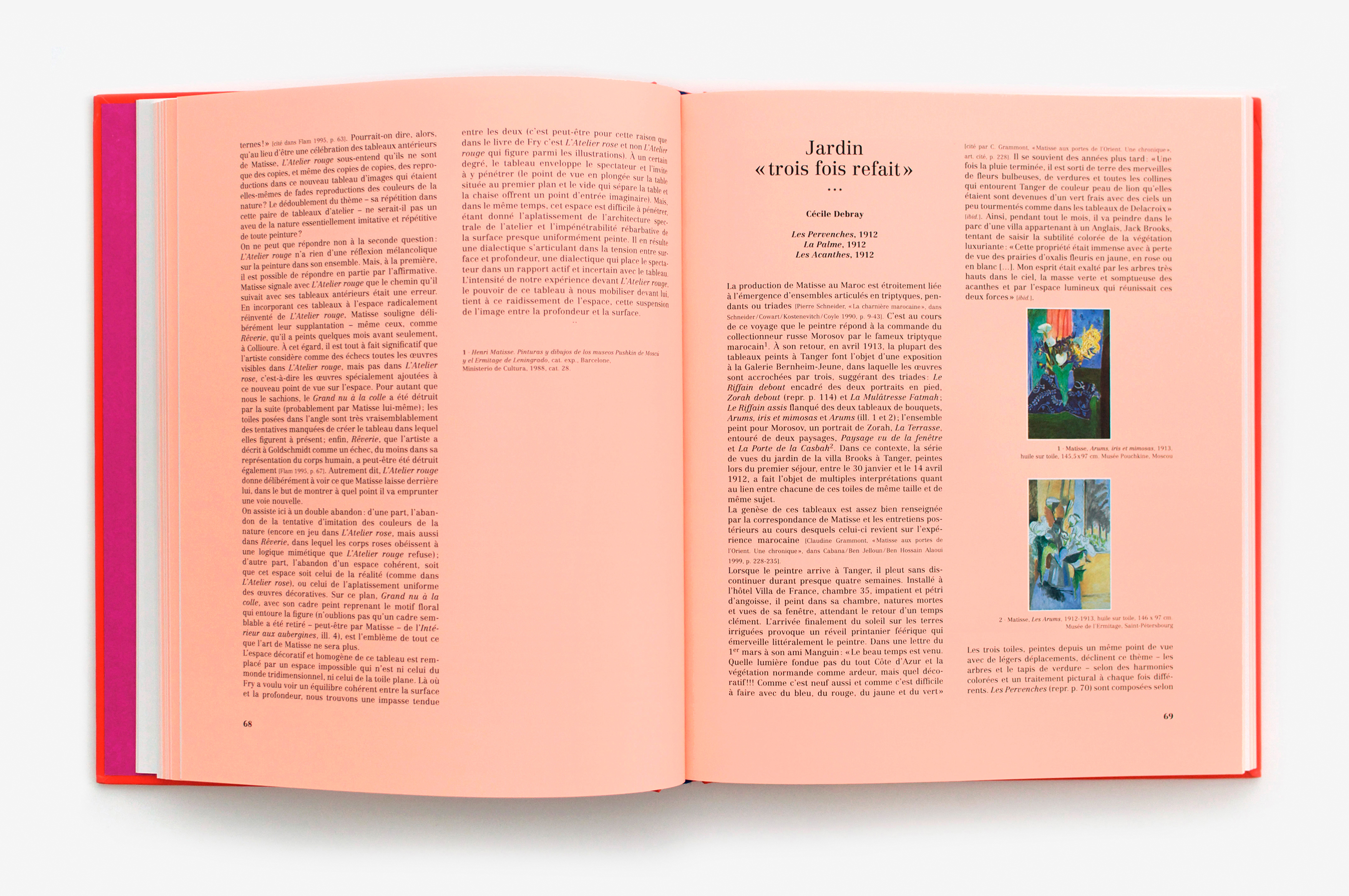
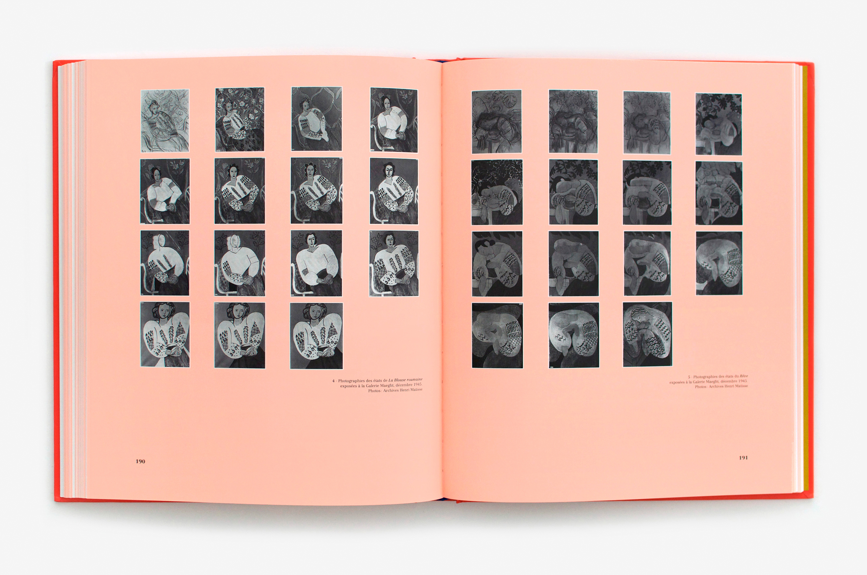
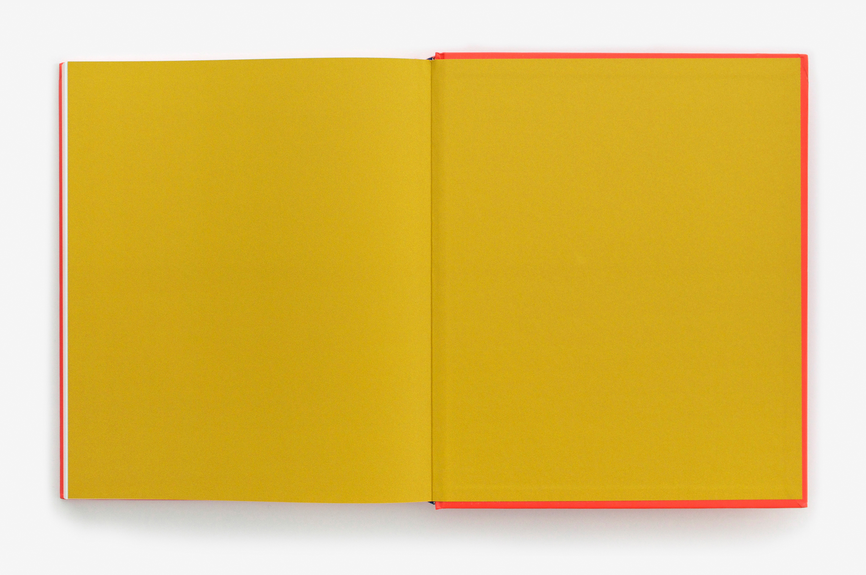
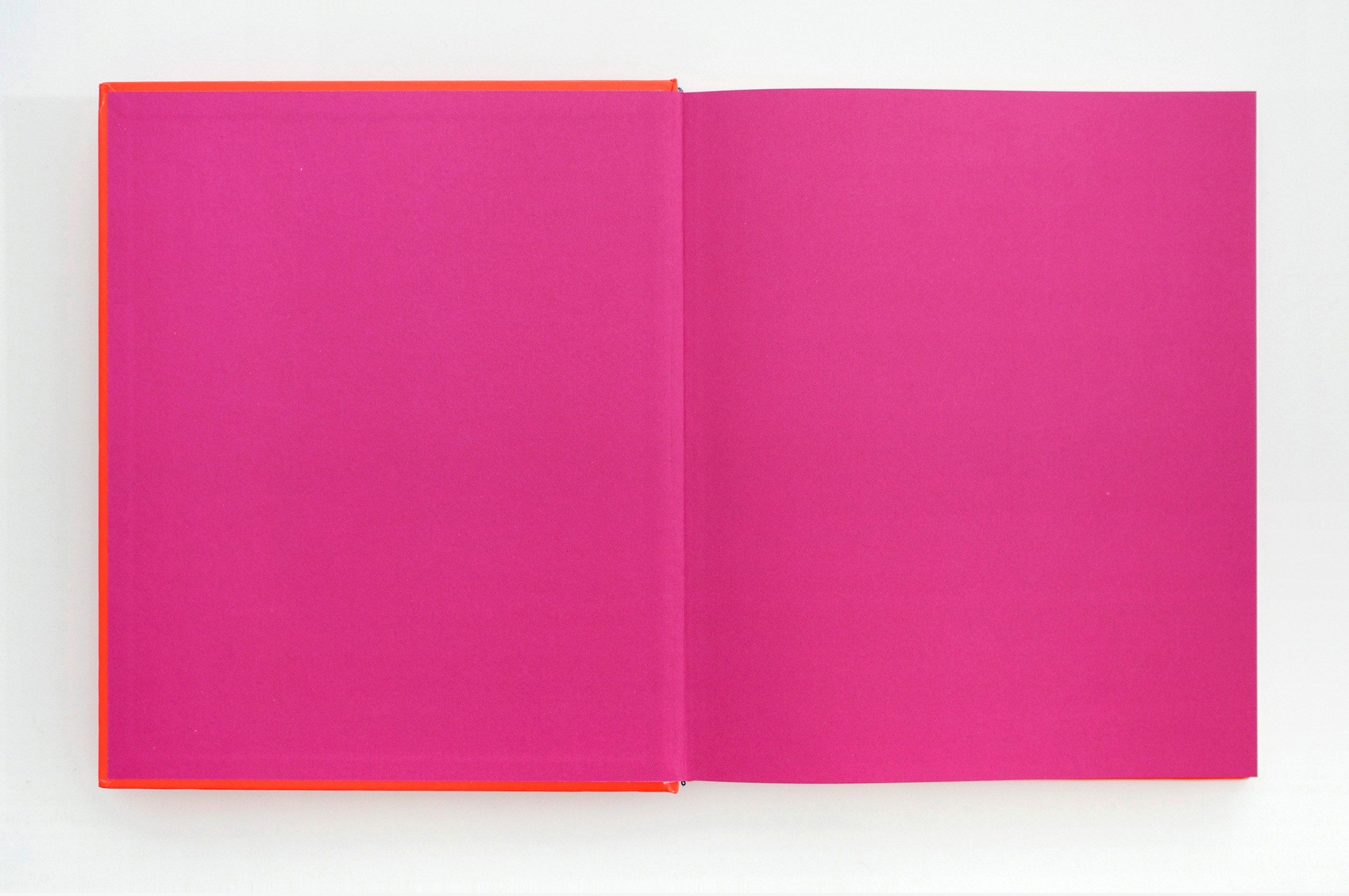
Pour le graphisme de ce catalogue, j’ai privilégié la simplicité afin de valoriser la confrontation des paires d’œuvres. J’ai pris un contre-pied coloré par rapport au «bleu Matisse» omniprésent dans ses ouvrages: il n’apparait ici que dans le tranchefile. Sa couleur complémentaire, l’orange, imprègne toute la gamme colorée. Les aplats orangés, présents sur les pages de textes, rythment la monstration des paires d’œuvres et les enserrent dans un écrin coloré subtil et vif.
For the graphic design in this catalog, I opted for simplicity, in order to emphasize the confrontation of the works presented within. In terms of color, I intentionally went against the typical ‘blue Matisse’ so omnipresent in his works: it appears here in the headband. Its complementary color, orange, permeates the whole color range. The orange solids, present on the pages of text, punctuate the presentation of the works in pairs, and enrobes them in a subtle yet vivid setting.