Manuels
Contexte: Éditions 369, depuis 2018
Description: 10×15 cm, 64 pages
Typographie: Helvetius, 205TF
Mise en page réalisée avec Béatrice Delas
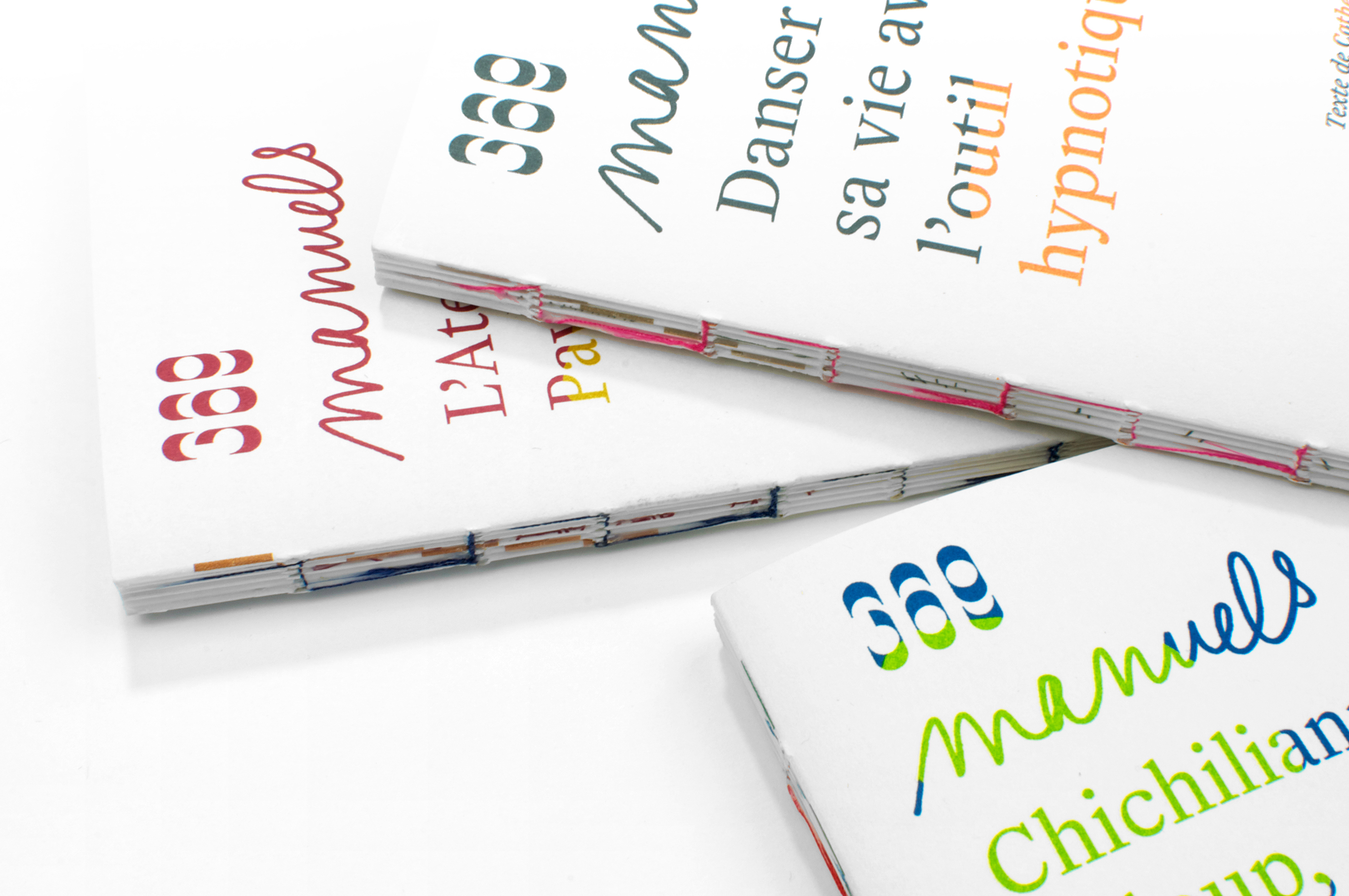
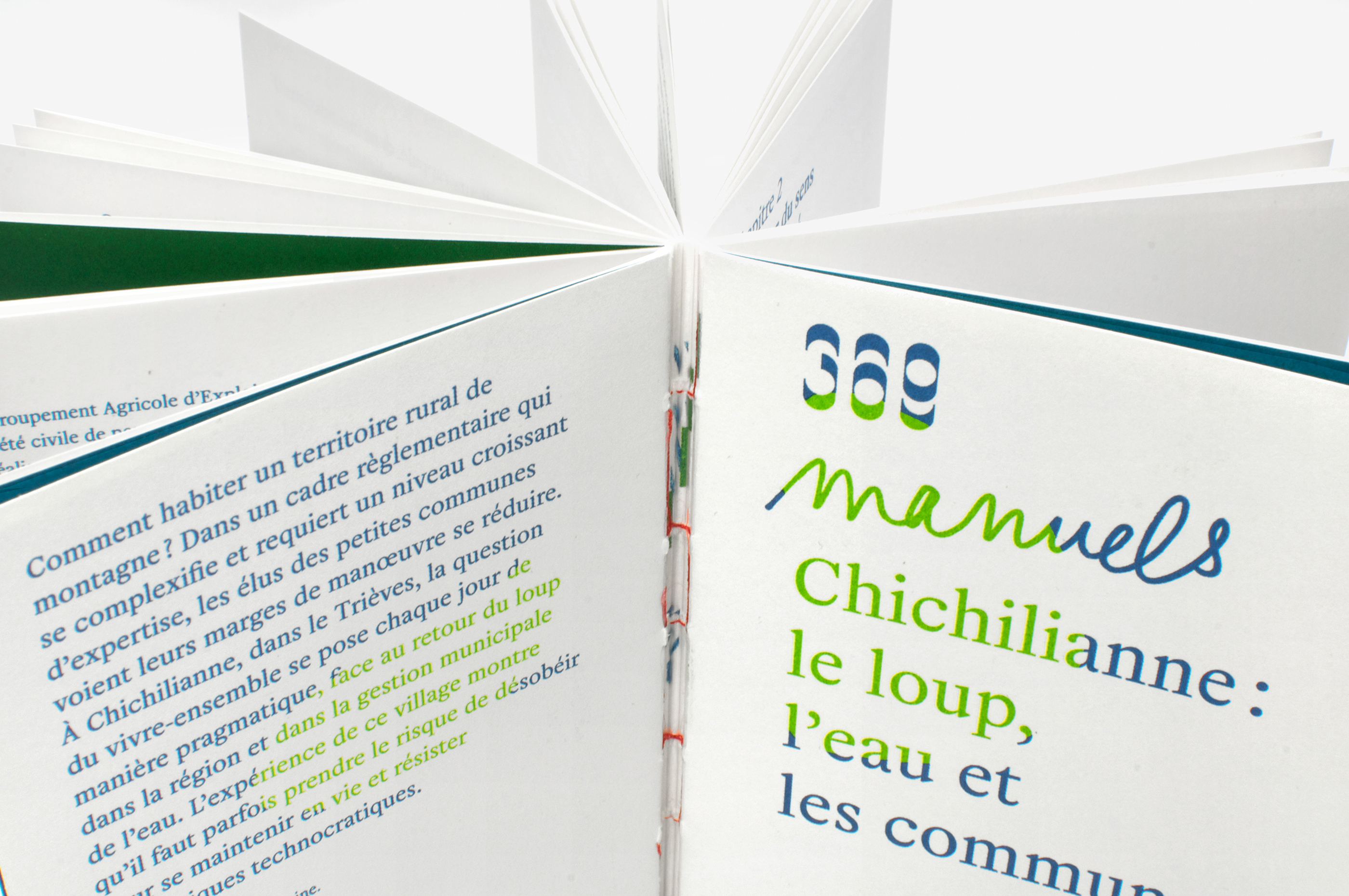
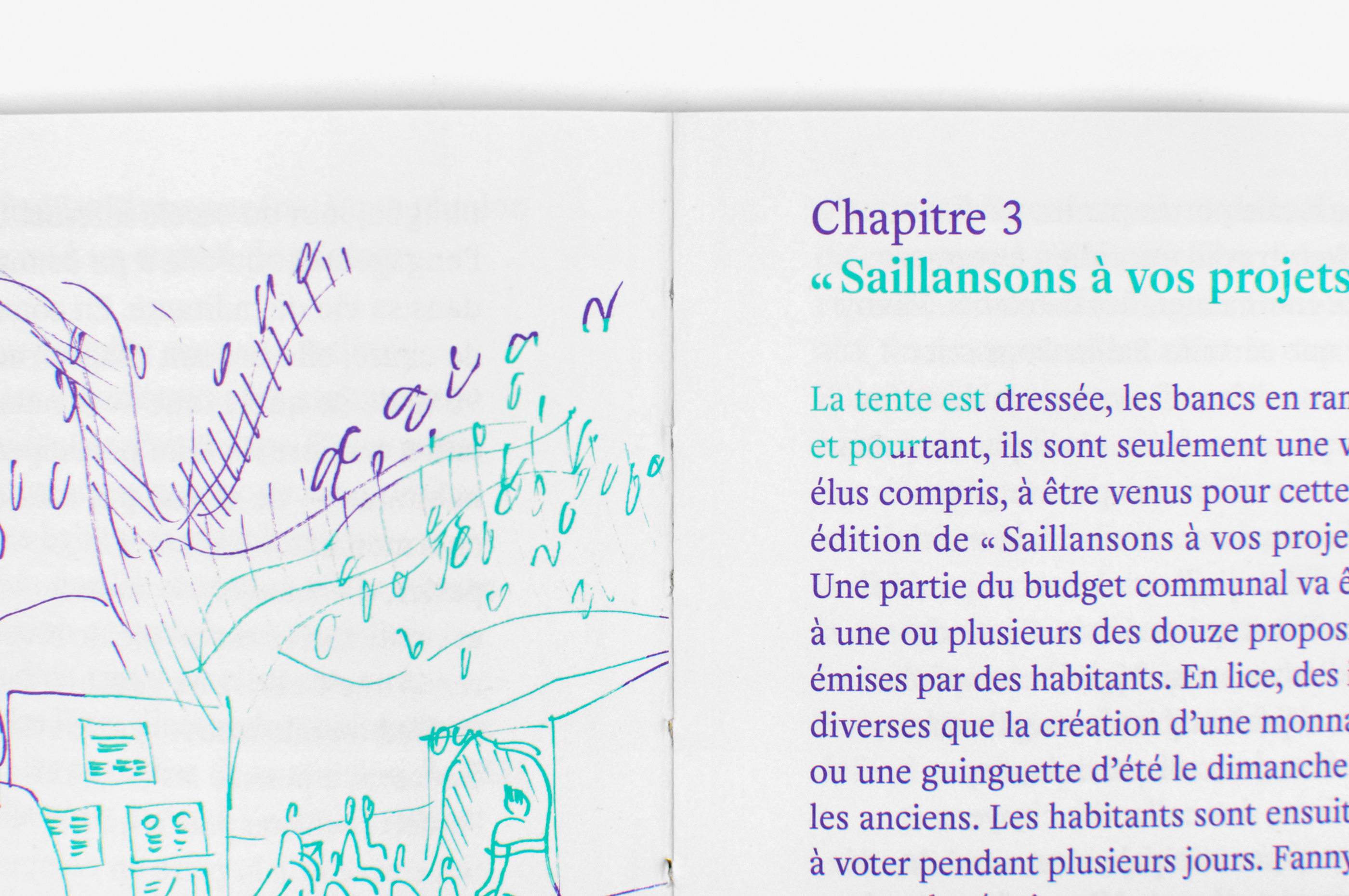
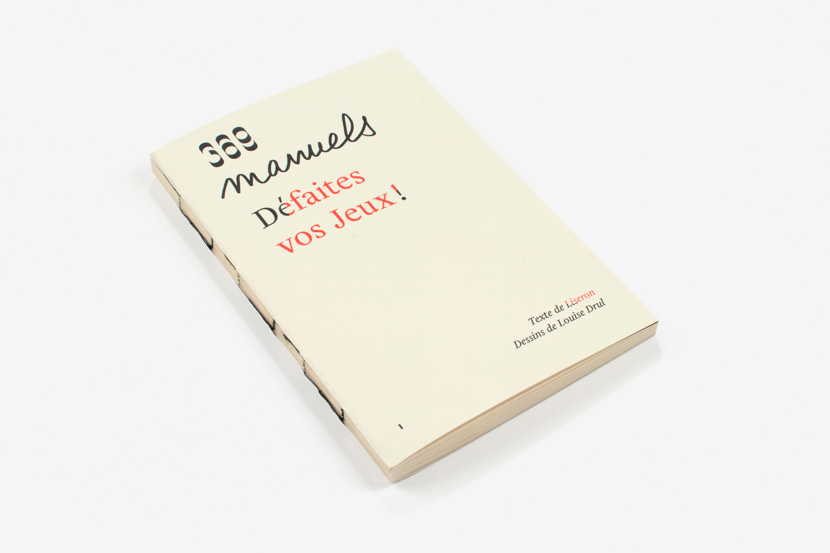
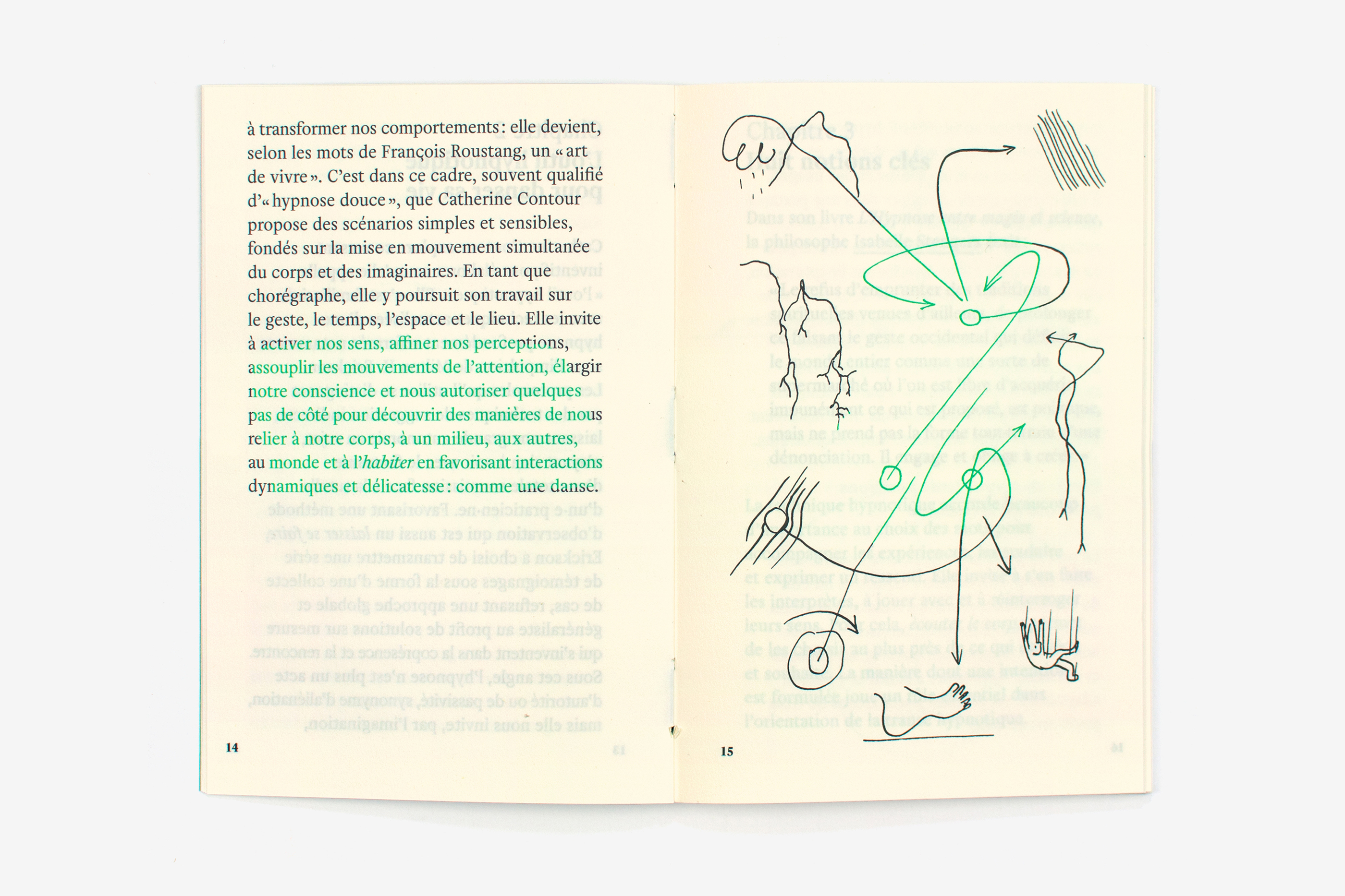
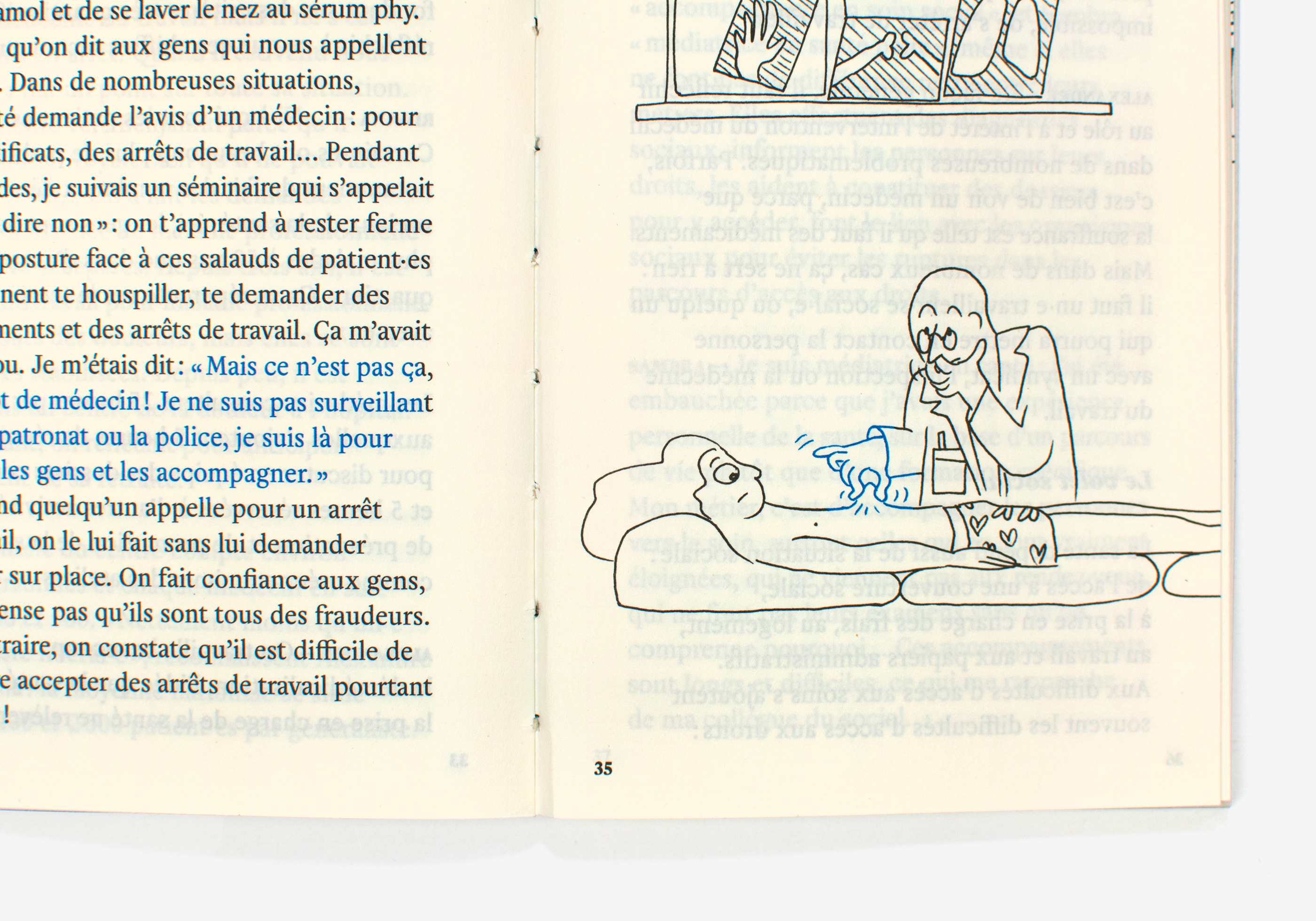
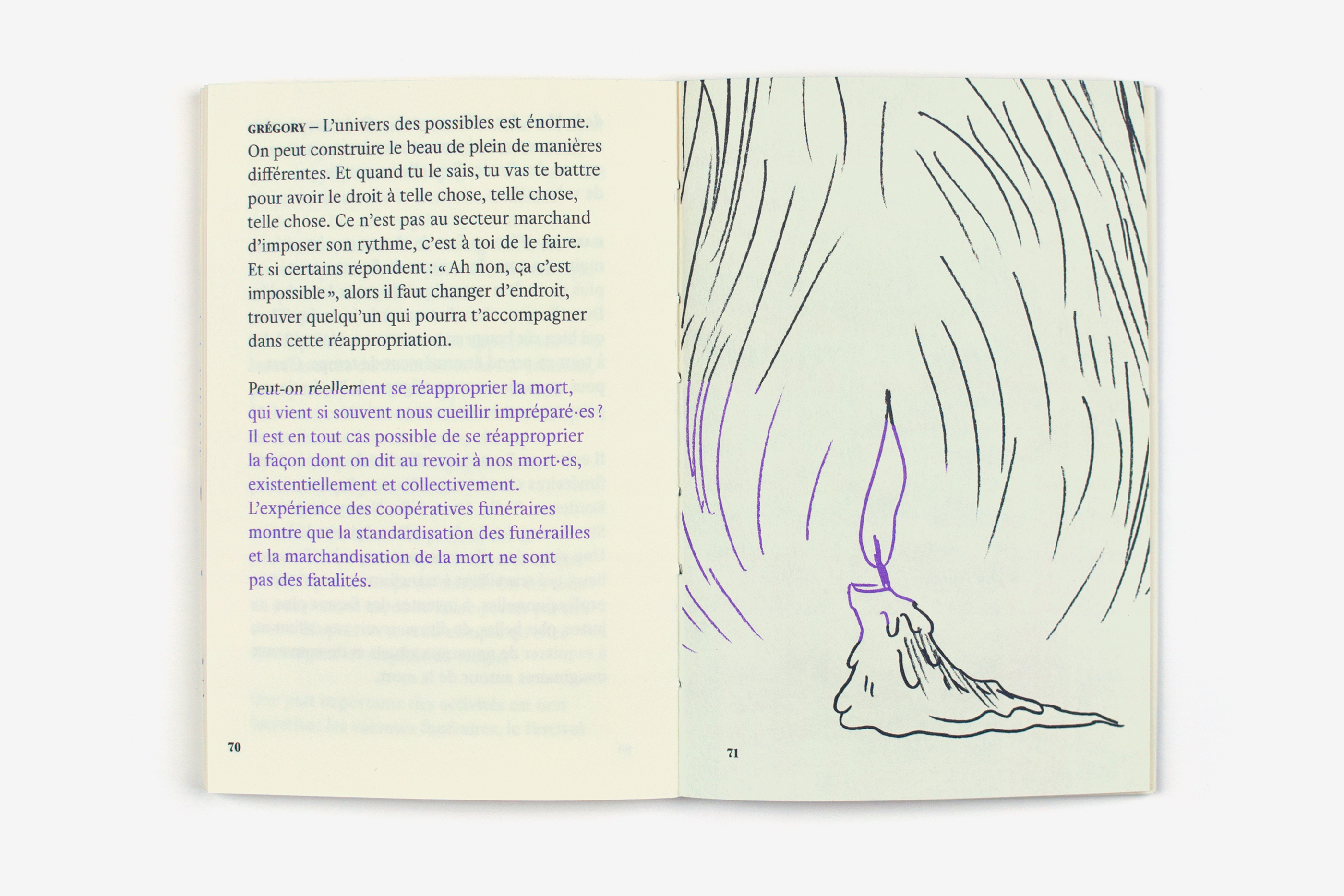
Cette première collection de livres éditée par 369 retrace des expériences collectives qui répondent aux bouleversements de notre société. Conçus sous la forme d’une enquête de terrain, ces Manuels sont enrichi par des ressources pratiques et des dessins. Les ouvrages, dans leurs forme, sont modestes: sans couverture, petit format, un seul papier, reliure apparente. Une jaquette transparente compense l’absence de couverture et autorise un dos typographique. Ils sont imprimés en bichromie: la première couleur, plus foncée, joue le rôle d’écrin; la seconde, plus vive, vient éclairer les informations à valoriser (titres, citations, détails dessiner, etc.). Ces zones de couleurs, définie de façon brute, permettent une mise en relief du contenu et une circulation libre dans l’ouvrage. La couleur est ici utilisée comme un outil, mis en œuvre manuellement. La typographie Helvetius (205TF), au classicisme singulier, est mise en page très simplement: elle contrebalance cet usage singulier de la couleur.
This first collection of books published by 369 examines various collective initiatives and their responses to the upheavals in modern society. Taking the form of field research, these Manuals are further enriched by practical resources, diagrams and drawings. The books are modest in appearance, small, with no cover and using only one type of paper with the stitching of the signatures visible. A transparent dustjacket with the title printed on its spine makes up for the lack of a cover. They are printed in two colors: the first, darker color is used for the main text while the second, brighter color is used to emphasize particular passages (headings, quotations, diagram details, etc.). These markedly defined areas of color serve to highlight the content and different sections of the book. Here color is a tool to be used manually. The unique classicism of the Helvetius (205TF) font is very simply laid out on the page, providing a contrast with the book’s unusual use of color.