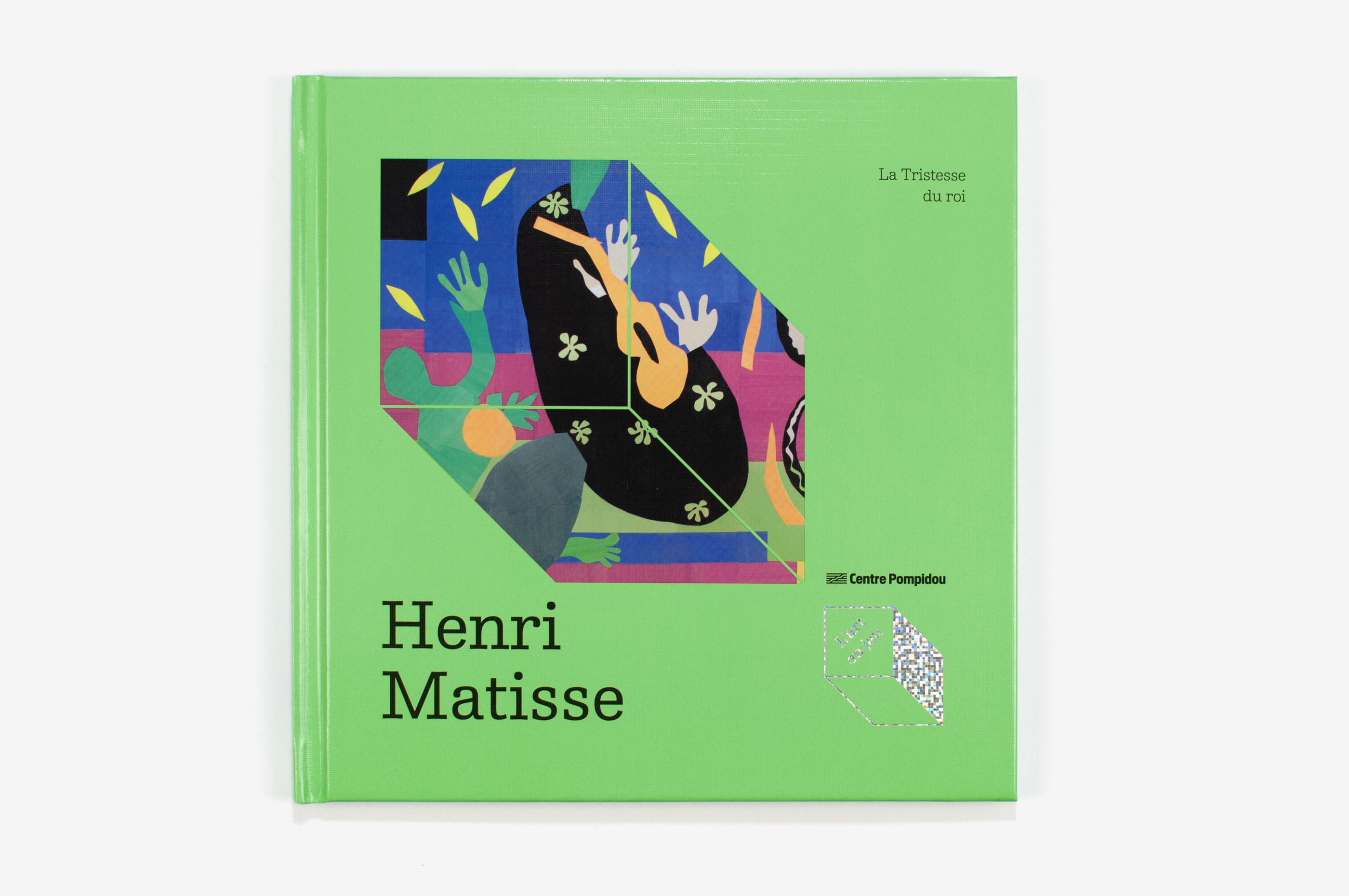
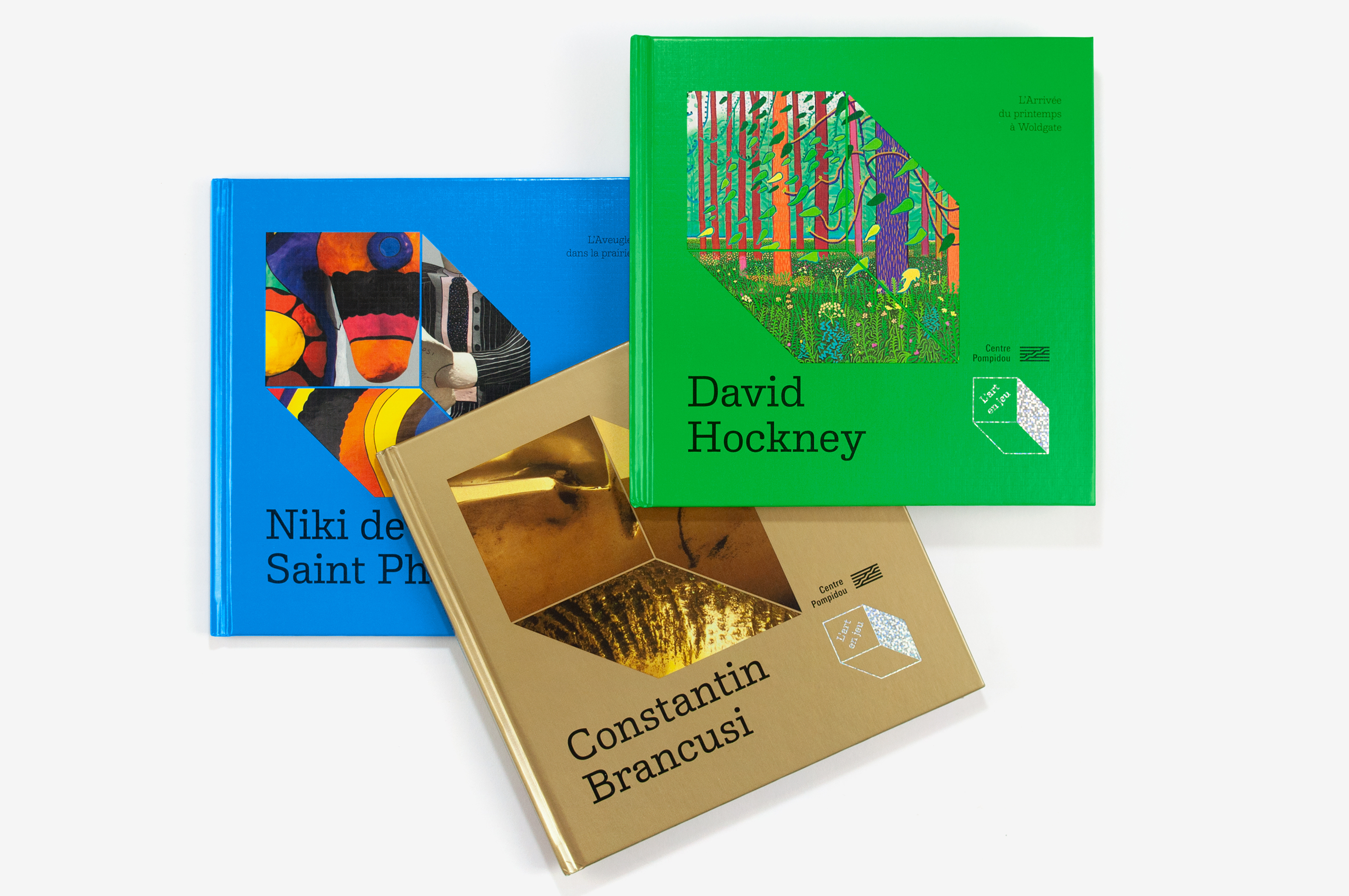
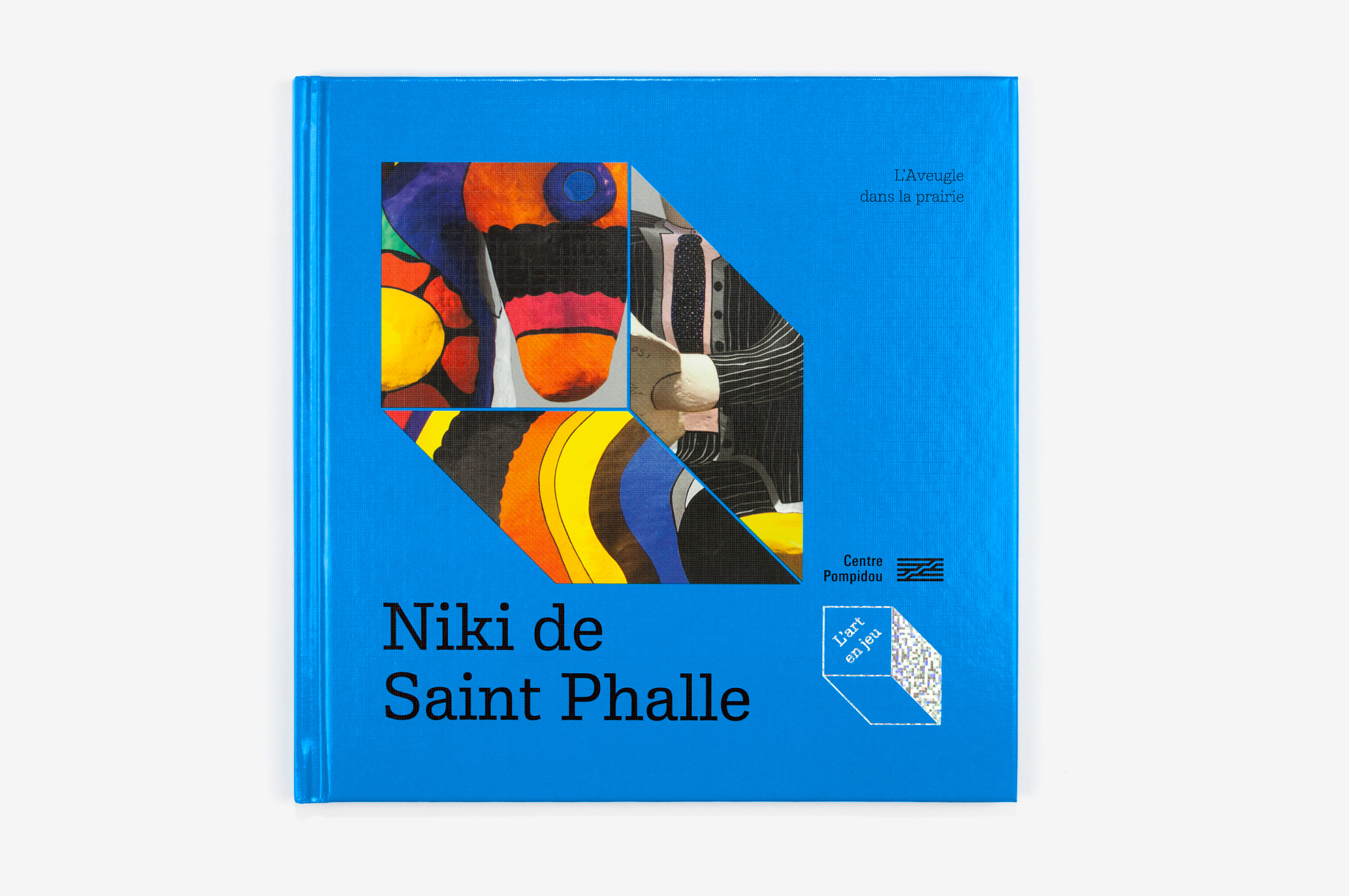
L’art en jeu
Contexte: Centre Pompidou, depuis 2021
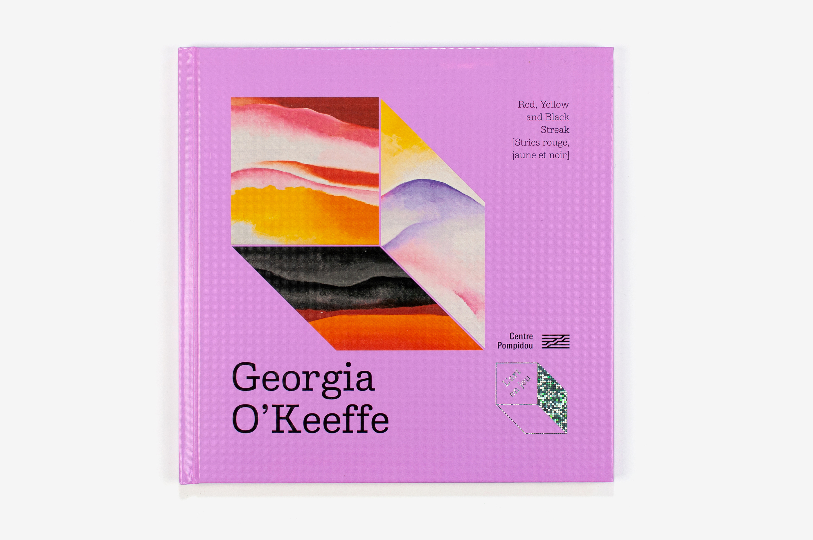
Description: 20,5×20,5 cm, 32 pages
Typographie: Album Slab, 205TF
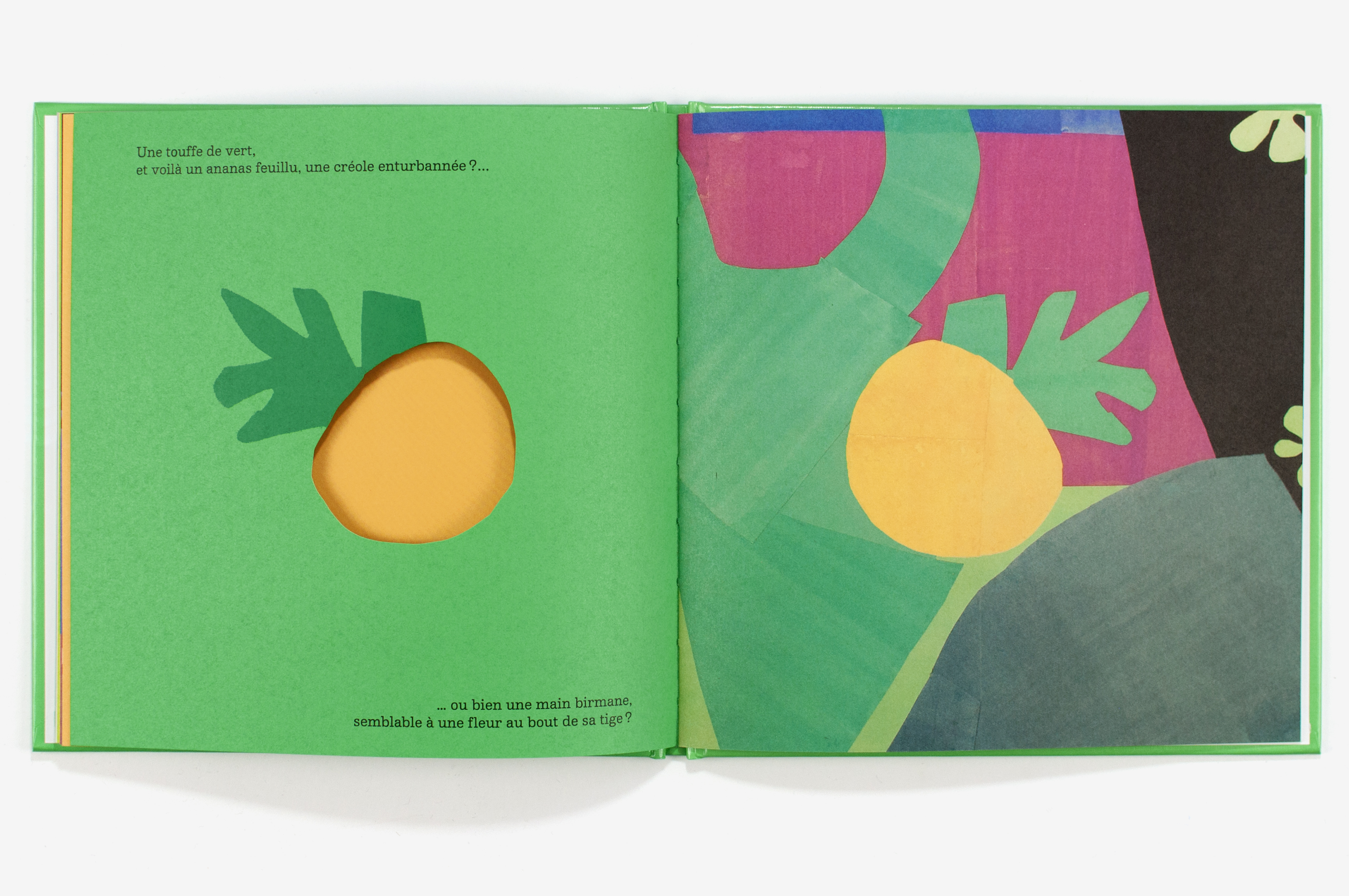
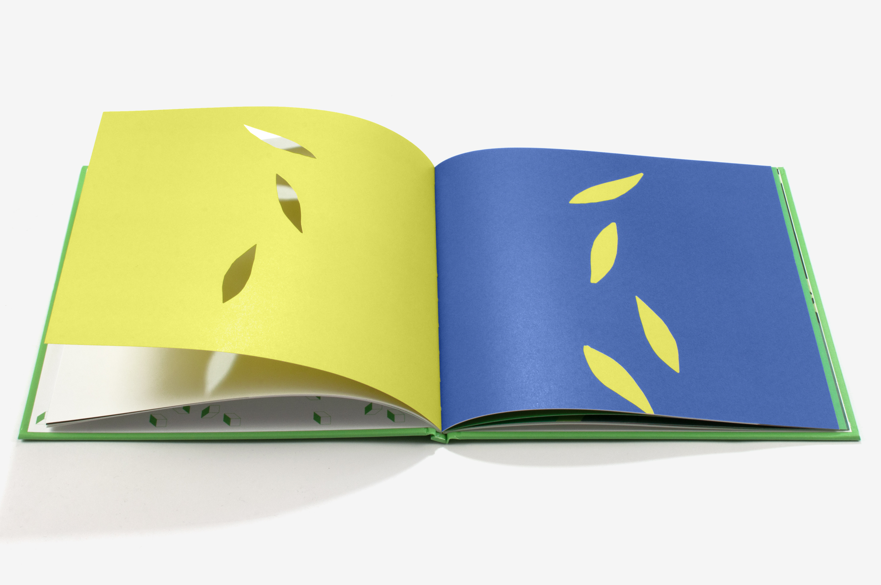
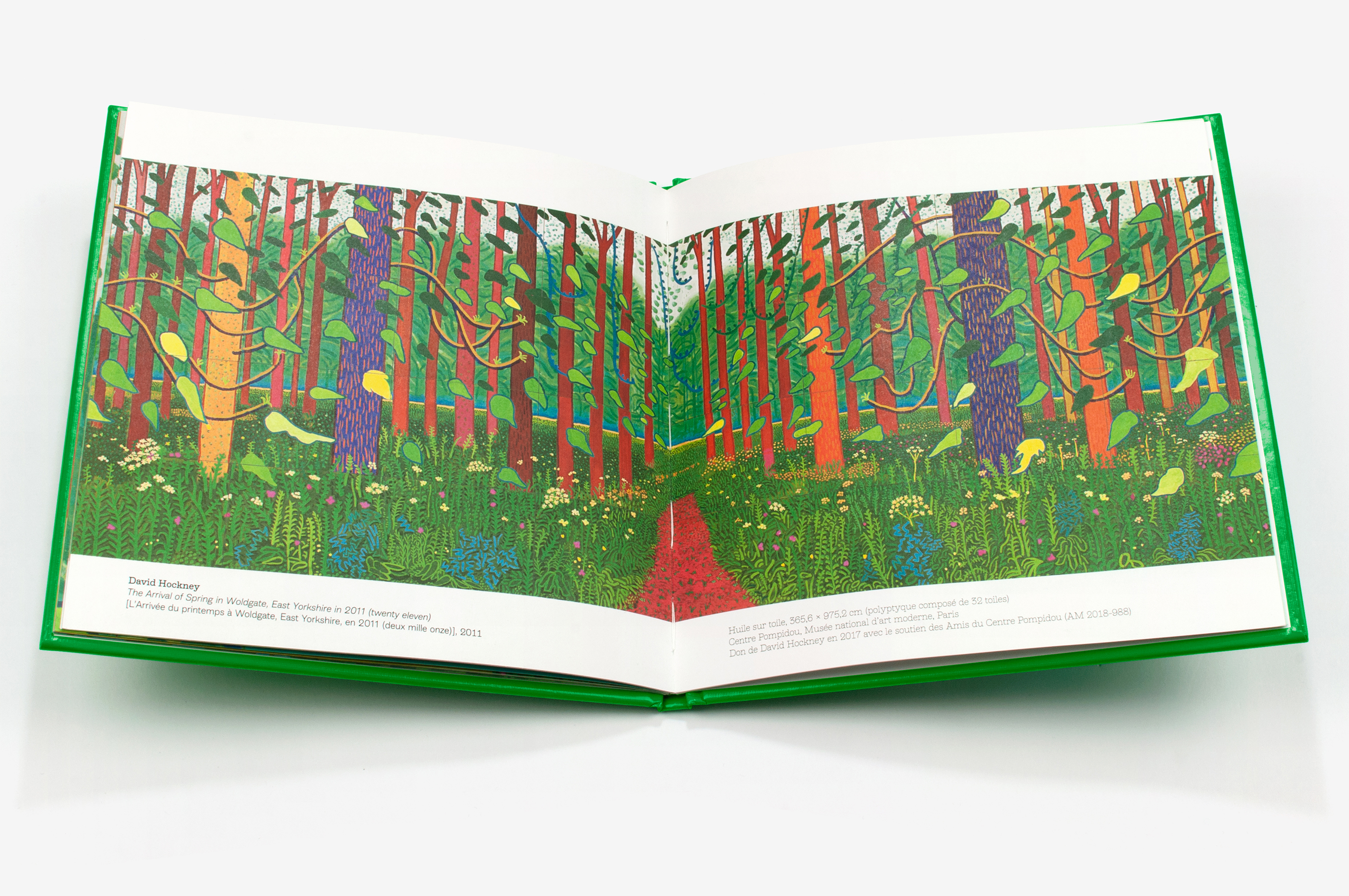
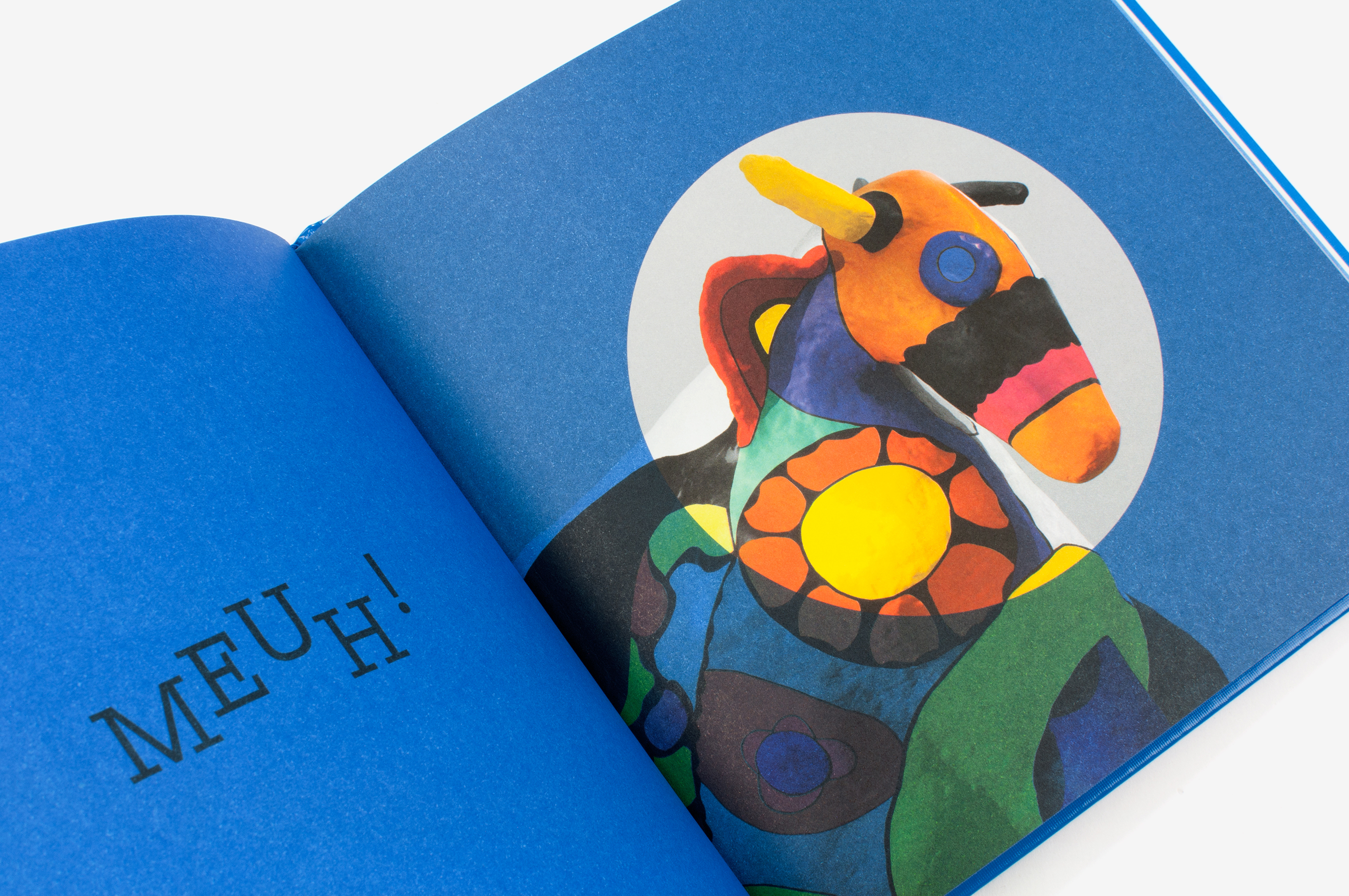
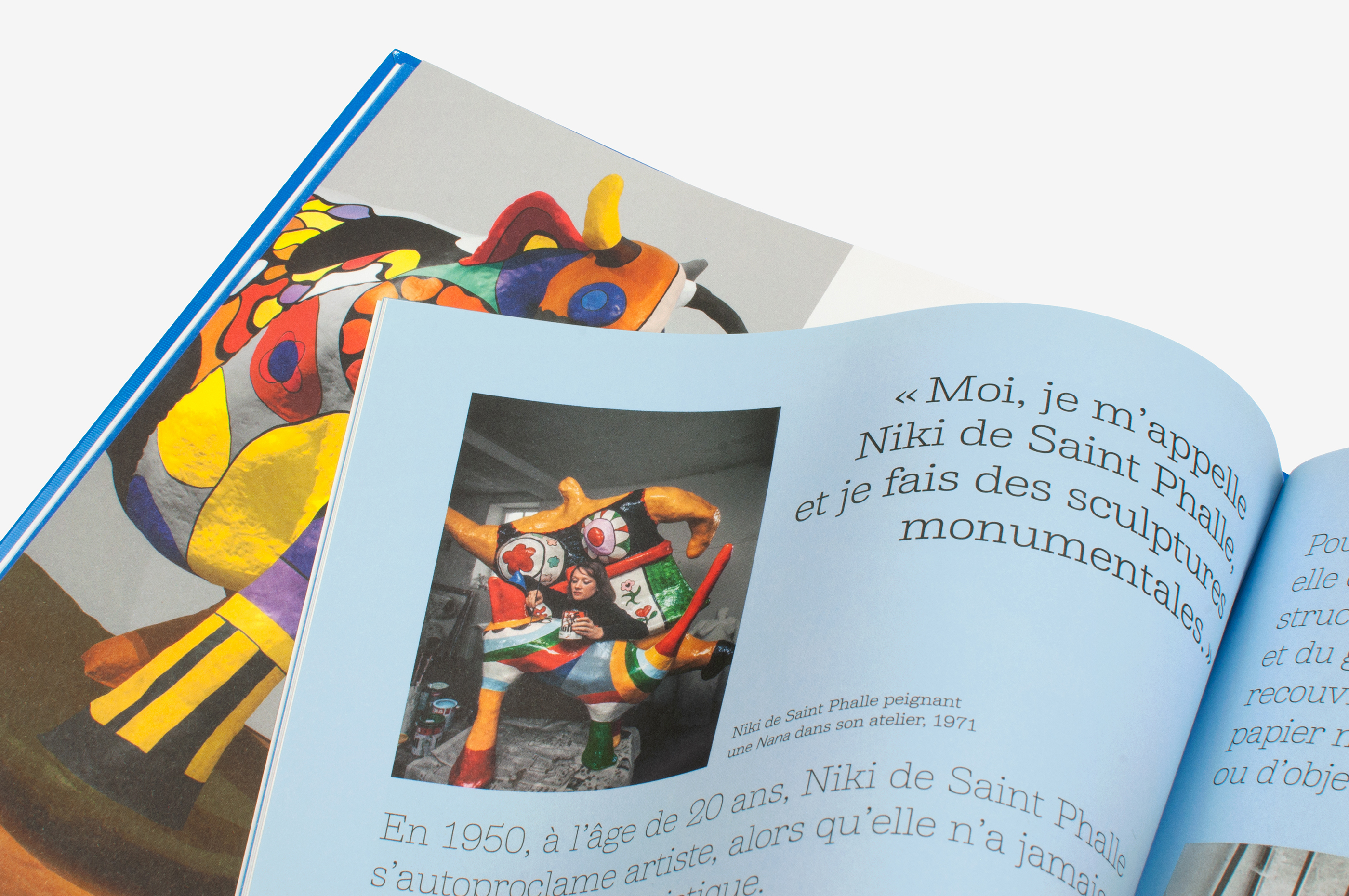
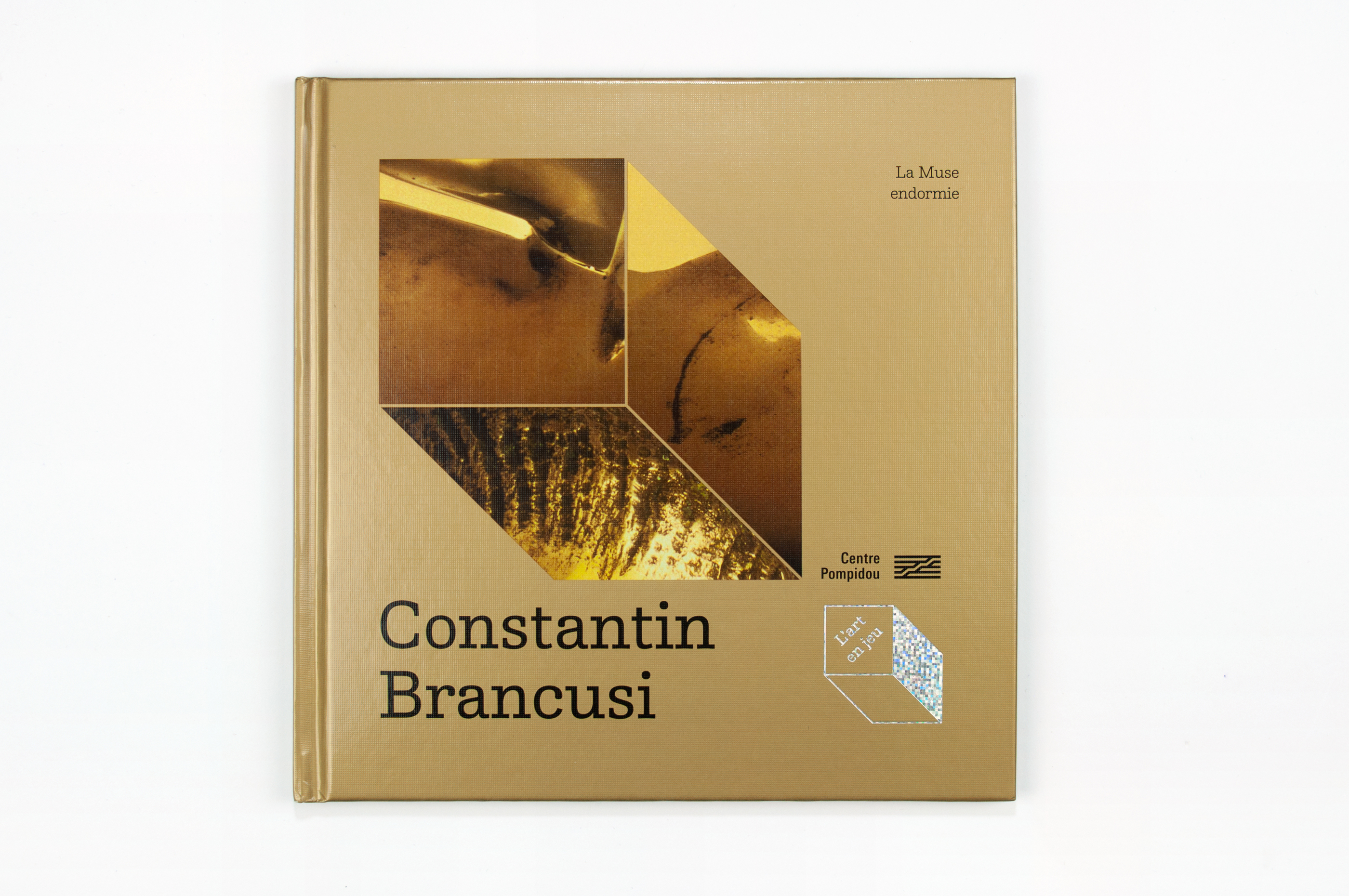
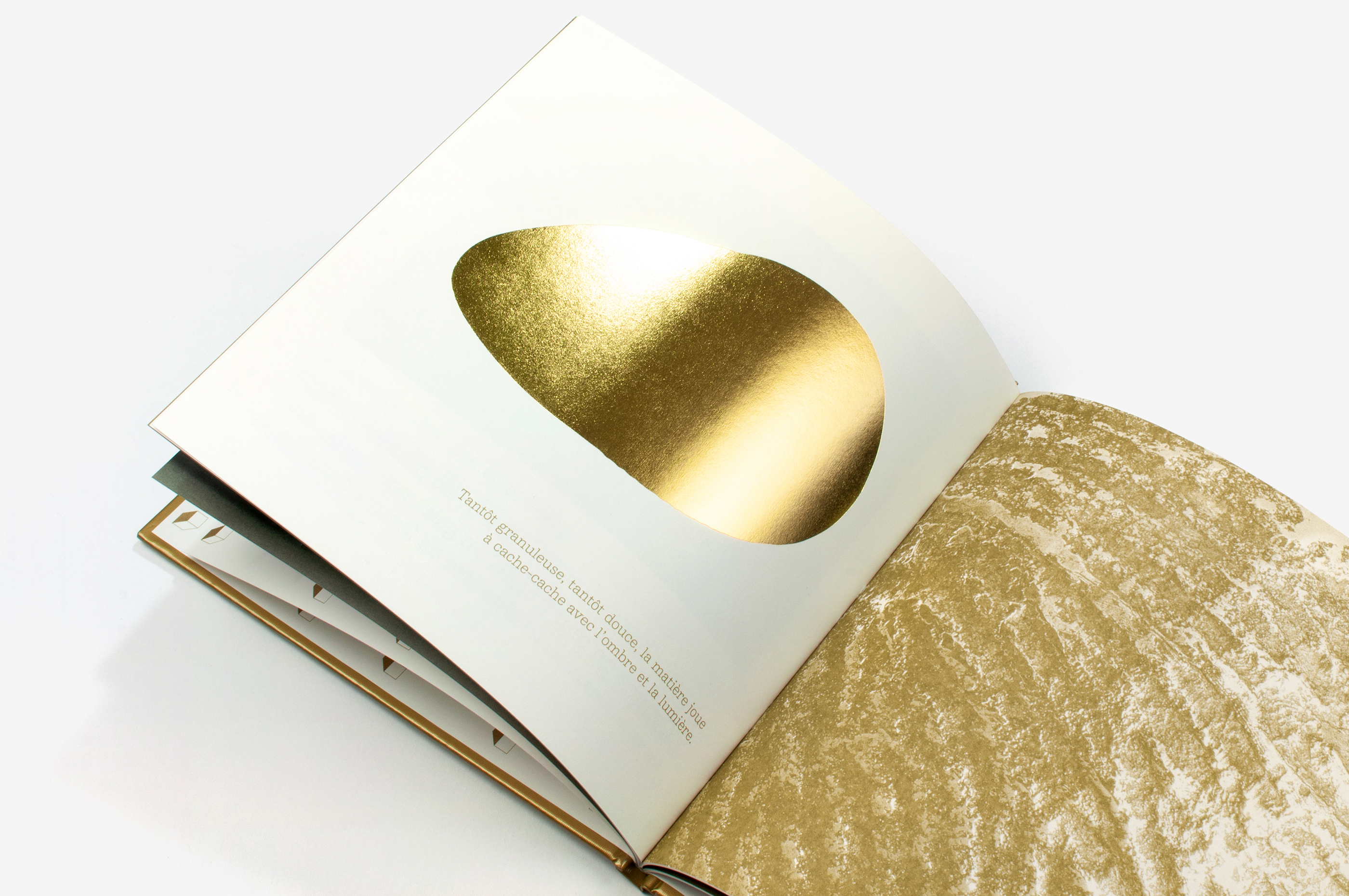
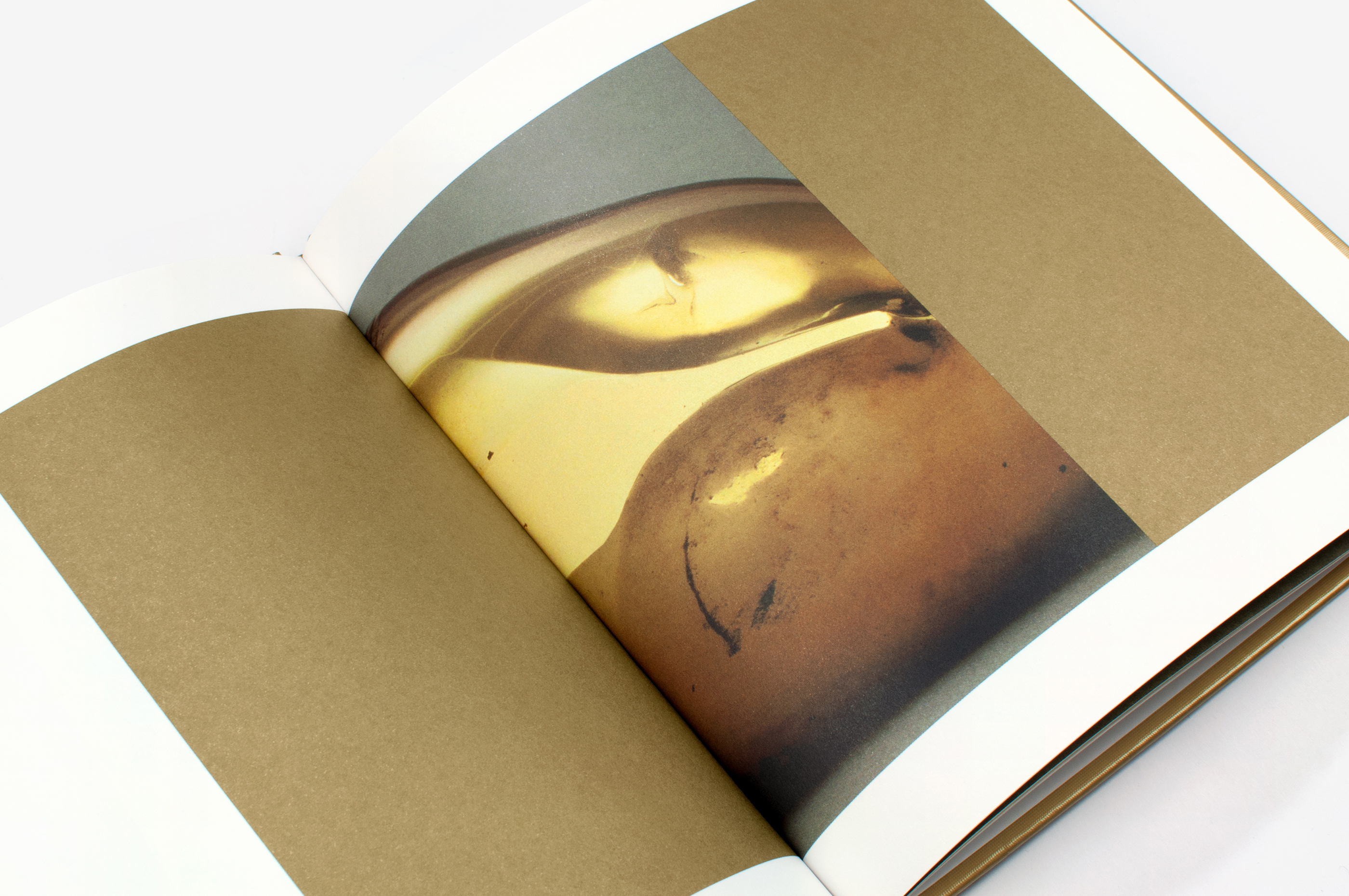
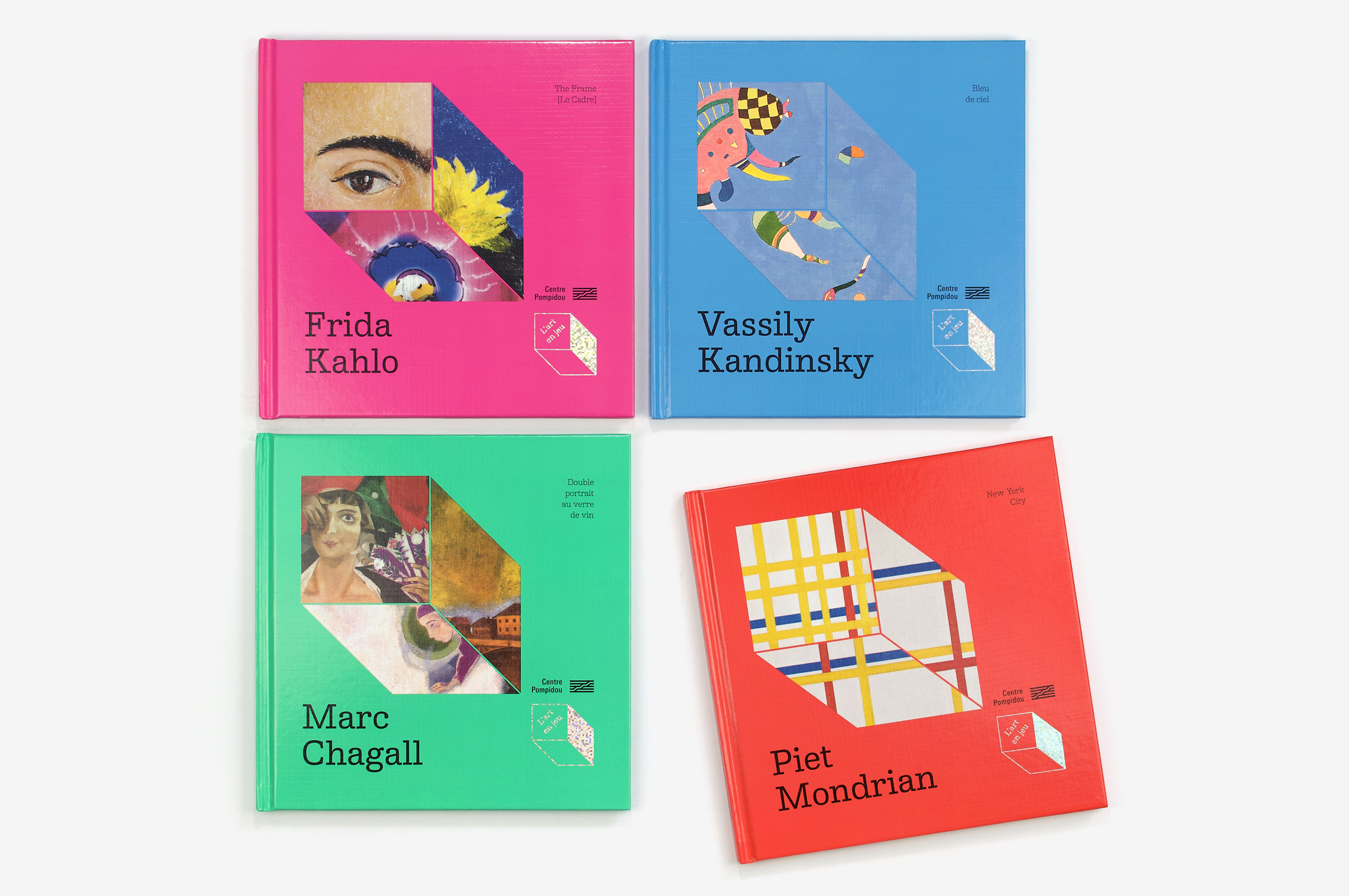
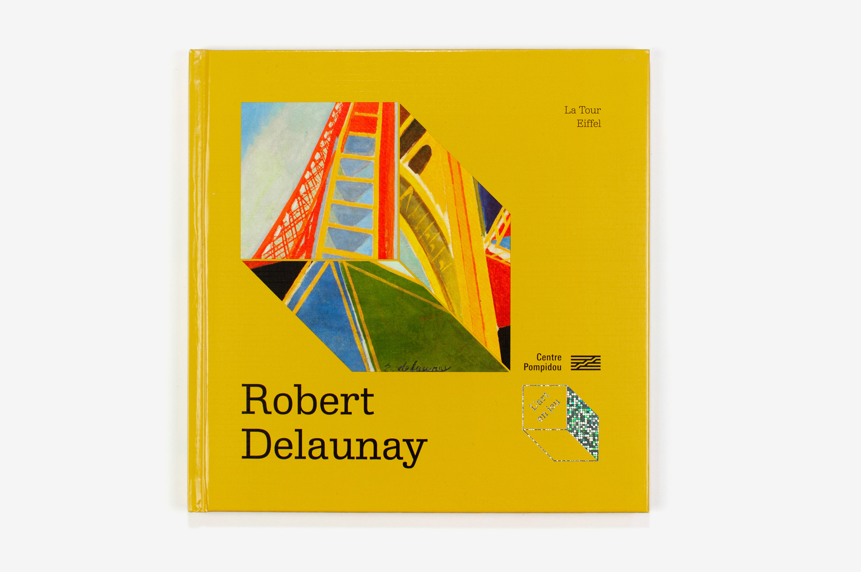
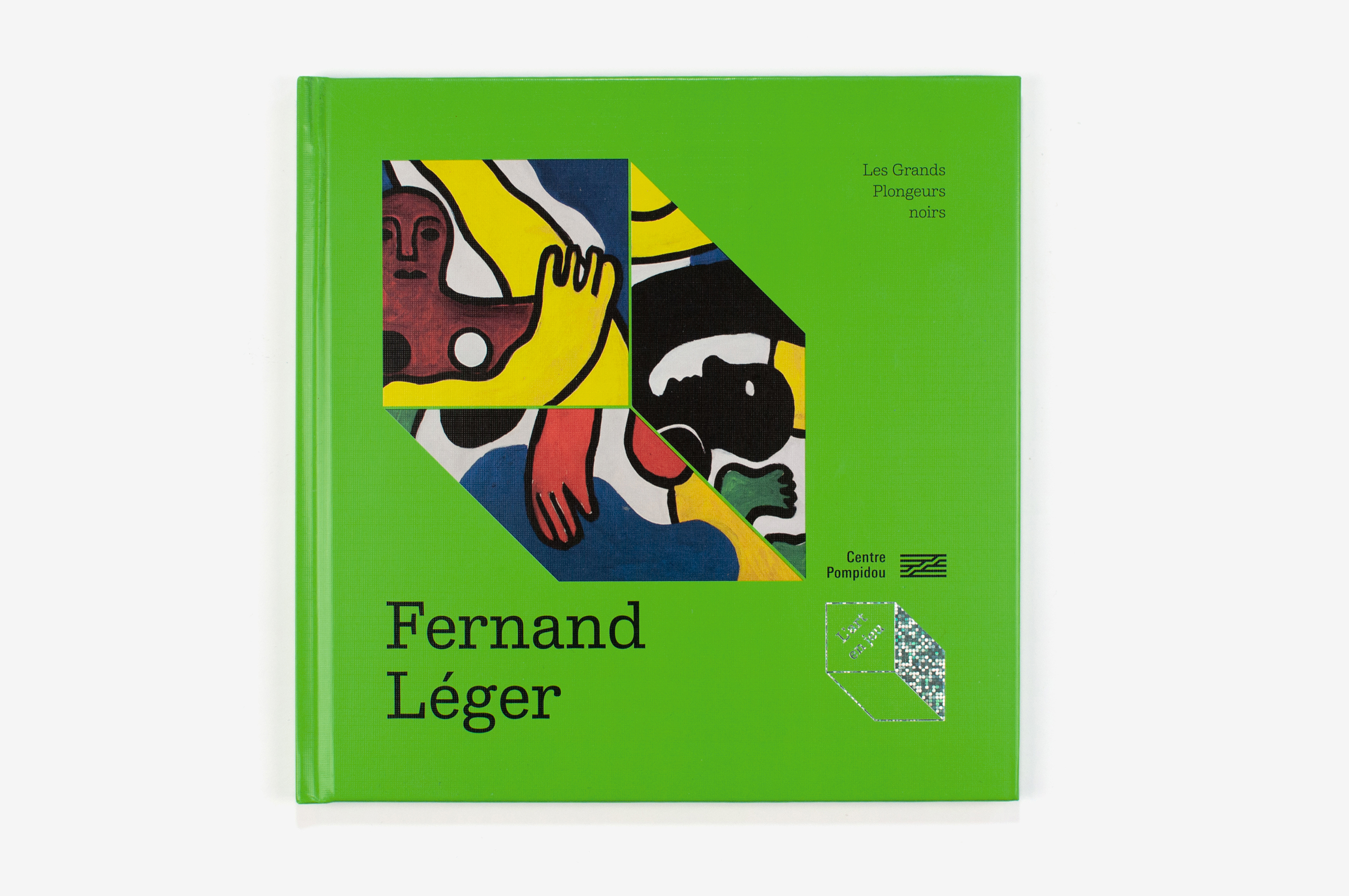
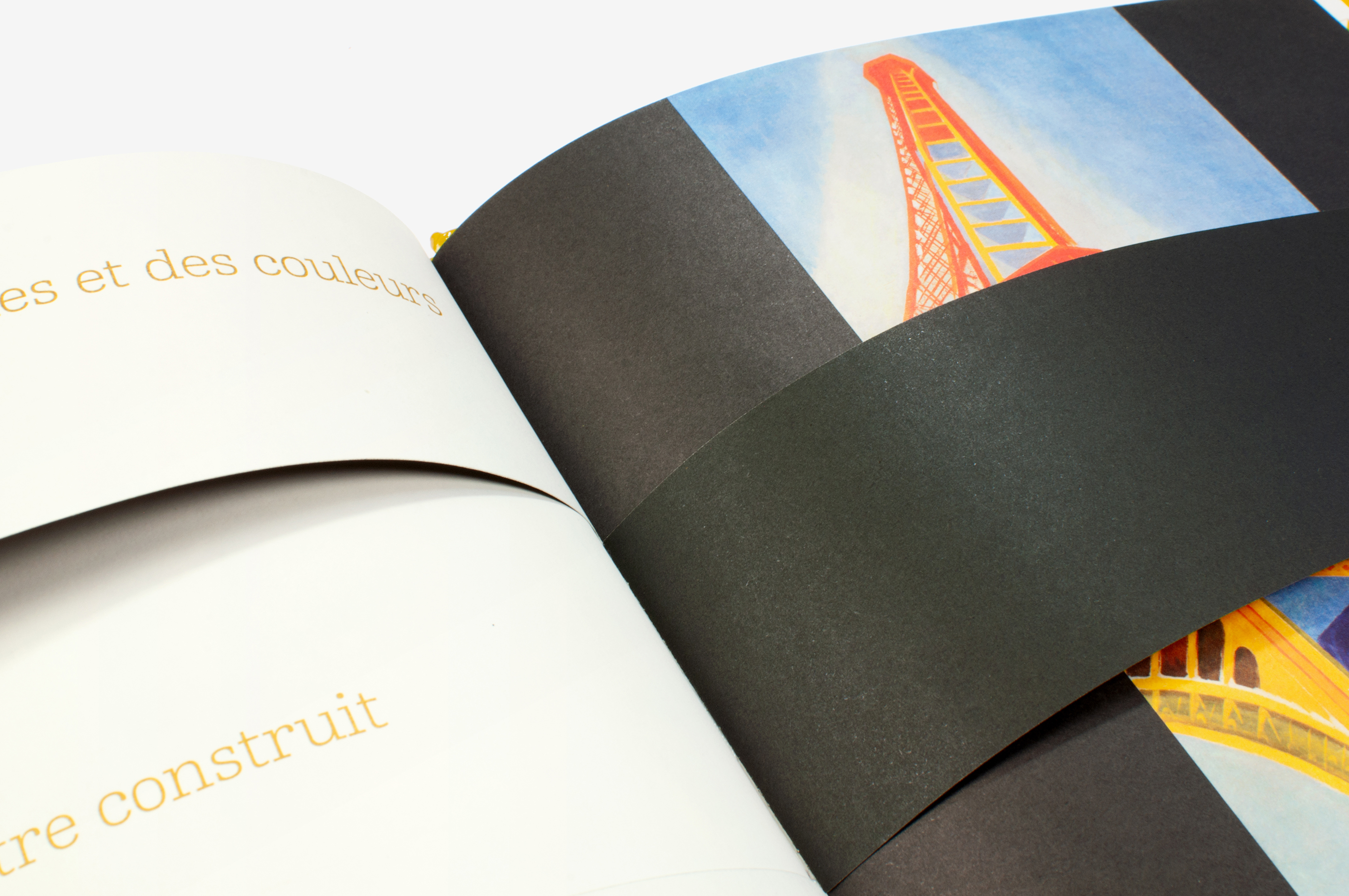
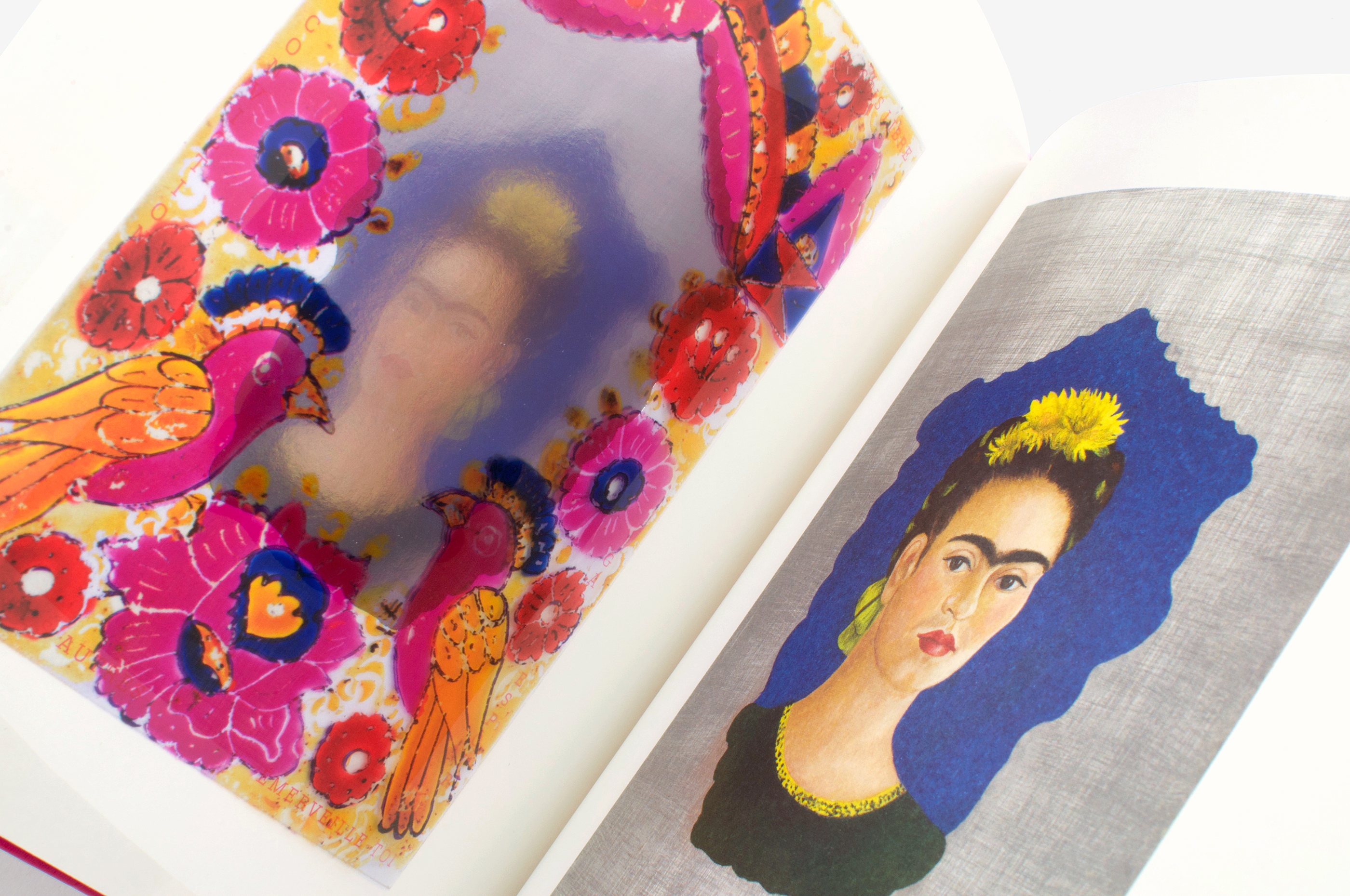
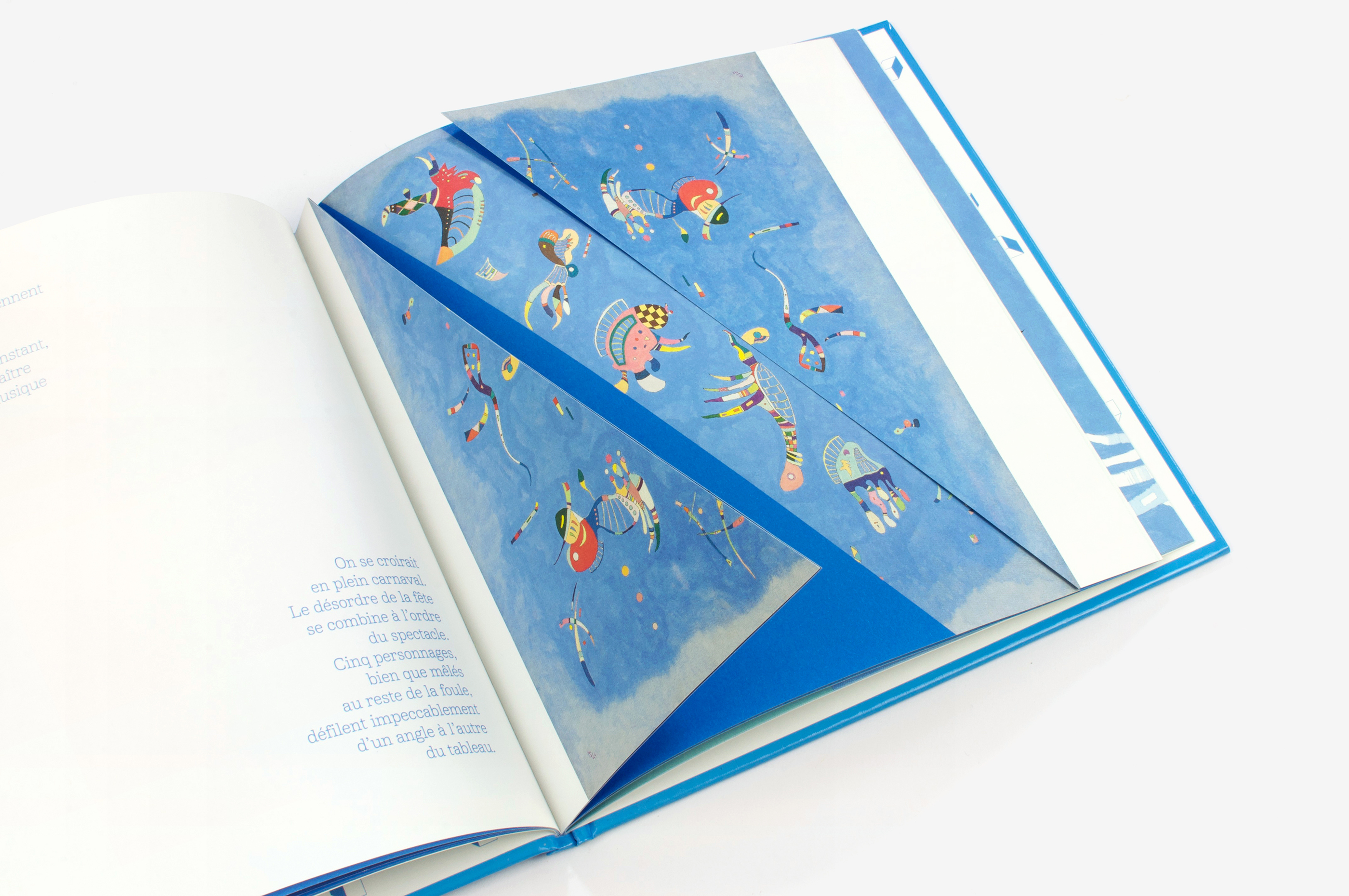
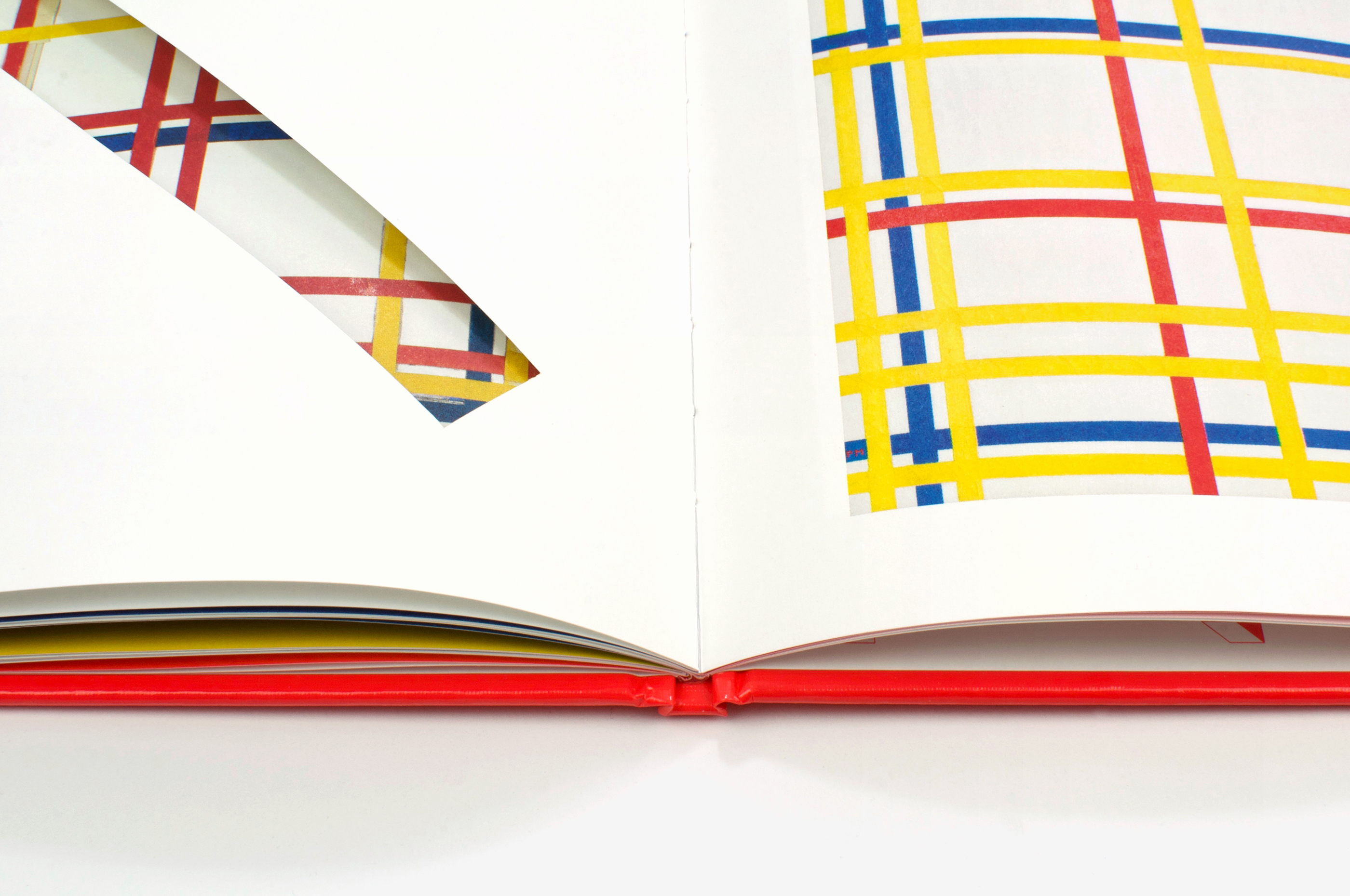
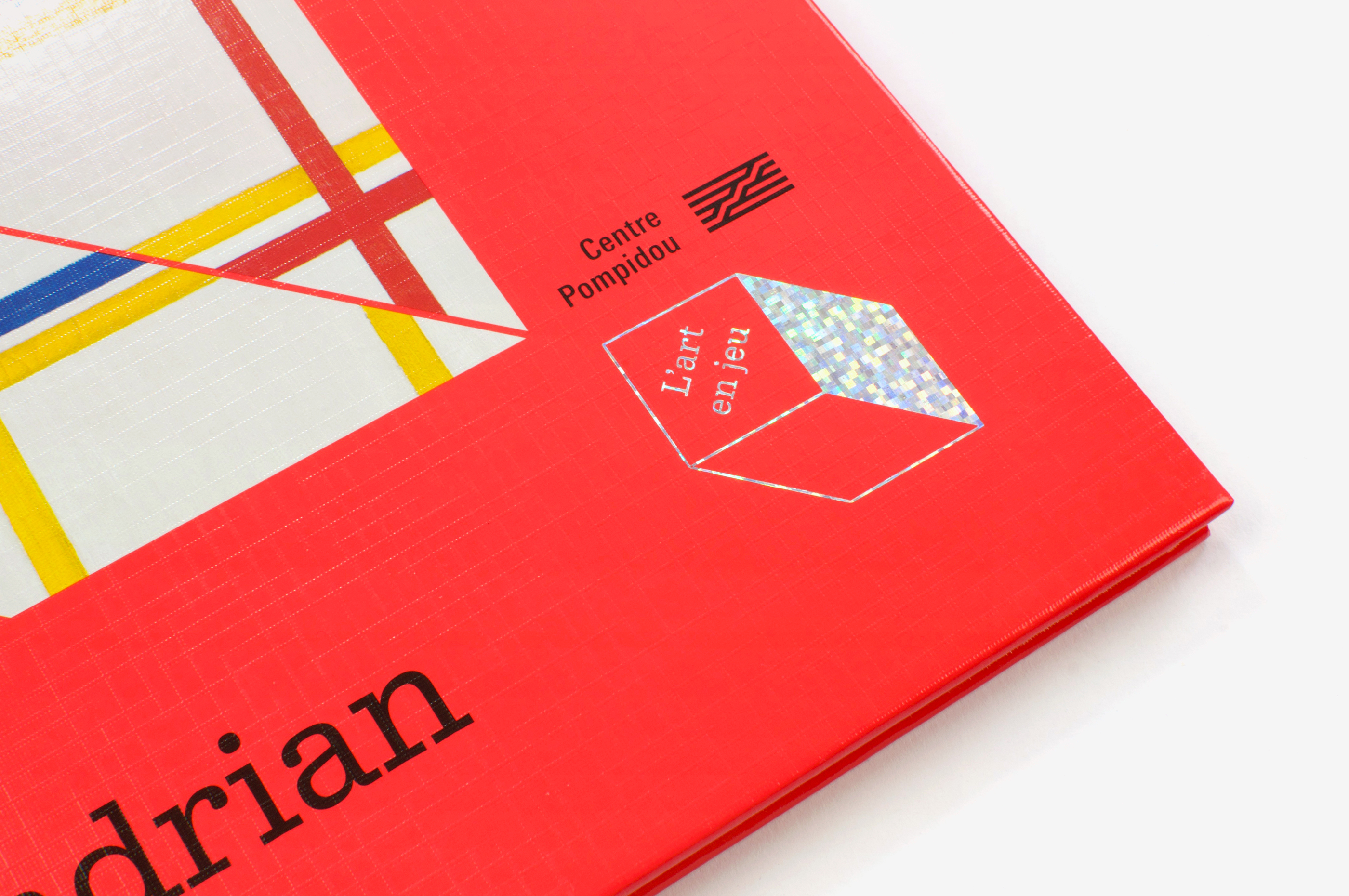
Le Centre Pompidou m’a confié la mission de remettre en selle sa fameuse collection jeunesse parue dans les années 80. Le principe éditorial est le suivant: dans chaque ouvrage, un auteur présente une œuvre de la collection du Musée, de façon ludique et singulière. Le graphisme a eu ici pour mission dépoussiérer visuellement la collection, mais aussi de traduire avec subtilité les intentions éditoriales, en évitant la surenchère de façonnage. Je me suis approprié les fondamentaux de l’identité visuelle initiale (format, présence du carré en perspective…) pour articuler le projet graphique. En regard de cette continuité, j’ai envisagé certains aspects de façon totalement nouvelle. L’usage d’un seul caractère typographique Album (dessiné par Thomas Huot-Marchand) permet ainsi d’éviter une certaine cacophonie visuelle, et la couleur est désormais utilisée comme un outil pour déployer la collection et structurer les ouvrages. Le choix d’une cinquième couleur en complément de la quadrichromie permet une immersion chromatique en résonance avec l’œuvre. Le logotype holographique en couverture fait un clin d’œil à l’esthétique mainstream des cartes à collectionner.
The Centre Pompidou entrusted me with the task of reviving its famous children’s collection published in the 1980s. The editorial principle is as follows: in each book, an author presents a work from the Museum’s collection in a playful and unique way. The task for the graphic designer was not only to update the visual appearance of the collection, but also to subtly convey the editorial intentions without making them too obvious. In developing the project, I started from the fundamentals of the initial visual identity (format, presence of the square in perspective, etc.). While bearing this continuity in mind, I approached certain aspects in a completely new way. The use of a single typeface avoids visual confusion while colour is now employed as a tool to display the collection and structure the books. The choice of a fifth colour in addition to the four-colour process allows a chromatic immersion that resonates with the work. The holographic logo on the cover is a reference to the popular hobby of card collecting.