Congrès du Cipac
Contexte: Cipac, 2013
Impression: Lézard Graphique, Nory
Description: Affiche, brochure, cartes postales, etc.
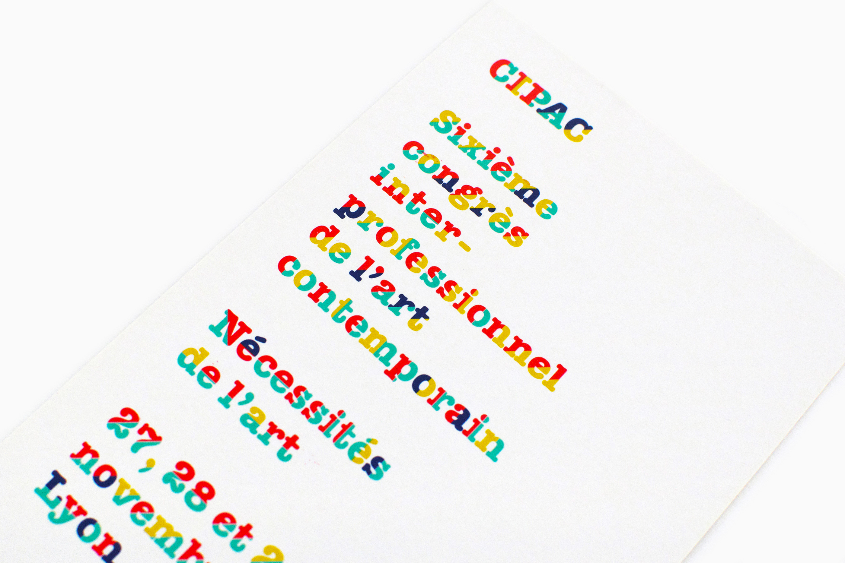
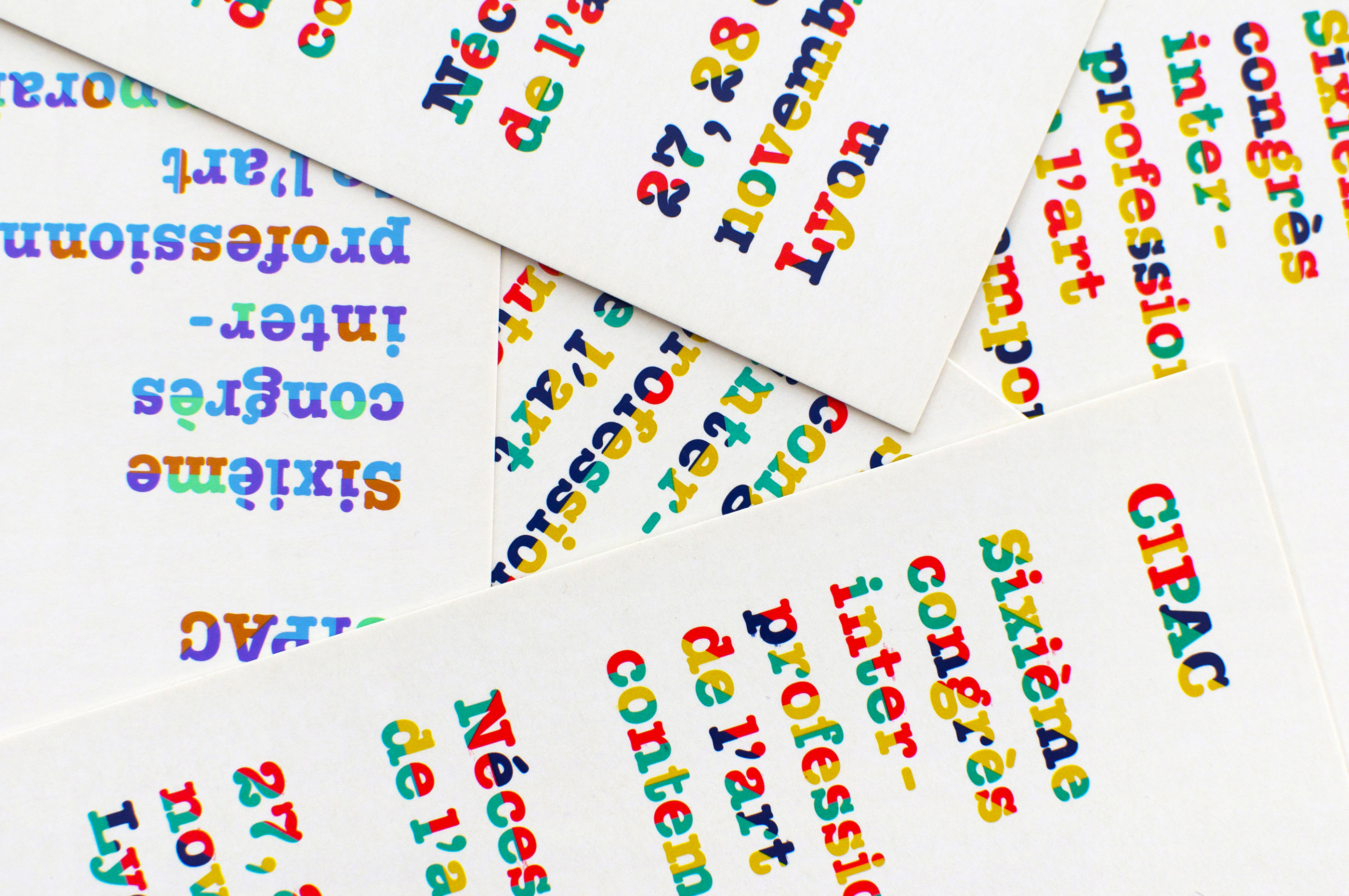
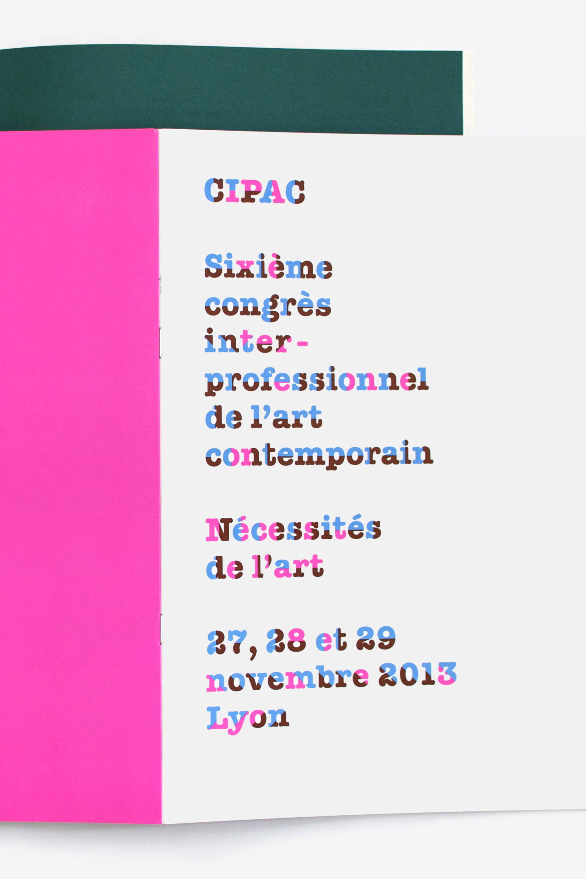
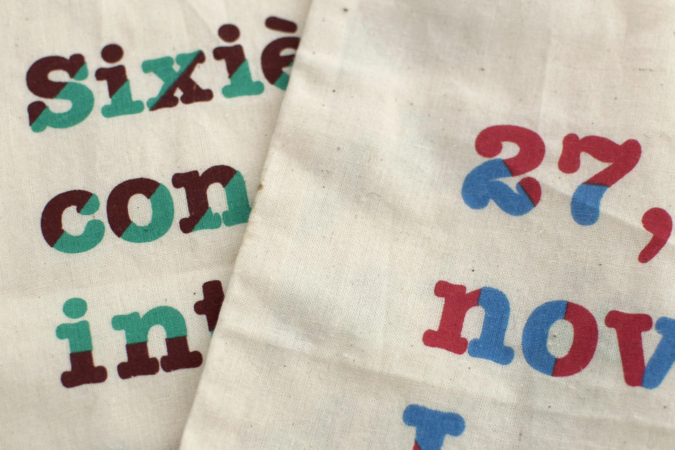
L’identité graphique du Congrès du Cipac est basée sur la typographie American Typewriter, dont le dessin de lettre familier est inspiré des machines à écrire. Chaque lettre est ici coupée (à l’horizontale, à la verticale ou en diagonale), permettant une polychromie typographique. Sur chacun des supports, les couleurs et la dynamique varient comme une ruche, faisant écho à la variété des points de vue invités à s’exprimer durant le Congrès.
The graphic identity of Cipac Congress is based on the American Typewriter typeface, whose familiar letter design is, of course, inspired by the classic writing machines. Each letter is cut (horizontally, vertically or diagonally), opening up further possibilities, such as the use of typographical polychrome. Across the different uses and media, the colors and dynamics of the lettering vary and intertwine, echoing the diversity of the viewpoints presented by those invited to speak at the Congress.