Océans
Contexte: Museum national d’Histoire naturelle, 2019
Description: 20×25 cm, 120 pages
Typographie: Le François, 205TF
Mise en page réalisée avec Béatrice Delas
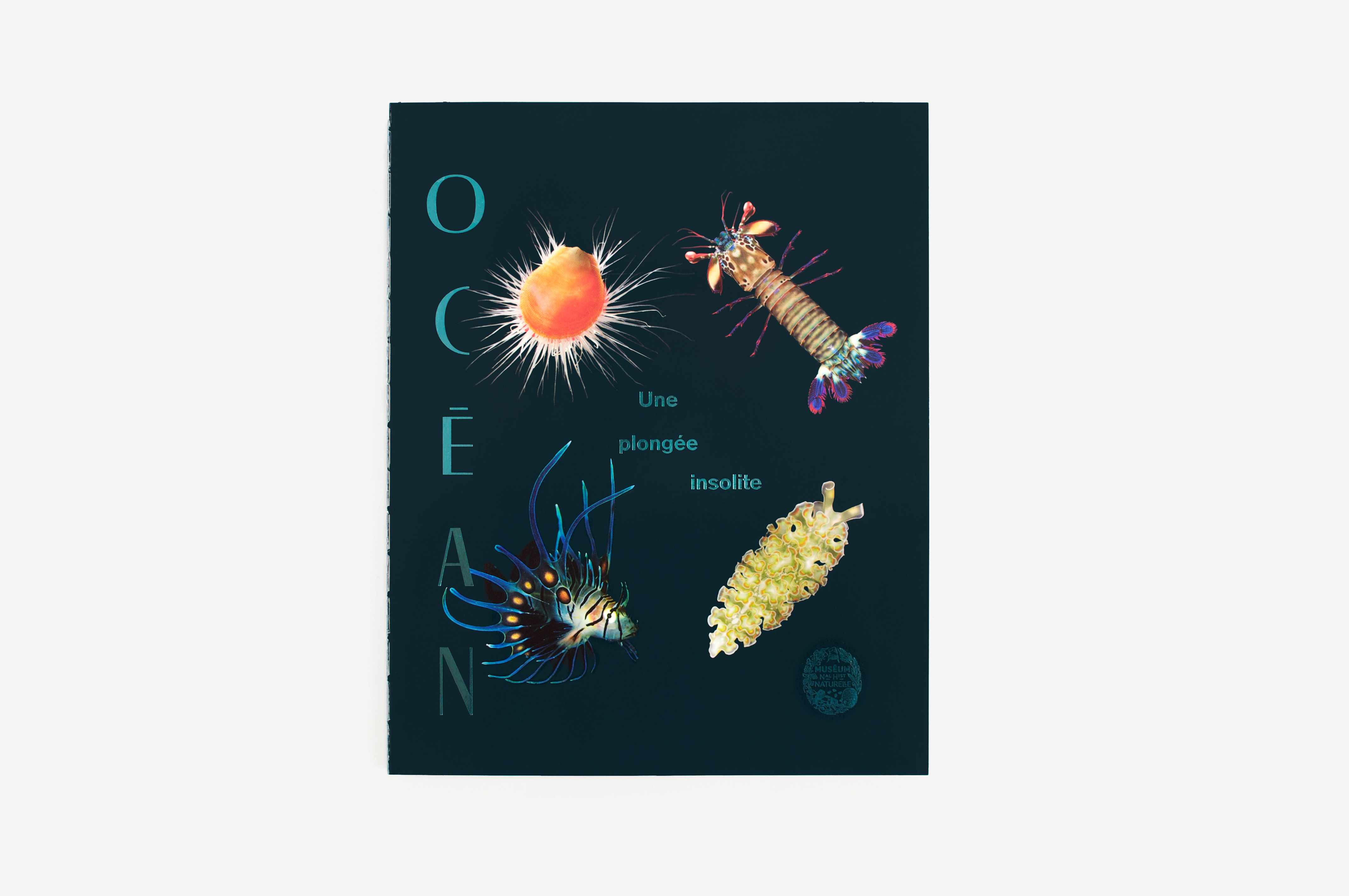
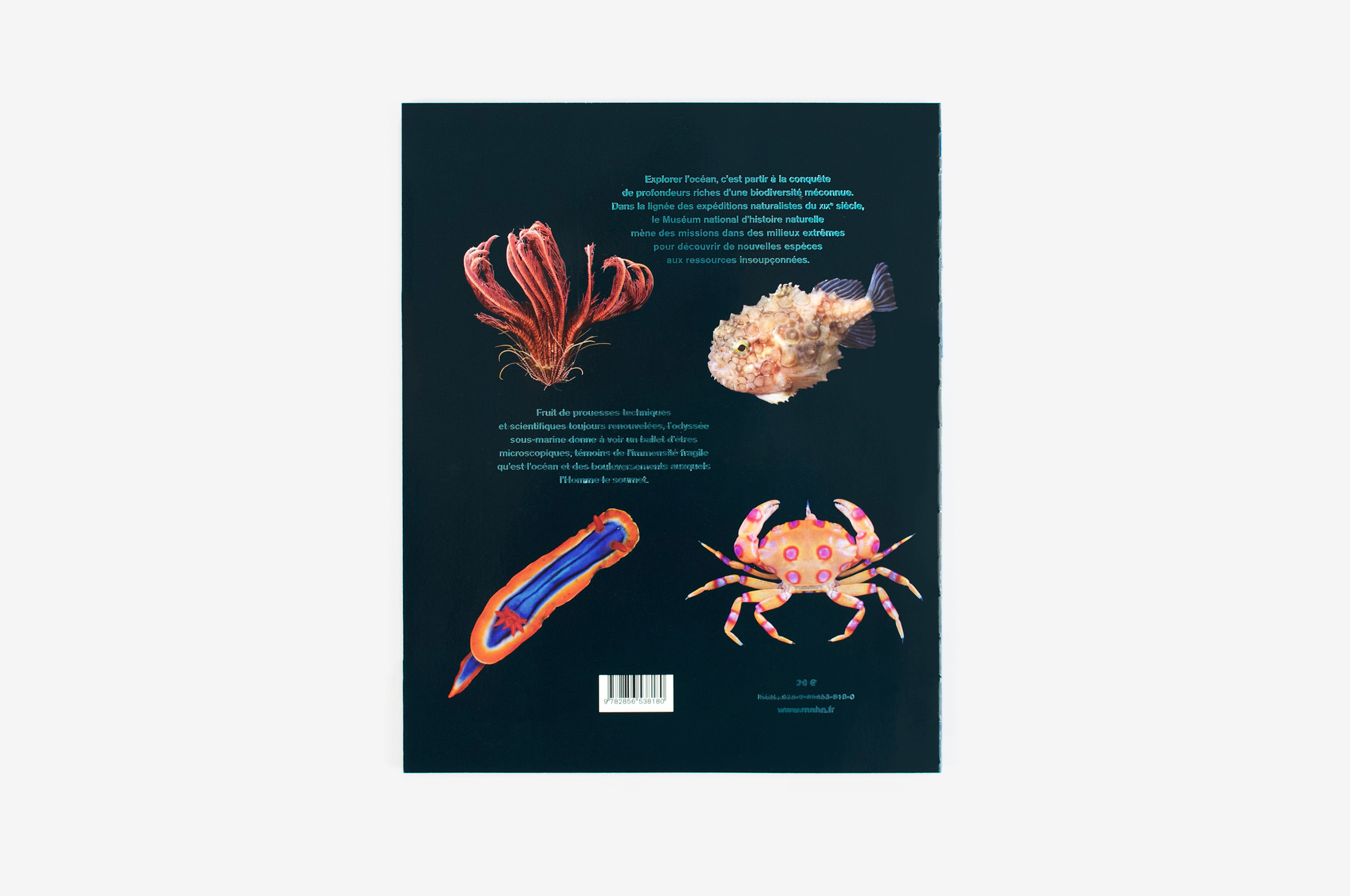
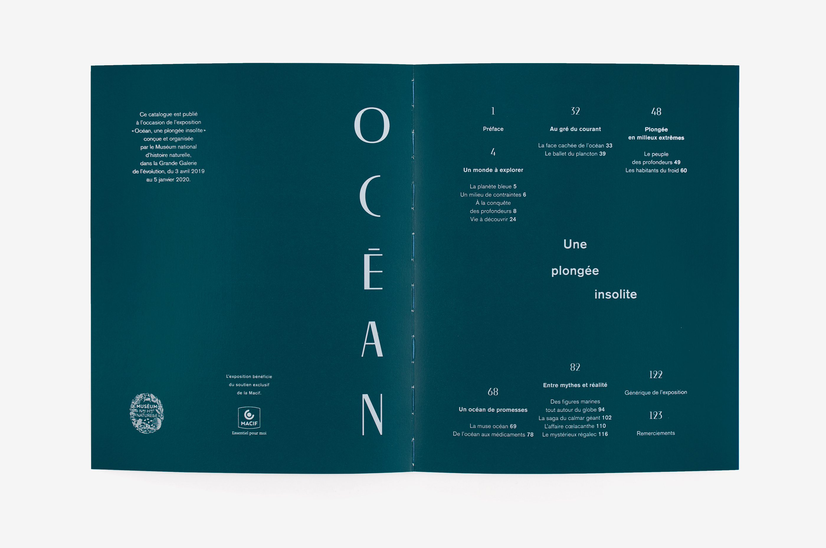
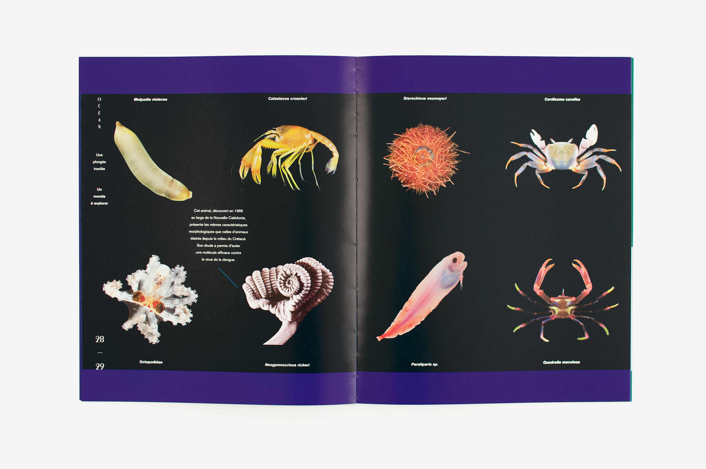
Dans ce catalogue d’exposition qui a été pensé comme un magazine, le graphisme des pages de couverture fait cohabiter textes et images de façon à la fois structurée et flottante. La reliure copte permet d’investir les gardes comme des sas d’entrée et de sortie dans le livre. Les chapitres sont organisés grâce à la couleur, et tout le contenu y est placé en négatif dans des aplats bleus variés, appuyant la dimension immersive de la thématique des océans.
In this exhibition catalogue, published as a kind of magazine, the graphic design of the cover pages brings together text and images in a way that is both structured and free. The Coptic binding allows the endpapers to be used as entry and exit points into the book. The chapters are organised through colour, and the entirety of the content is printed in negative on a variety of blue backgrounds suggestive of the depths of the ocean.