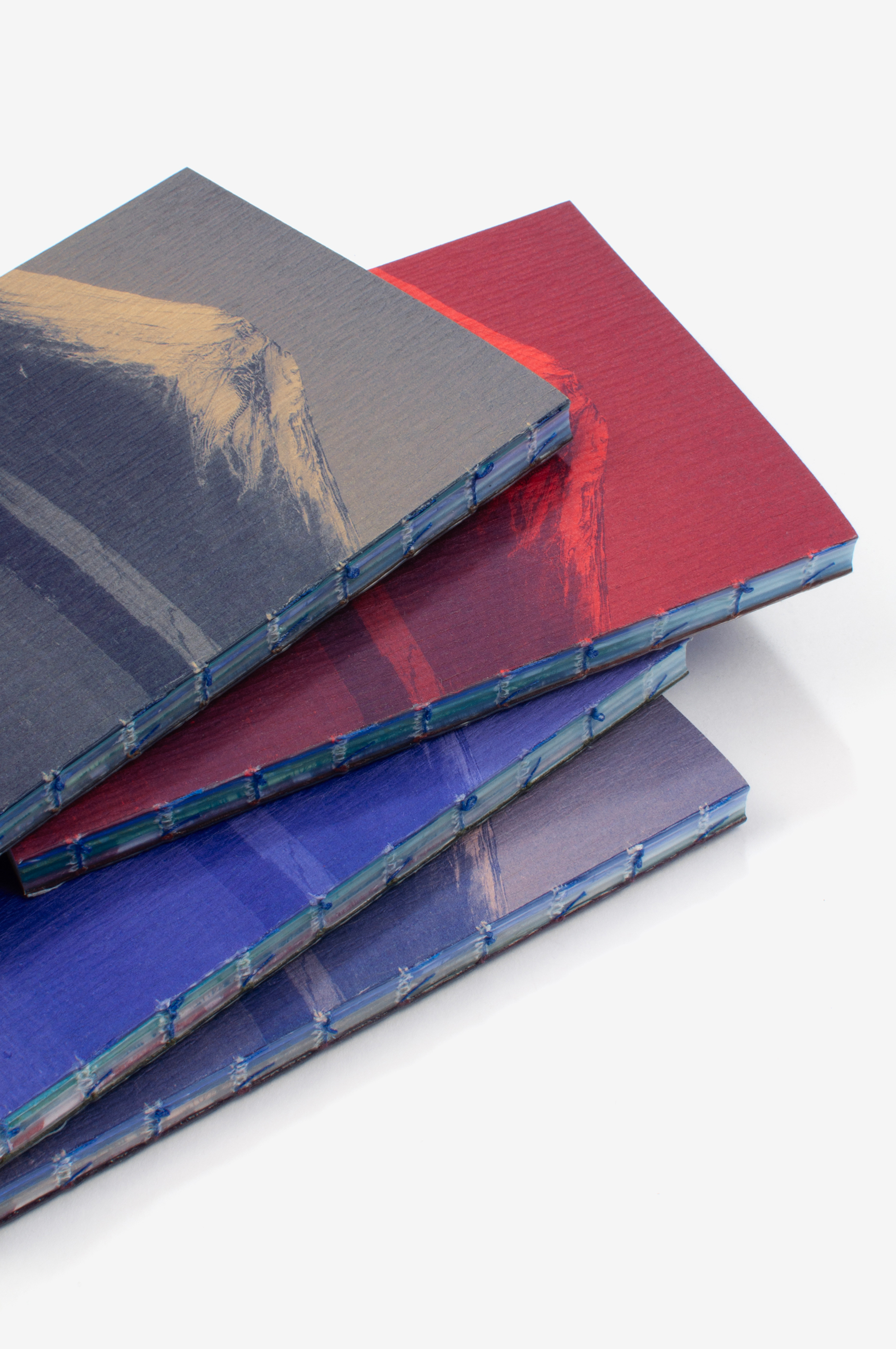
Fuji
Un livre de Fanette Mellier & Clément Vauchez
Contexte: Éditions du livre, 2026
Impression: Le Réveil de la Marne
Description: 10×16 cm, 72 pages
Fuji est un livre qui fonctionne comme une boucle. Son principe est très simple, mais nous avons mis vraiment longtemps à l’élaborer. Et malgré cette apparente simplicité, il y a beaucoup de choses à en dire.
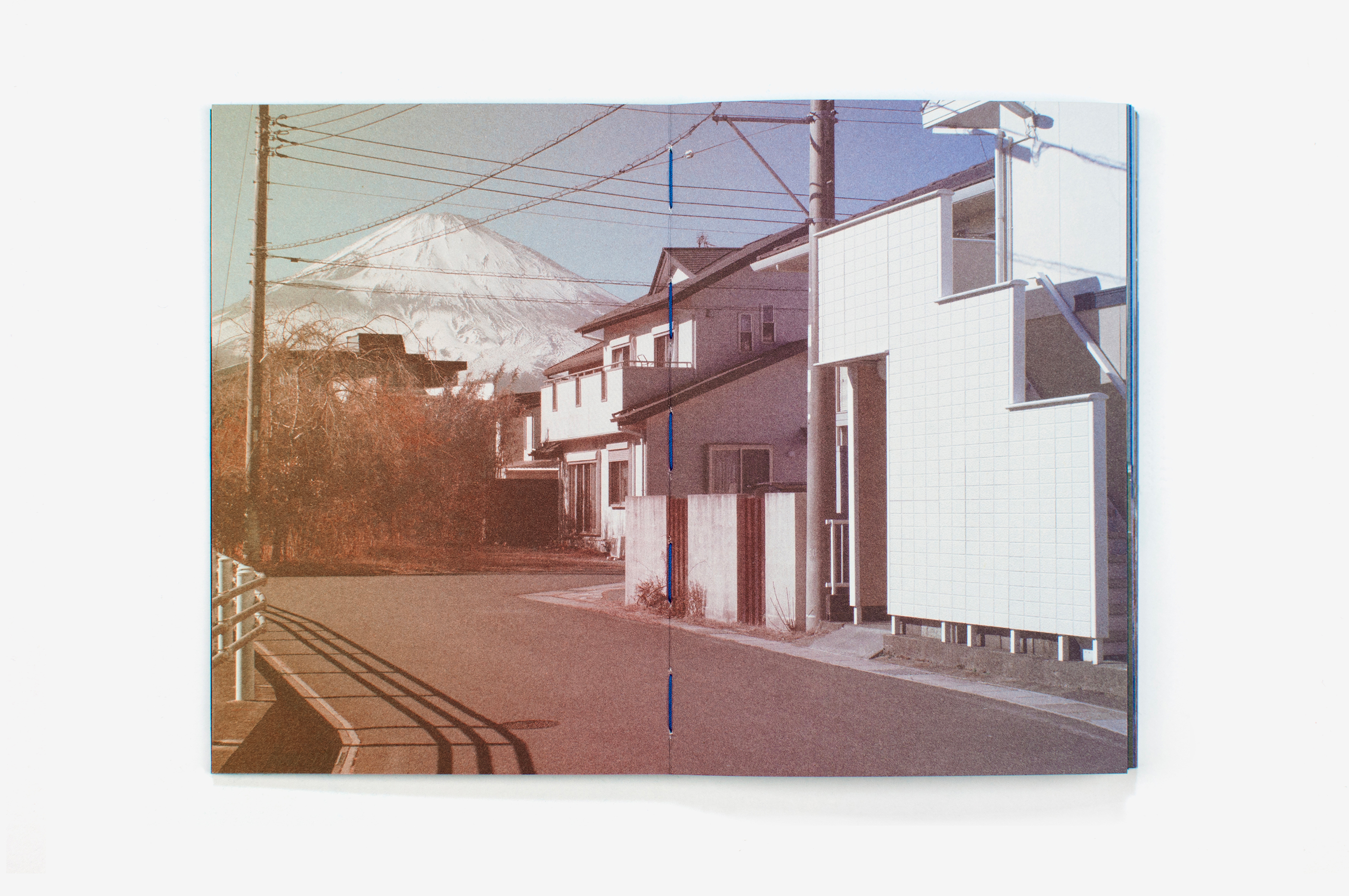
J’avais envie depuis longtemps de faire un livre sur le Japon, un pays que nous avons visité à plusieurs reprises avec mon époux, Clément Vauchez, et qui nous fascine. Lors d’un séjour à Tokyo, en réfléchissant à un sujet éditorial, le mont Fuji s’est imposé soudainement, comme il surgit parfois dans le paysage japonais. Sa dimension iconique n’atténue en rien la fascination que procure sa présence réelle dans le paysage. Le fait de pouvoir tourner autour de lui, et de le voir à la fois toujours identique et différent selon les points de vue, m’a semblé intéressant éditorialement. Il pouvait ainsi constituer le point de repère autour duquel construire le livre.
Je me suis également appuyée sur l’œuvre iconique de Hokusai, Les Trente-Six Vues du mont Fuji, dont la puissance visuelle a profondément nourri ma perception du paysage japonais. La façon révolutionnaire dont Hokusai a abordé le paysage, entre permanence d’un motif et variations de ses représentations, ainsi que la présence du pigment bleu de Prusse dans ses gravures, ont été des sources d’inspiration pour ce projet.
Au départ, j’ai imaginé représenter le mont Fuji par le dessin, dans la continuité de mes autres ouvrages aux Éditions du Livre. Mais la simplicité de sa forme se conjuguait de façon trop évidente avec le minimalisme de mon dessin: cela ne convenait pas pour retranscrire les vibrations subtiles du réel. Au fil des mois, il m’est apparu évident que les paysages du livre devaient être capturés par la photographie, ce qui permettrait également que le livre découle de la réalité d’un voyage autour du mont Fuji.
J’ai proposé à Clément de m’accompagner dans ce projet et d’envisager le livre à quatre mains. Il est avant tout graphiste, mais il a une pratique photographique exigeante, qu’il n’avait jamais vraiment déployée sous la forme d’une édition. Cela m’a semblé une belle occasion de partager une expérience humaine et éditoriale inédite. En prenant à bras-le-corps la dimension photographique du projet, Clément s’est engagé lui aussi dans cette aventure et a guidé notre tour du mont Fuji.
J’avais déterminé en amont le chemin de fer et la façon dont le Fuji devait apparaître dans le livre. J’avais également fixé les caractéristiques de l’ouvrage en cohérence avec les contraintes techniques, qui ont nourri ma démarche de création. Ainsi, le petit format de 11×16 cm correspond à une imposition de 32 pages intérieures sur une même feuille d’impression. Le fait d’imprimer l’ensemble des pages dans un même mouvement me semblait très important.
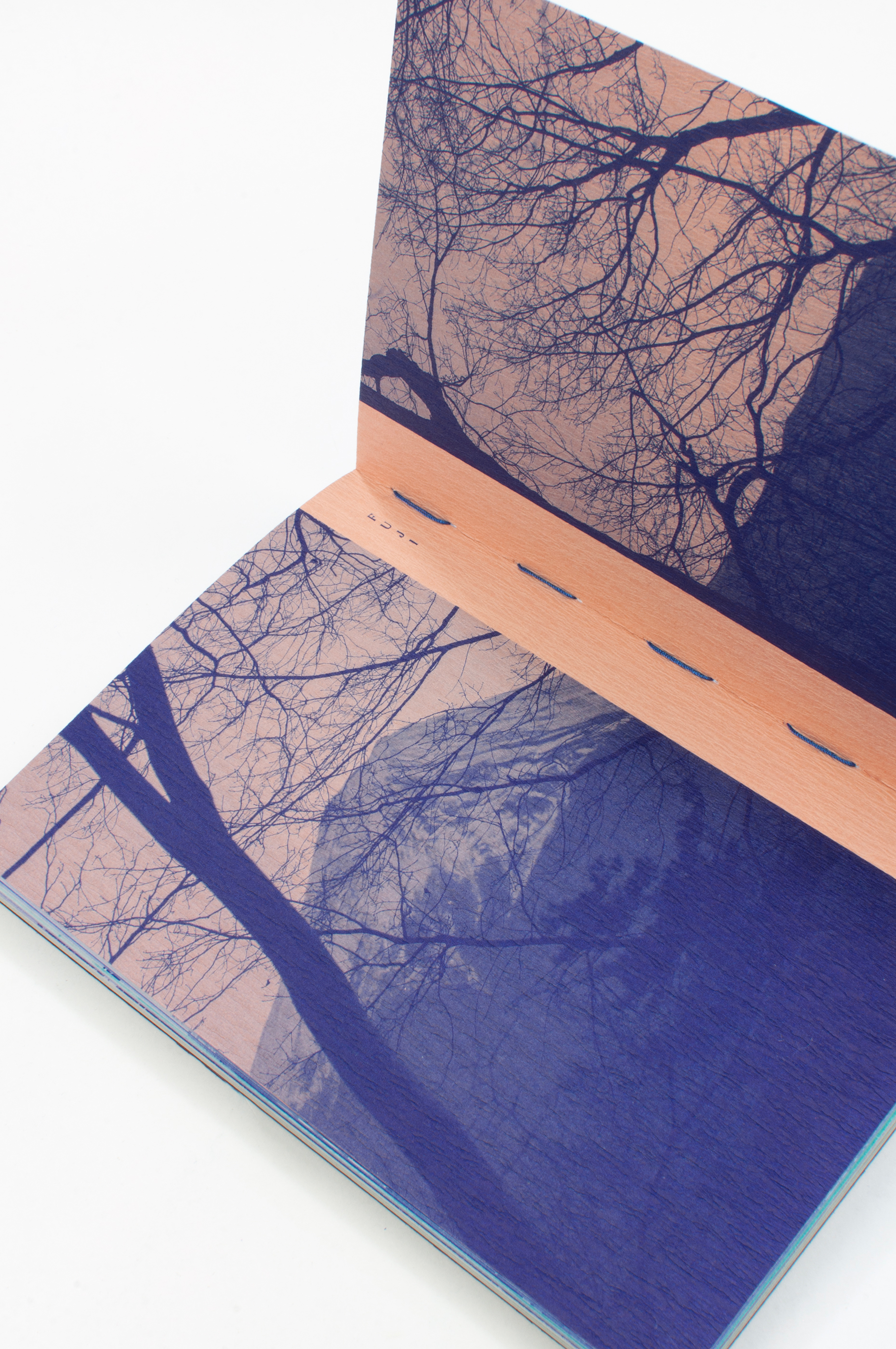
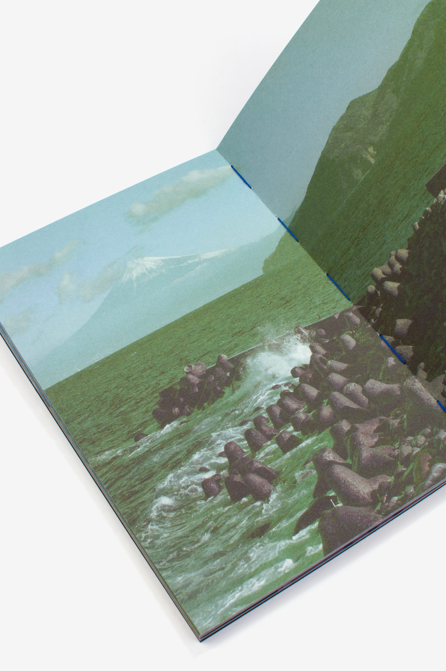
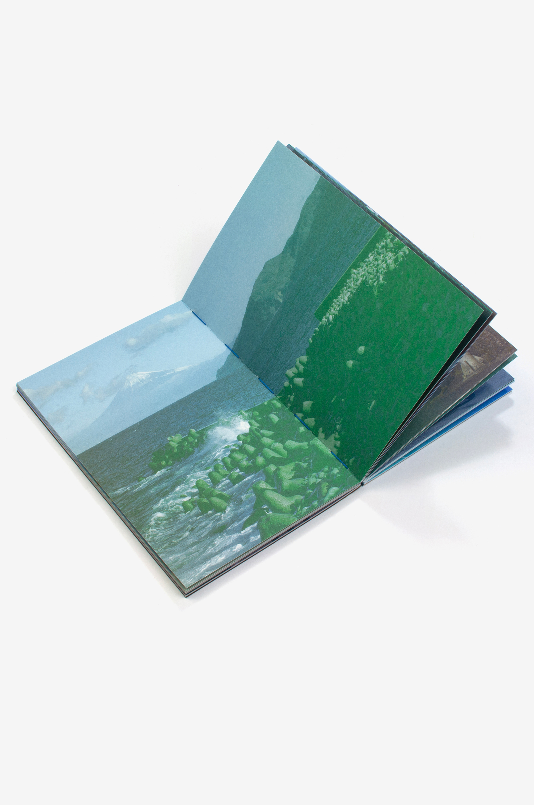
Par ailleurs, le nombre de pages intérieures, associé aux deux cahiers de quatre pages qui forment le début et la fin de l’ouvrage, permet de déployer 36 paysages, en cohérence avec Hokusai. Ces deux cahiers encadrent l’ensemble des cahiers intérieurs dans une reliure copte, avec son fil apparent.
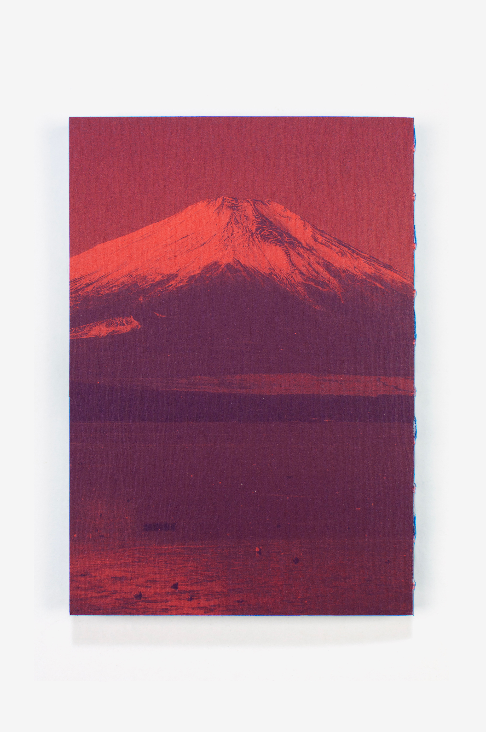
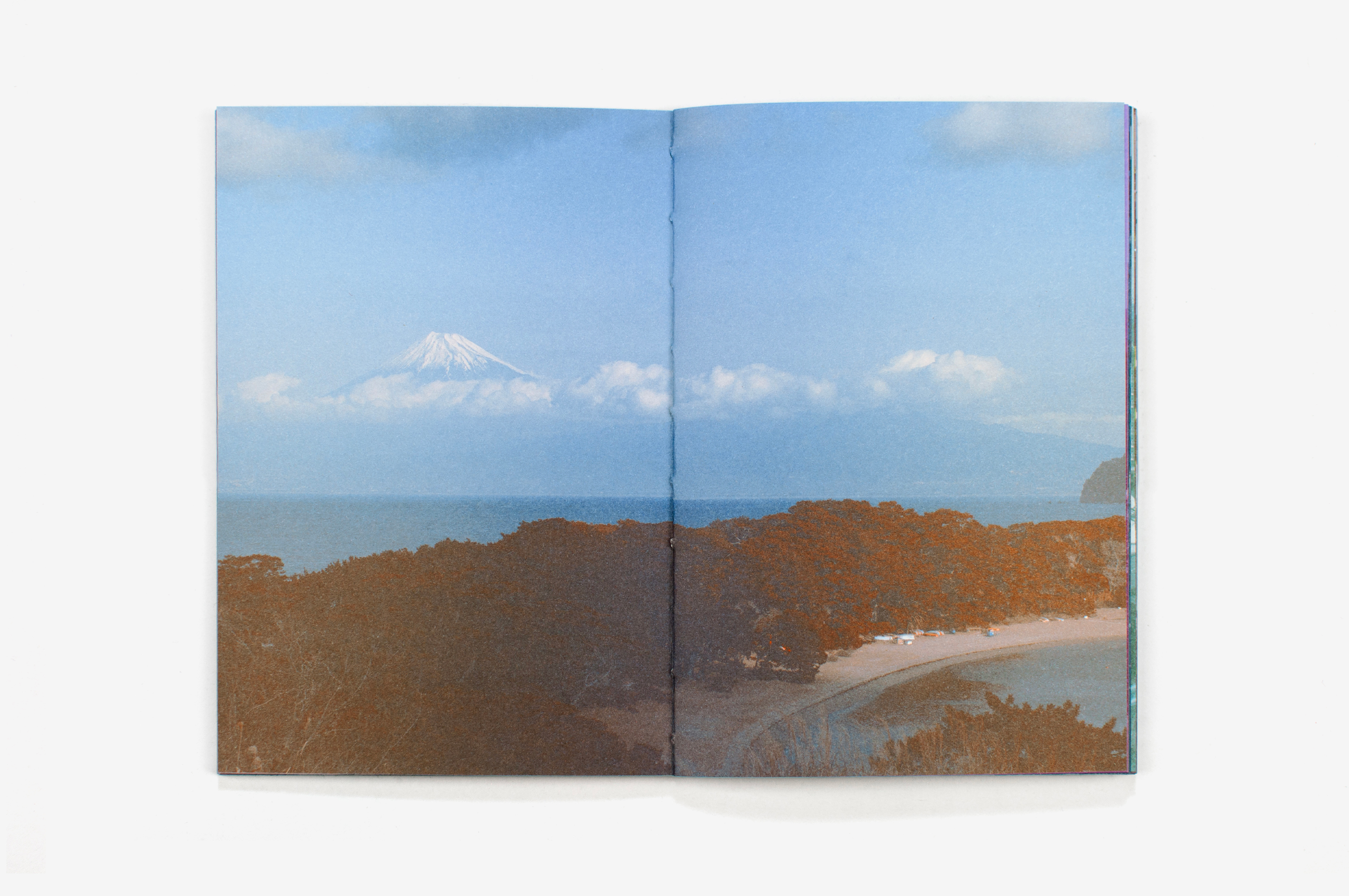
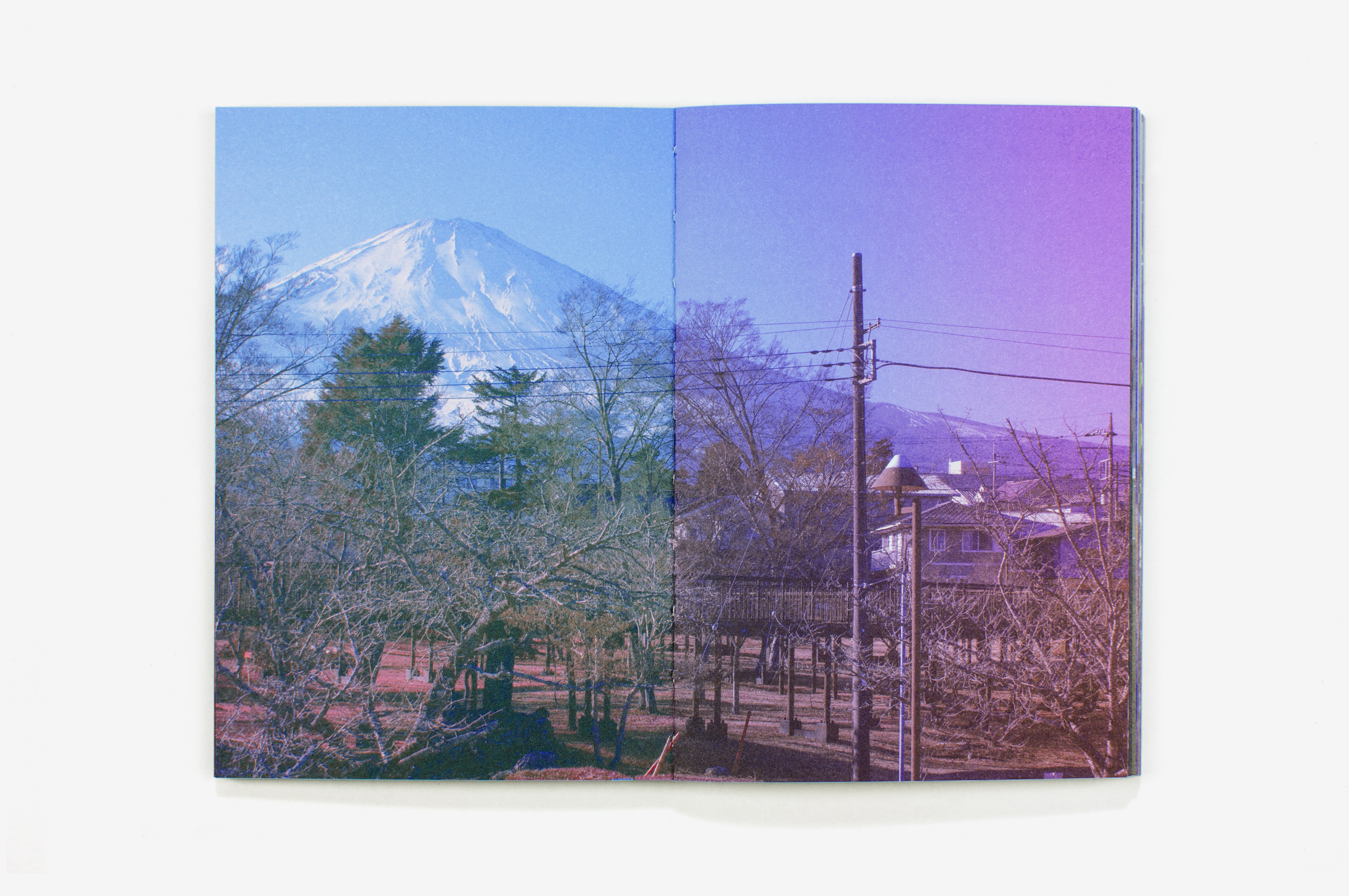
Je souhaitais que le livre commence par la fin: la quatrième de couverture occidentale devenant la couverture au Japon. Le mont Fuji devait alors être visible sur la «belle page» japonaise, celle de gauche. Le cadrage des photographies devait intégrer cette contrainte particulière, en décentrant le mont Fuji dans les prises de vue.
Le fait d’aller à rebours de nos conventions éditoriales occidentales résonnait de façon concrète avec notre périple et la conduite à gauche au Japon. Les réflexes sont bousculés: dans les habitudes de conduite comme dans le livre, les repères sont inversés. L’ordre des photographies correspond à la temporalité des prises de vue, le tour ayant été réalisé dans le sens inverse des aiguilles d’une montre.
Le cadre était bien défini pour le projet photographique, mais il était important que la dimension évanescente du Fuji transparaisse dans les paysages. Il apparaît puis disparaît d’un instant à l’autre, à la faveur de la lumière et du mouvement des nuages. C’est ainsi que notre périple a consisté à tenter de le capturer comme un papillon. La variété des contextes produit un effet kaléidoscopique.
Nous avons également souhaité que le livre interroge les conventions techniques de reproduction des images photographiques en quadrichromie. La photogravure a été travaillée par Clément de façon minutieuse, dans une logique de séparation des couches préfigurant l’impression.
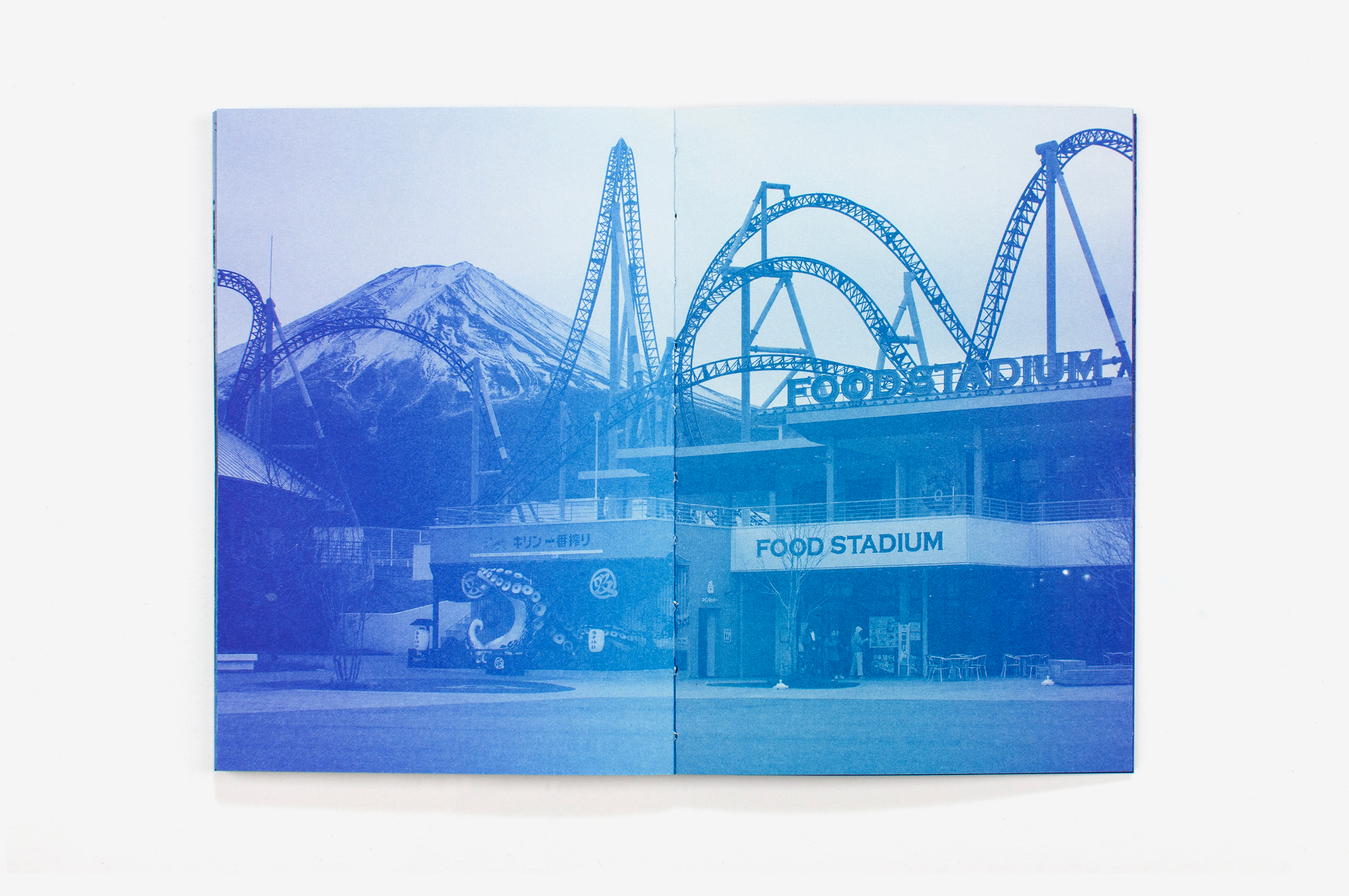
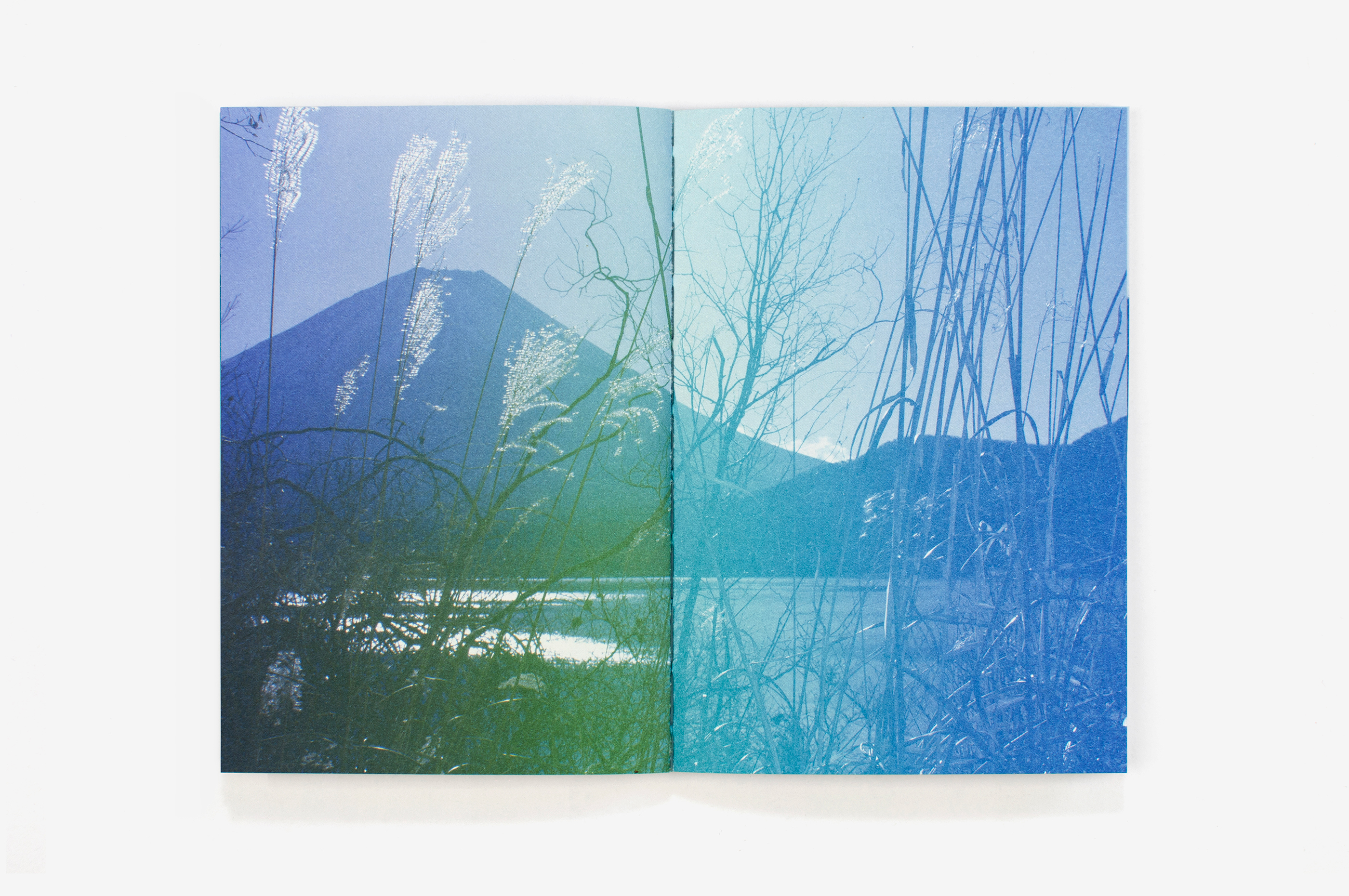
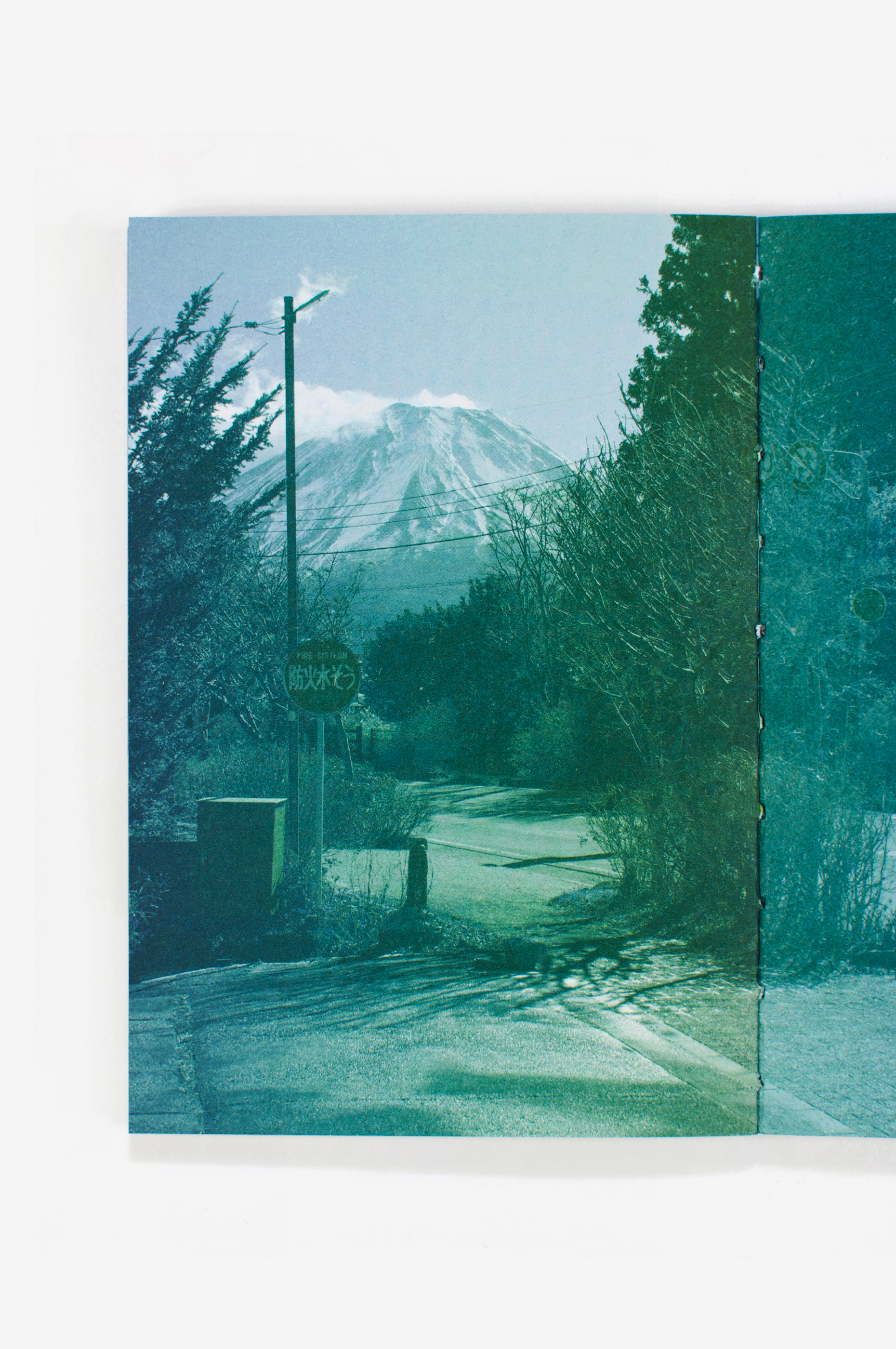
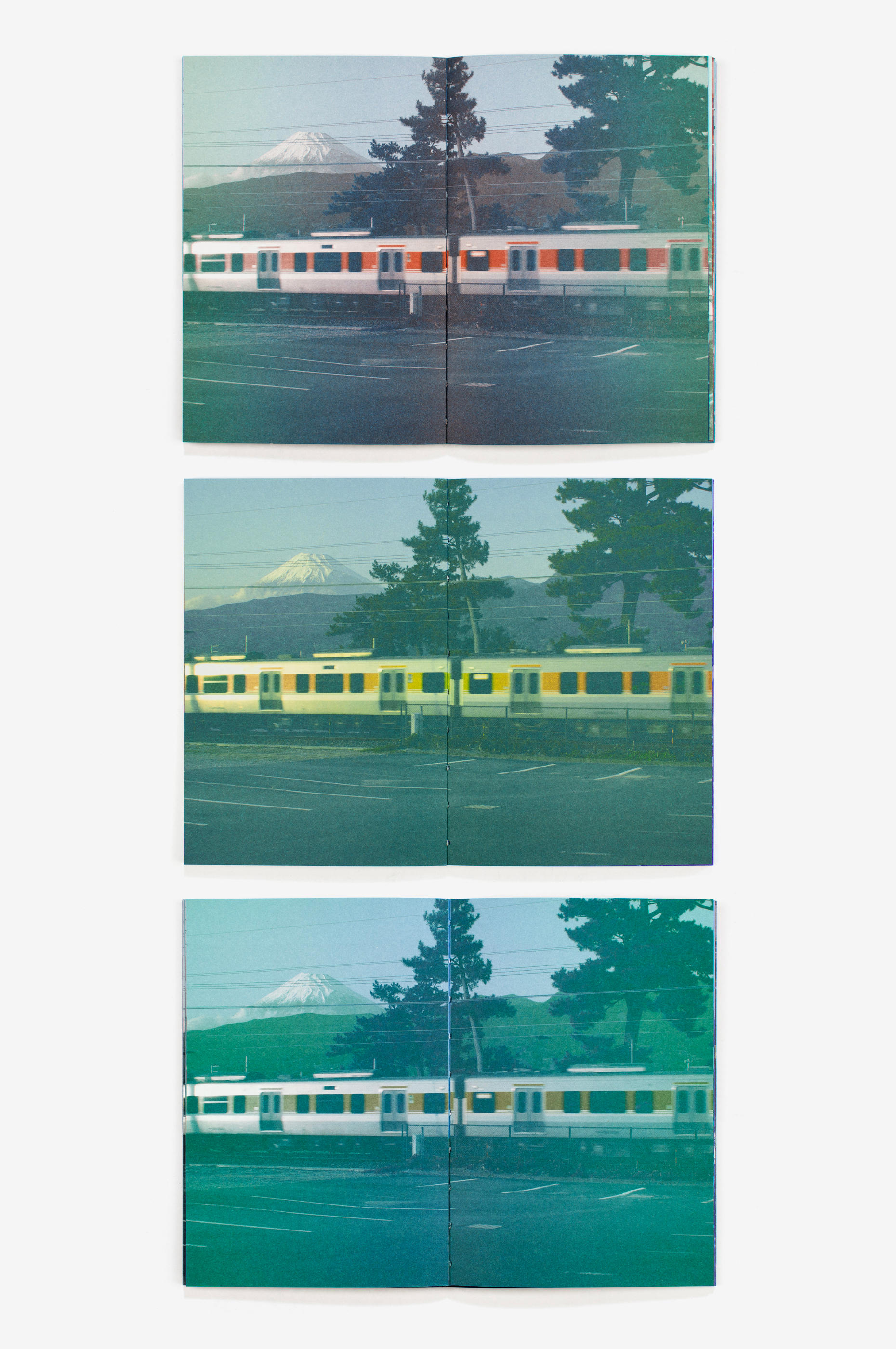
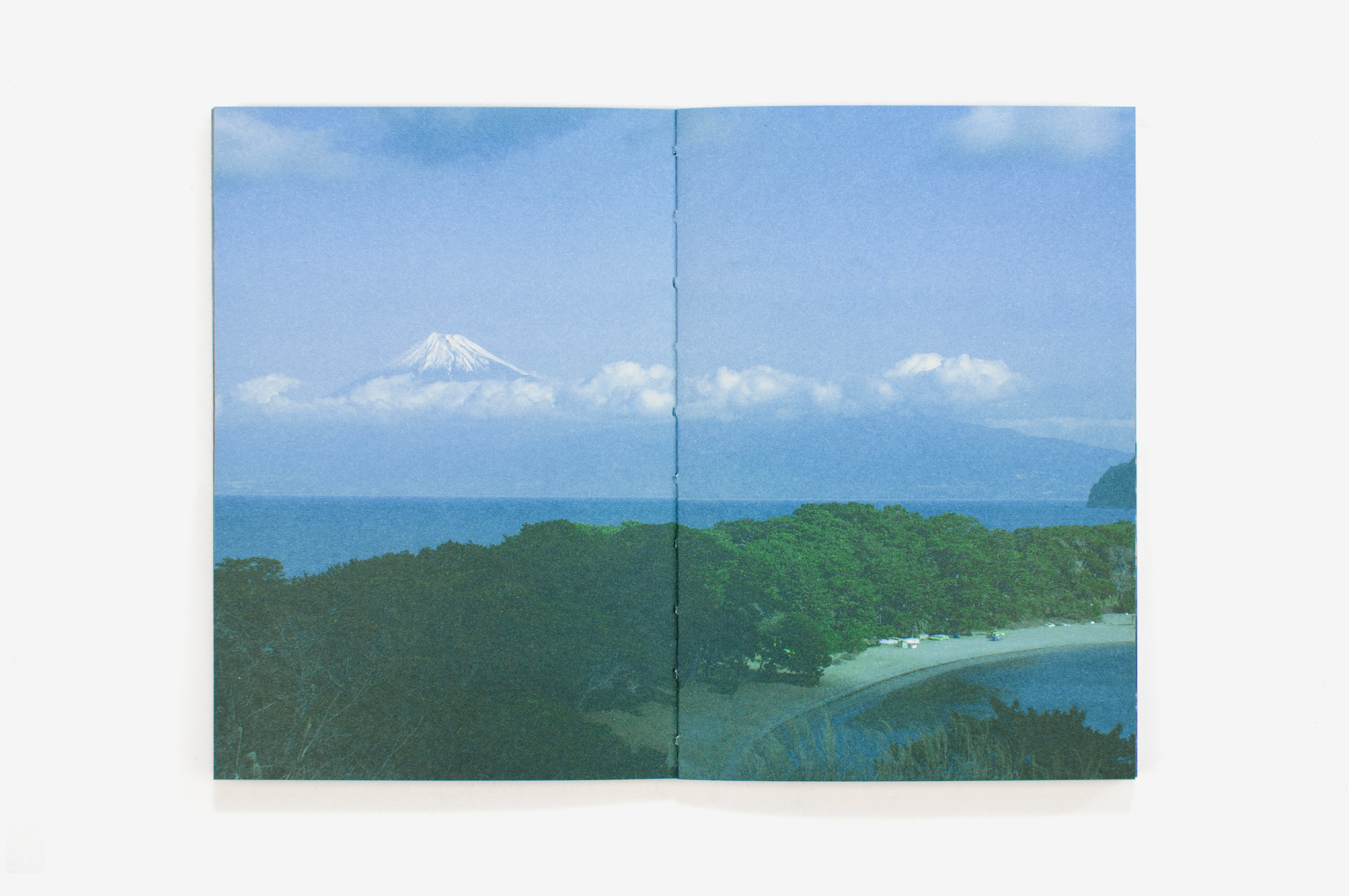
Sur le premier cahier, imprimé en une couleur, les photographies n’ont pas été simplement converties en niveaux de gris. Les quatre couches de la quadrichromie ont été converties une à une et travaillées séparément, avant d’être fusionnées pour former une image monochrome bleue.
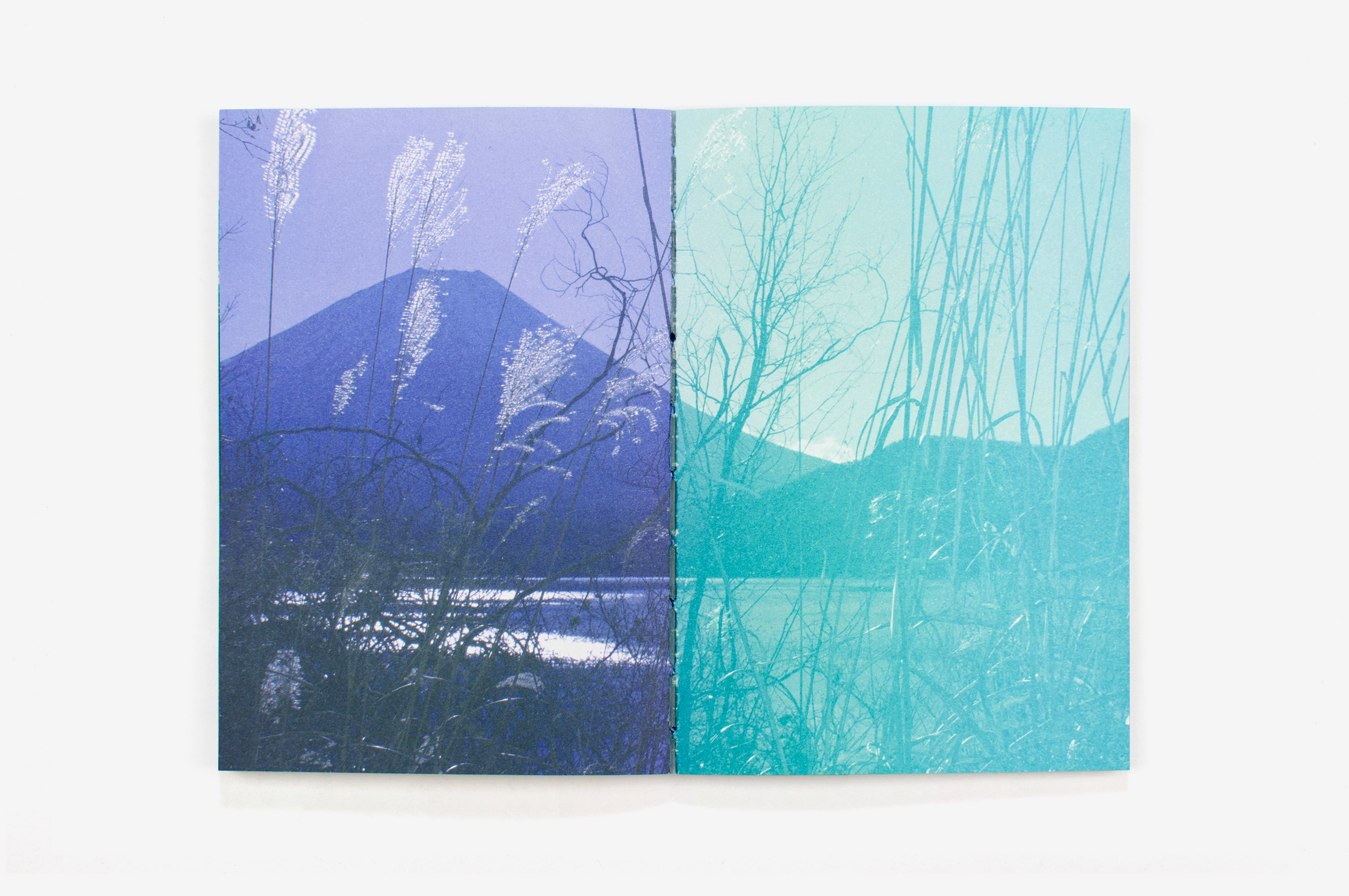
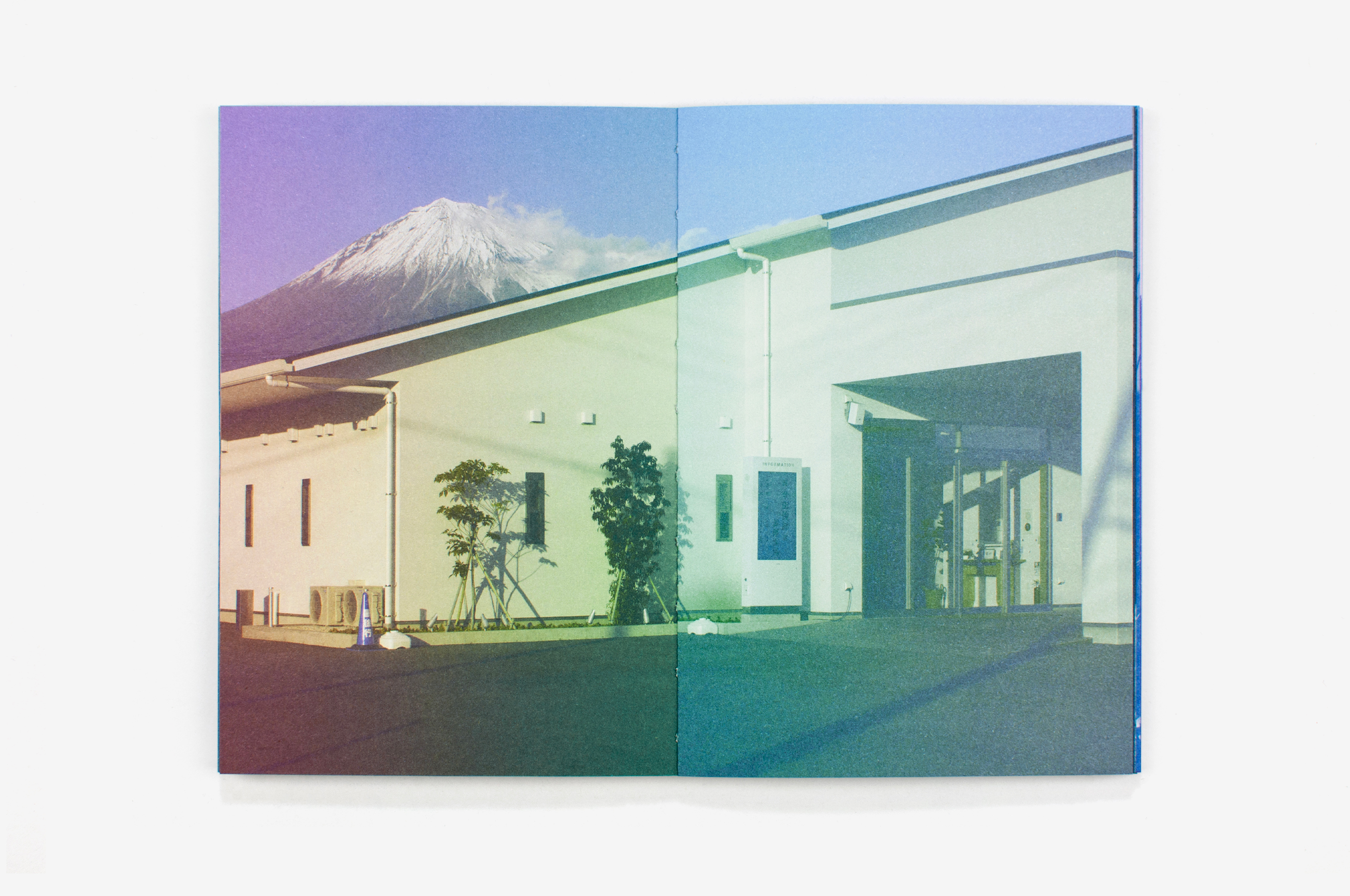
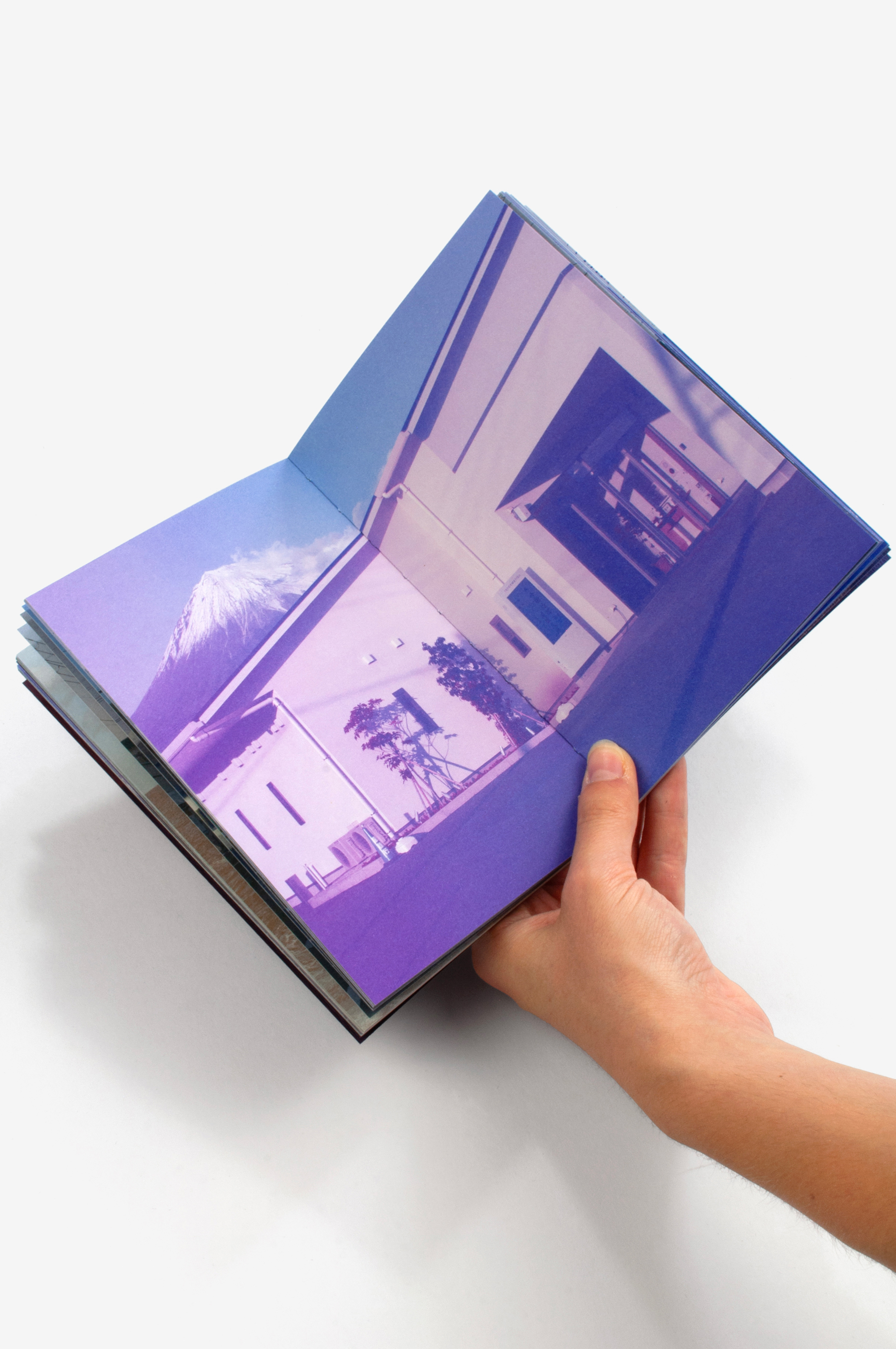
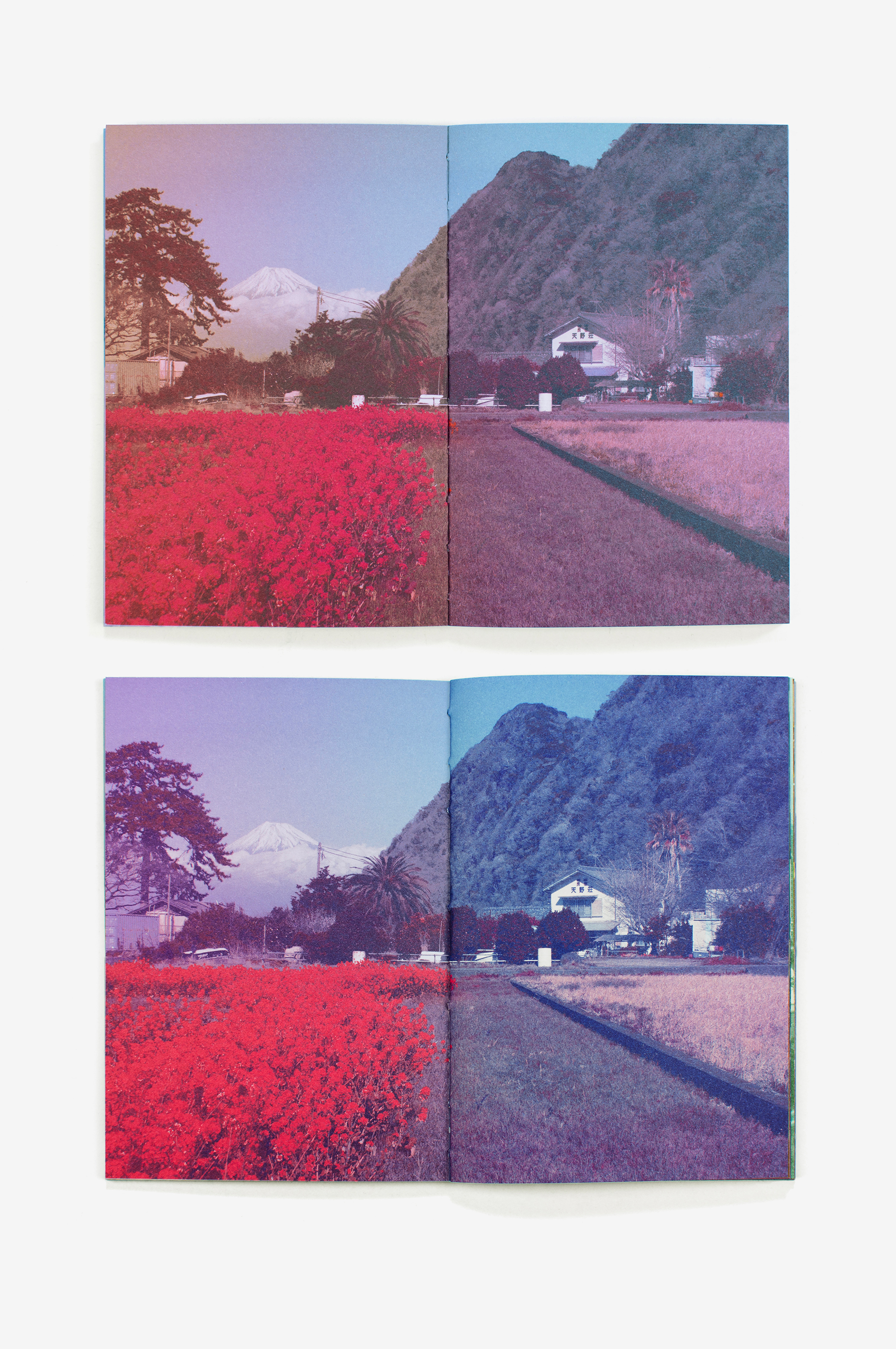
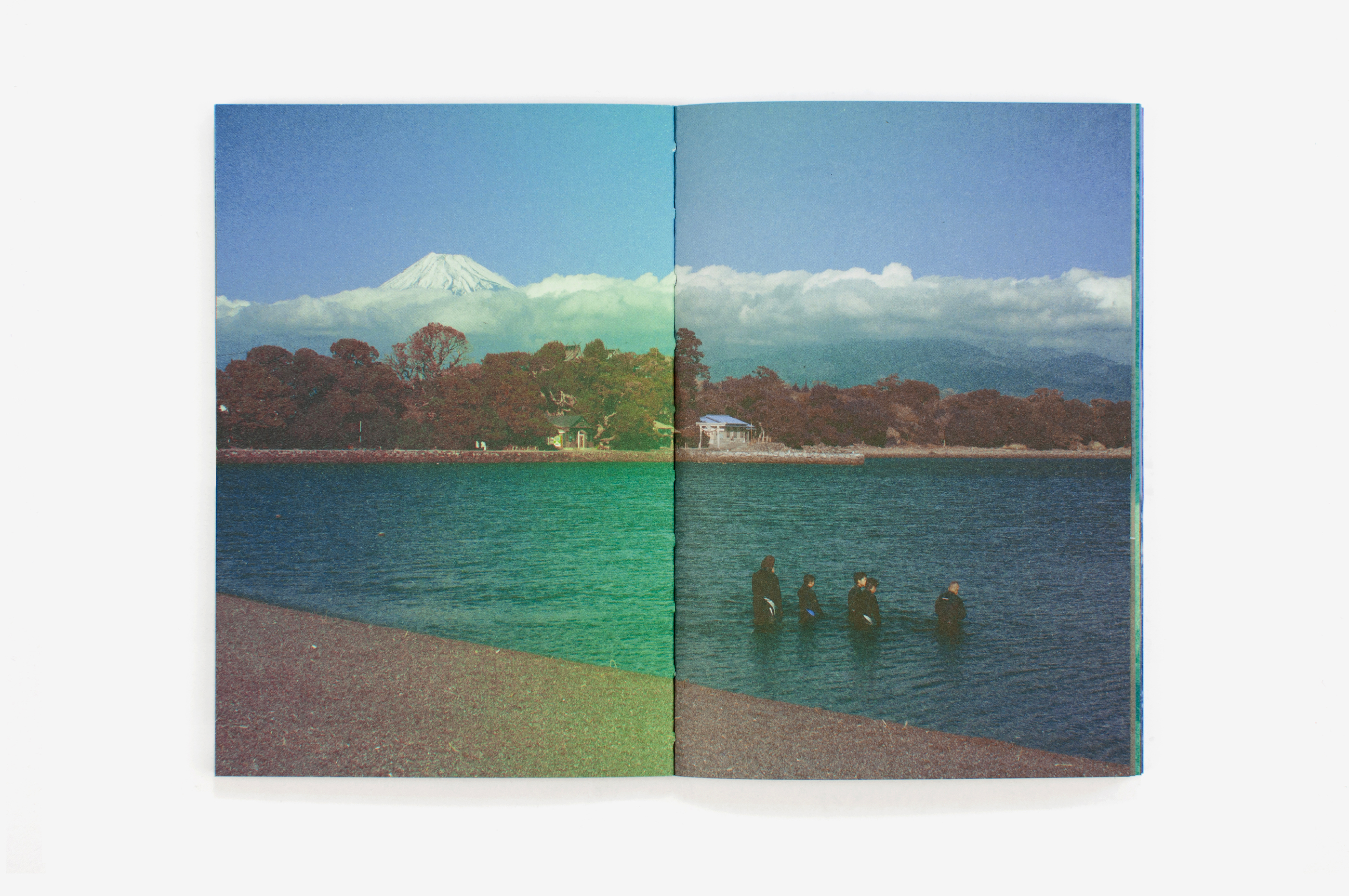
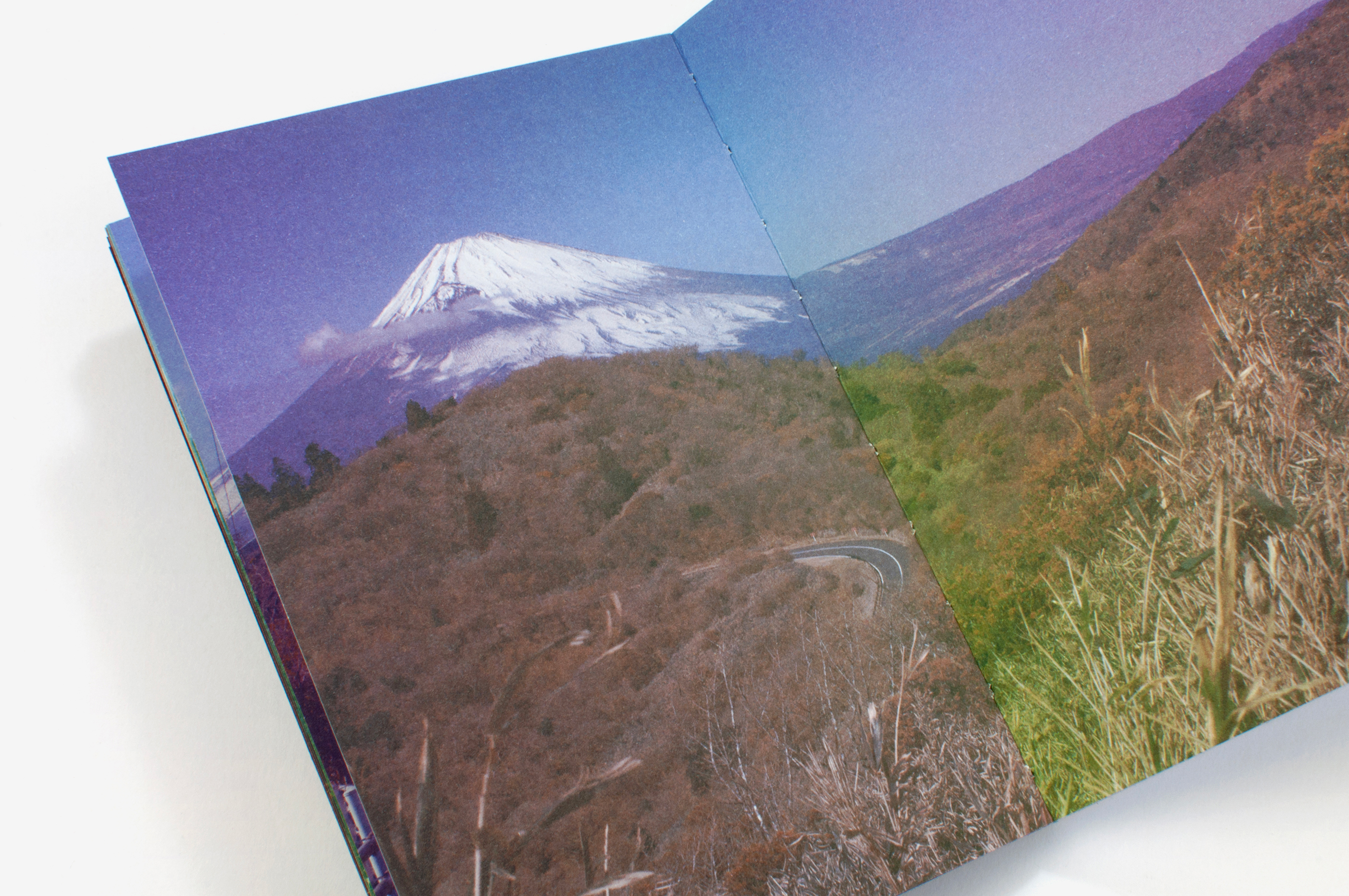
Sur le deuxième cahier, trois des quatre couches ont été fusionnées, et une seule couche a été imprimée avec une couleur supplémentaire. La couleur a ainsi été travaillée dans une logique de révélation progressive des couches, au fil des cahiers. Les couleurs viennent peu à peu enrichir le bleu et mettre en relief les paysages, jusqu’à révéler, dans le dernier cahier, des images au spectre riche. La couleur n’est donc pas présente d’emblée: elle se dévoile au cours de la lecture, comme si l’image se révélait couche après couche.
Cette décomposition en couches relève du procédé conventionnel de reproduction des images en offset, mais j’ai souhaité que l’encrage des plaques soit entièrement expérimental afin de permettre une approche inédite de la reproduction des images.
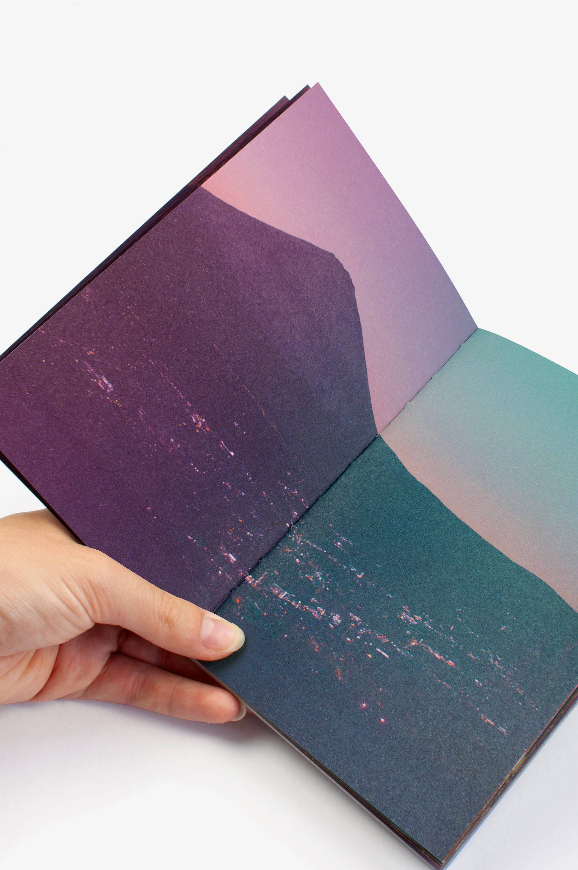
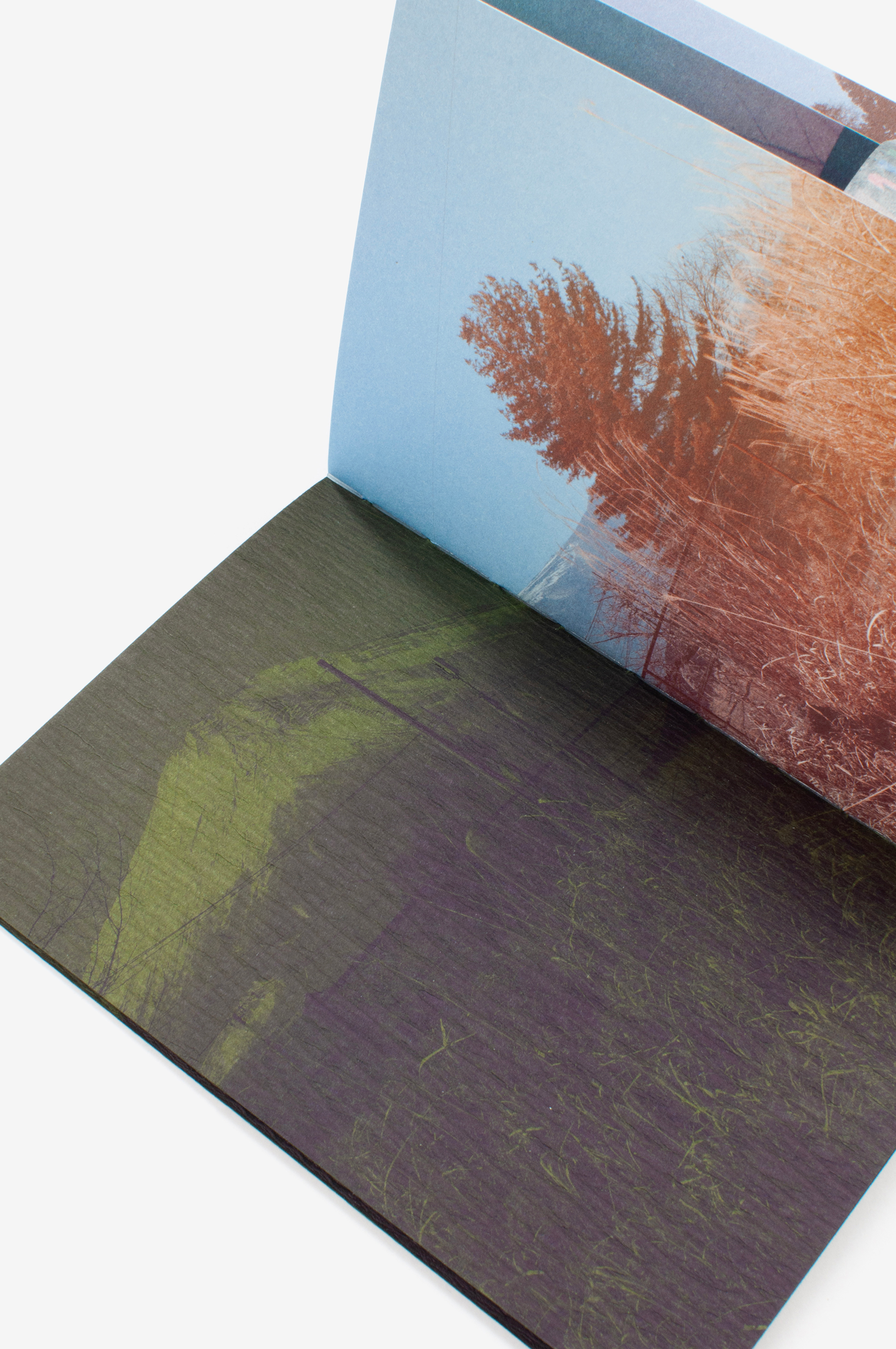
La préparation du calage, à travers ses aspects techniques, a constitué la part artistique principale de mon intervention dans ce livre. J’ai anticipé la répartition des couleurs dans les encriers en fonction de l’imposition, afin d’obtenir des variations tout au long du tirage. Plus de 30 couleurs ont été préparées en amont, puis réparties dans les encriers selon le plan établi. Je suis ensuite intervenue spontanément au fil du calage en affinant l’encrage, pour obtenir des dégradés variés. En plus de ces variations liées à l’encrage, un mélange aléatoire des feuilles avant l’impression du verso a permis que chaque planche d’impression devienne unique dans la correspondance entre son recto et son verso.
L’accompagnement rigoureux d’Alexandre Chaize, éditeur du livre, à toutes les étapes du façonnage, avec le contrôle d’une répartition aléatoire des cahiers avant la reliure, a permis de rendre chaque exemplaire du livre singulier. Les différentes combinaisons de couleurs des papiers de couverture, au début et à la fin de l’ouvrage, ont également permis d’accentuer cette unicité. Le livre Fuji obéit donc à une structure rigoureuse, mais réserve une place essentielle à l’imprévisible: celui du paysage, de la lumière et des encres. Il invite à une échappée du regard, imprégnée des couleurs fantasmées du Japon et portée par les aléas de l’impression.
Fuji is a book that reads as a loop. Though it’s based on a very simple principle, it took us quite a while to design it. And despite its apparent simplicity, there’s a lot to say about it.
I’d wanted to make a book about Japan for a long time. I’d visited several times with my husband, Clément Vauchez, and the country fascinates us both. While we were musing about book topics during a stay in Tokyo, Mount Fuji suddenly sprang to mind, just as it sometimes unexpectedly pops up in the Japanese landscape. Its iconic dimension in no way diminishes the fascination awakened by its real presence in the landscape. The fact that one can travel around the mountain, which always looks the same, yet changes when seen from different viewpoints, struck me as an interesting premise for a book which could also act as a reference point to build the book around.
I also drew inspiration from Hokusai’s iconic work, Thirty-six Views of Mount Fuji, whose visual power has profoundly enhanced my perception of the Japanese landscape. Hokusai’s revolutionary way of approaching the landscape, which embodies both a recurring motif and variation in its depictions, as well as the Prussian blue pigment featured in his prints, were further sources of inspiration for our project.
In the beginning I thought I would make drawings of Mount Fuji as a continuation of my other works published by Éditions du Livre. But its simple shape was too much like my minimalistic drawings, and wasn’t appropriate for reproducing the subtle vibrations of reality. As the months went by it became clear that the landscapes in the book should be captured by photography, which would also allow them to spring from the reality of a trip around Mont Fuji.
I asked Clément to join me in making the book. Though he’s above all a graphic designer, he also has a demanding photographic practice that he’d never really presented in book form before. It seemed like a great opportunity to share both a personal adventure and a new publishing experience. By agreeing to tackle the photographic aspect of the project, Clément got involved in the adventure and led our trip around Mount Fuji.
I defined the book’s layout and how Mount Fuji would appear in it early on. I’d also determined the characteristics of the work in terms of its technical requirements, which in turn engendered the creative process. The diminutive format of 11 x 16 cm would result in 32 inner pages that would be printed on a single sheet. The fact that all the pages would be printed at the same time held great significance for me. Furthermore, the number of inner pages, along with two groups of four pages that make up the beginning and end of the work, allowed for 36 landscapes, which perfectly matched Hokusai. The opening and closing four-page groups frame the inner pages, and the book features a Coptic binding with visible stitching.
I wanted the book to begin at the end: the Western back cover would become the Japanese front cover. This meant that Mount Fuji would be visible on the most important page of a Japanese book (known as «the beautiful page» in French publishing), the first one on the left after opening the cover. The way we framed the photographs also had to adapt to this unusual format, which meant that the mountain had to be off-centre in our shots.
Proceeding «backwards» in terms of Western publishing conventions resonated with our journey around the mountain and with driving on the left. Our instincts were thrown off balance, and our habitual ways of driving and designing books were reversed.
The order of the photos in the book echoes the order in which they were taken: we travelled around the mountain counterclockwise.
While the framing of the photographs was well-defined, it was also important that the evanescent nature of Mount Fuji should appear in the landscapes. The mountain can appear and disappear in an instant, depending on fluctuations in light and cloud movement. Our journey was like trying to capture a butterfly. The variety of contexts produces a kaleidoscopic effect.
We also wanted the book to address the technical conventions of reproducing photographic images through four-colour printing. Clement worked meticulously to create a method of separating the layers that would be echoed in the printing process.
In the first group of pages, printed in colour, the photographs were not simply converted into grayscale. The successive layers of the four-colour process were converted one by one and processed separately before being combined to form a single monochromatic image in blue.
Three of the four layers were merged in the second group of pages, with the final layer in an additional colour. Our method of working with colour reveals itself in progressive layers as the book unfolds. Colours were gradually added to the blue, highlight the landscapes, and culminate in the final section with images in a wide-ranging spectrum. Colour is not presented immediately, but is revealed to the reader little by little, as if the layers of the image are being unveiled one after another.
This layering technique is part of the conventional offset process of reproducing images, but I also wanted the inking of the plates to be done in a totally experimental way, which would enable us to approach image reproduction in a novel fashion.
The technical aspects of preparing the layout were the main artistic component of my contribution to this book. I planned how the colours would be distributed in the ink pans based on the order in which they would be layered, with the goal of creating variations throughout the print run. More than 30 colours were prepared in advance, and divided among the ink pans in accordance with my plan. I then spontaneously intervened during the layout, refining the inking to create a variety of nuances. Along with these variations in the inking process, we also randomly mixed the sheets before printing the back, which meant that each printing plate was unique in the way its front and back sides corresponded.
Alexander Chaize, our publisher, offered scrupulous support during the entire process of making the books, checking the random distribution of the pages before they were bound to ensure that each one was unique. The various colour combinations on the covers at the beginning and end of the books also helps to highlight their one-of-a-kind nature. Though Fuji’s design is rigorous, it also gives pride of place to unpredictability through its landscapes, the lighting, and inks. It encourages the reader to let his or her gaze wander and to revel in the fantastical colours of Japan while being borne along by the vagaries of the printing process.