Entre les pages
Contexte: Exposition avec Betty Bone, à la Médiathèque André Malraux et réseau des Médiathèques à l’occasion de Strasbourg Capitale mondiale du livre, 2024
Impression: Quintal_atelier, La Petite Frappe, Lézard Graphique et Le Réveil de la Marne
Photographies: Nicolas Watlefaugle
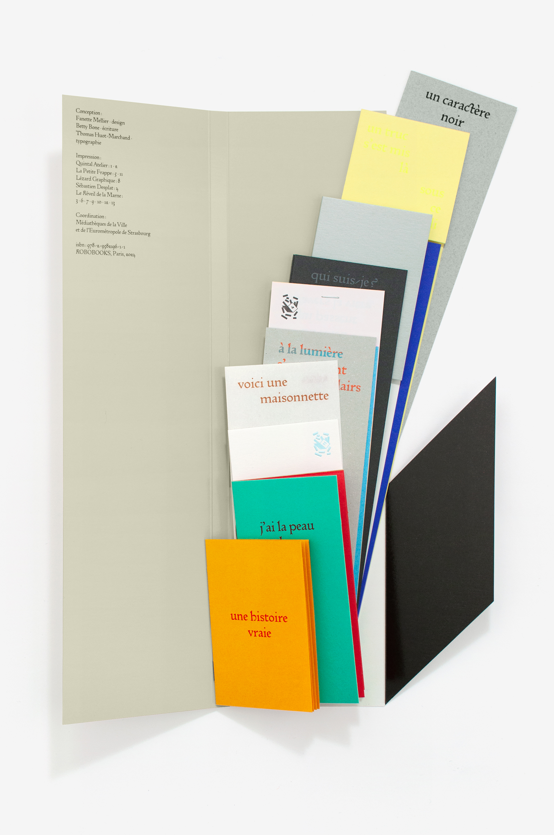
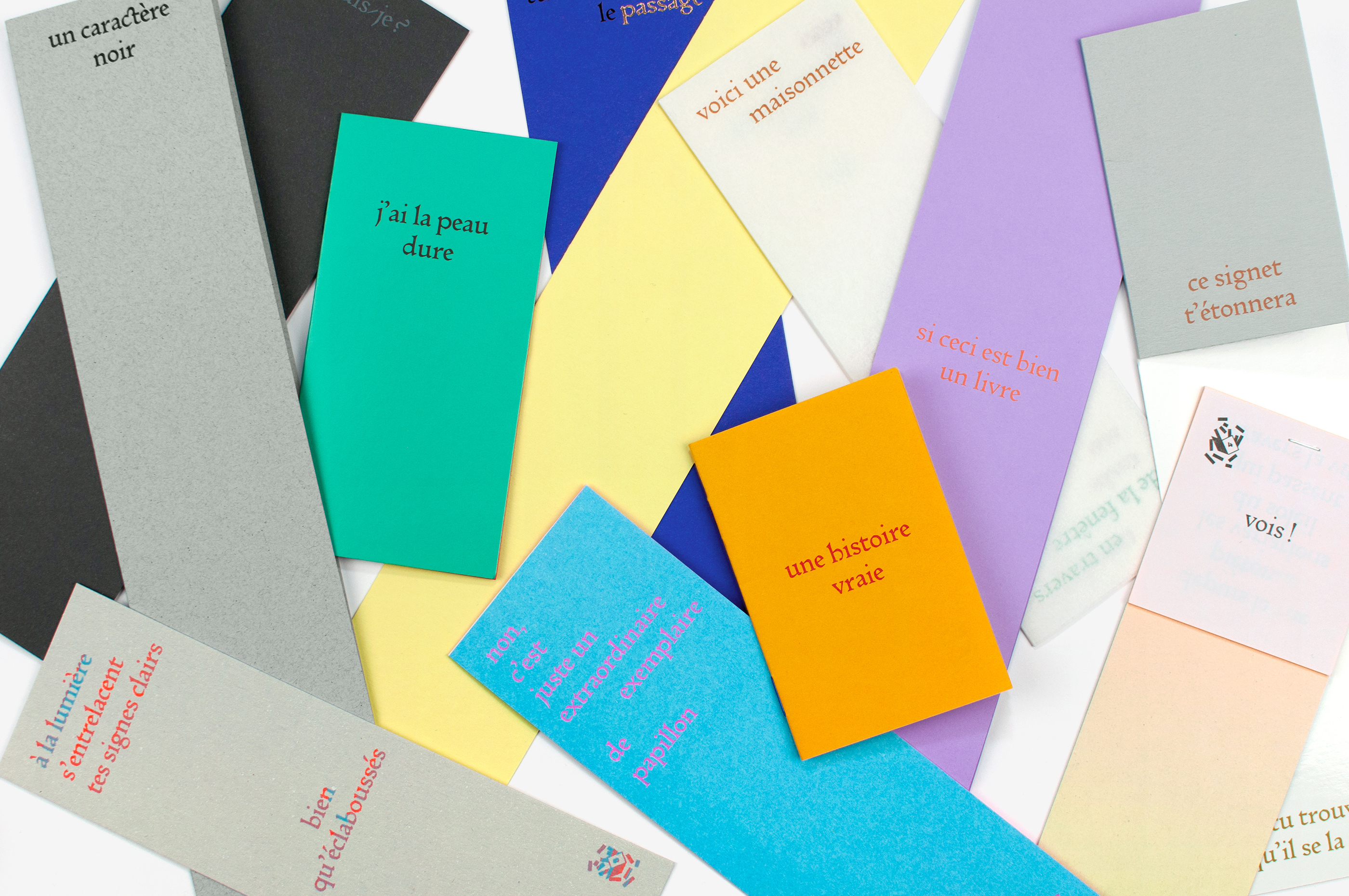
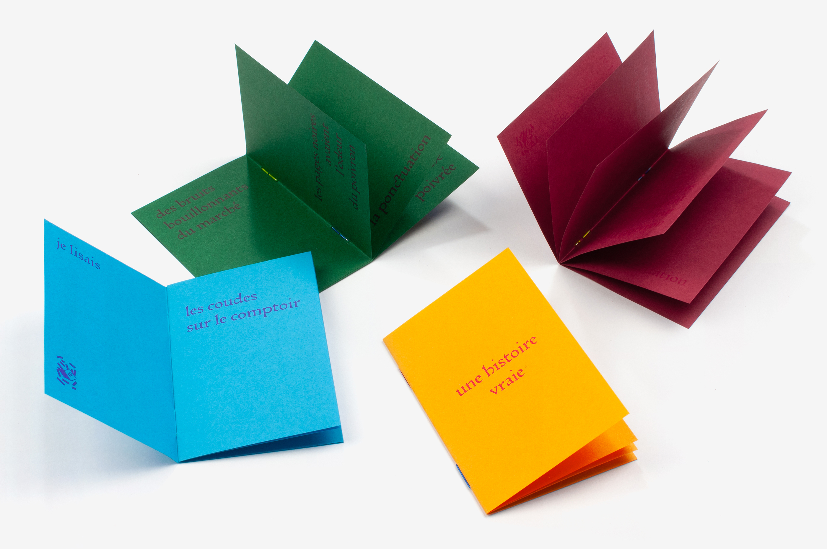
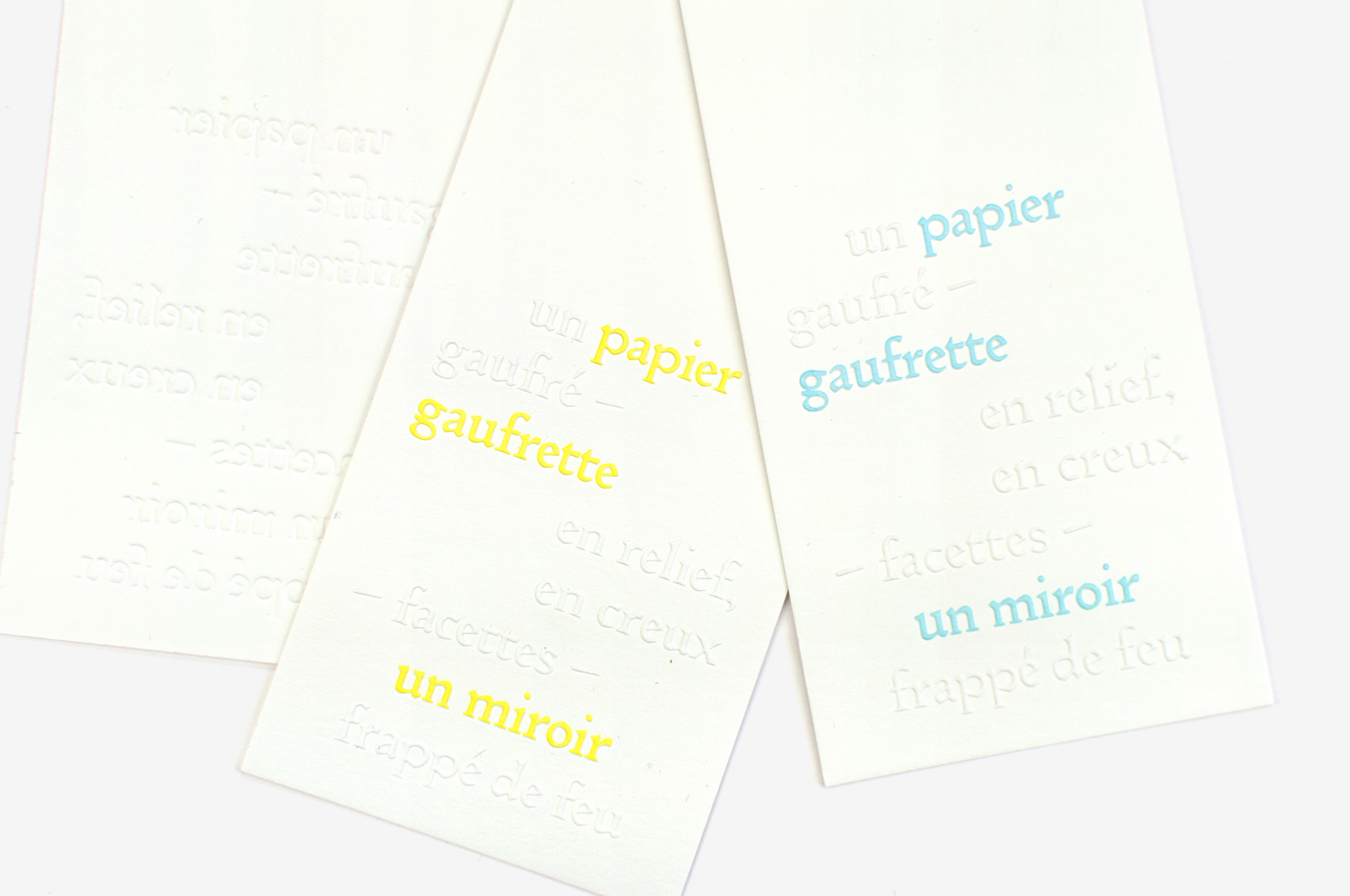
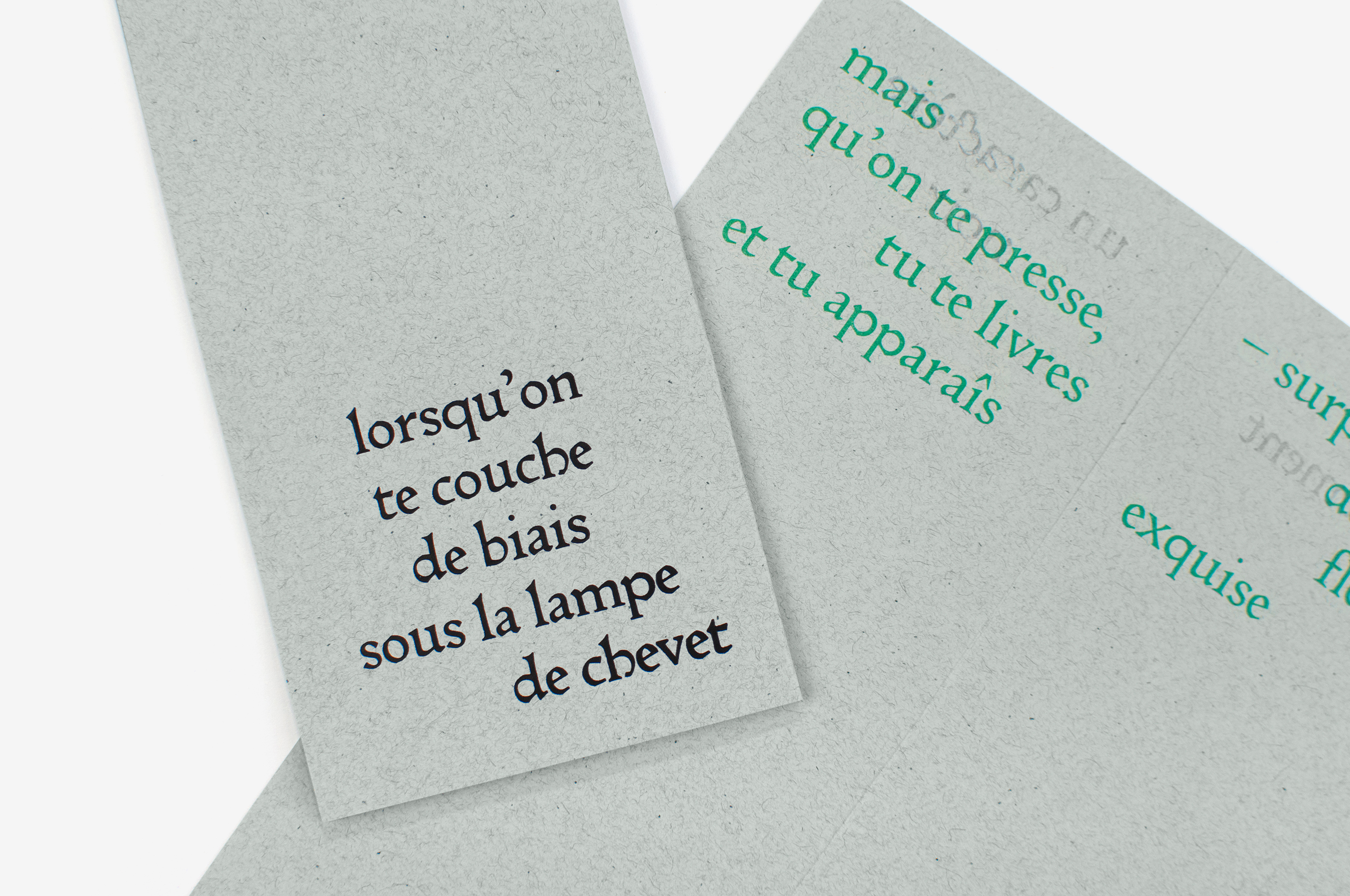
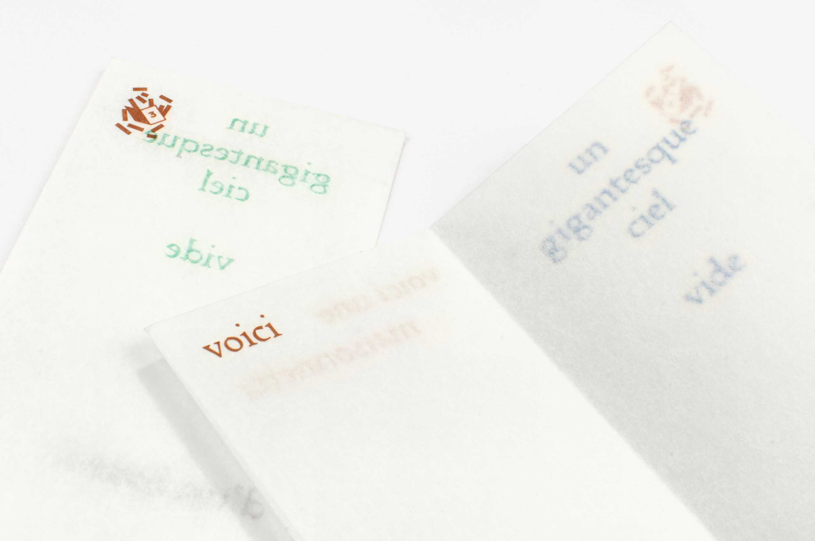
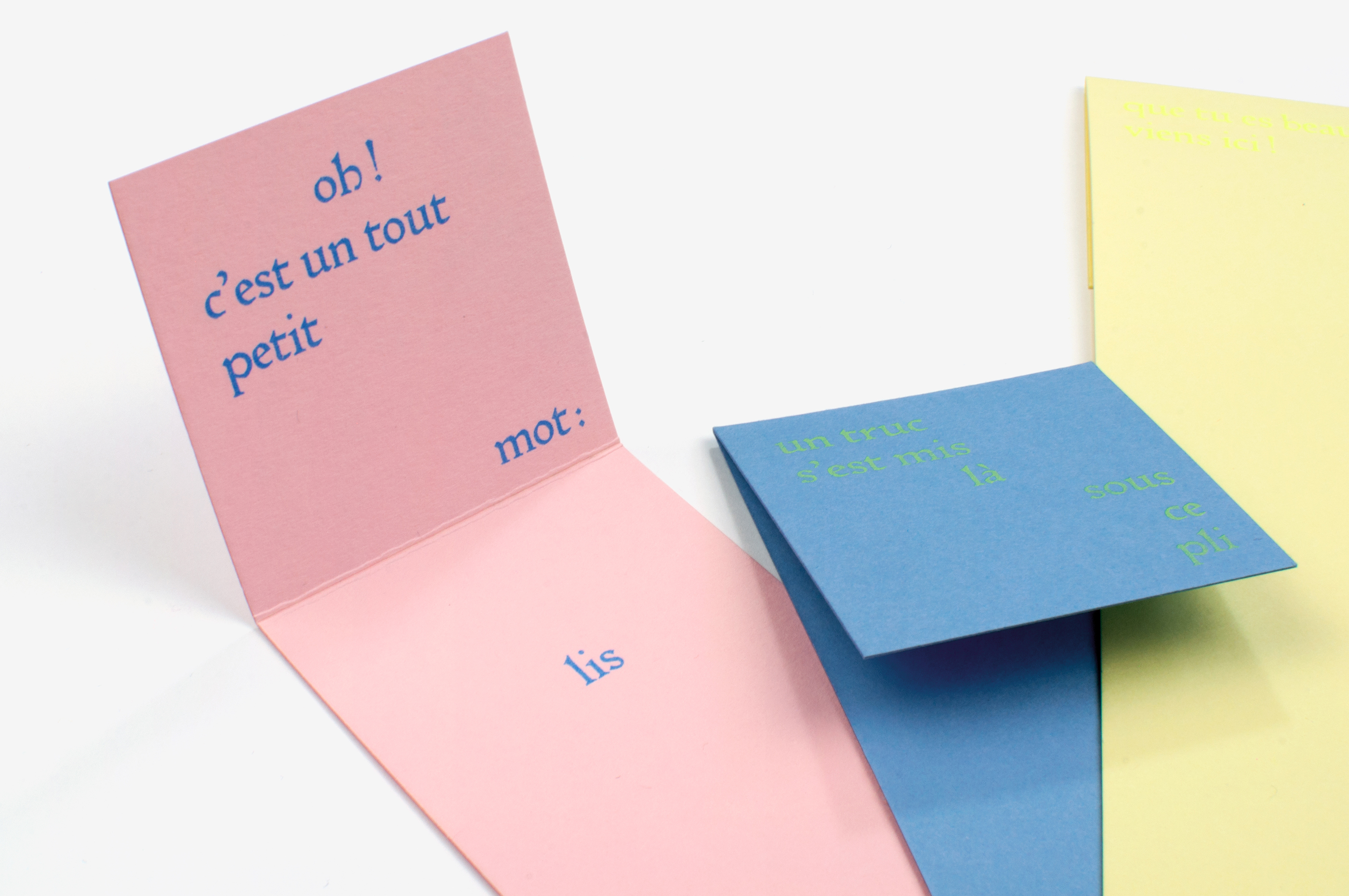
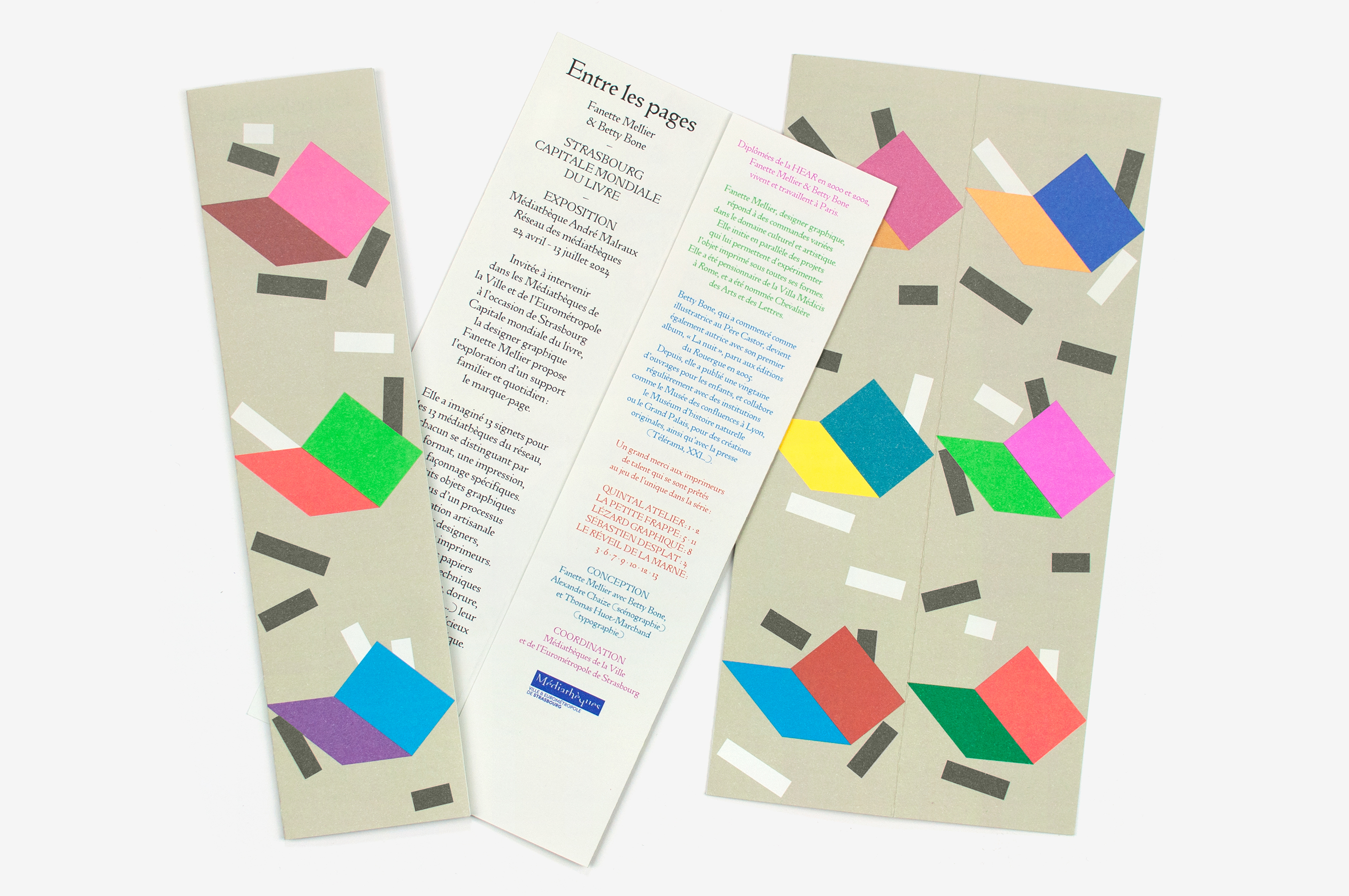
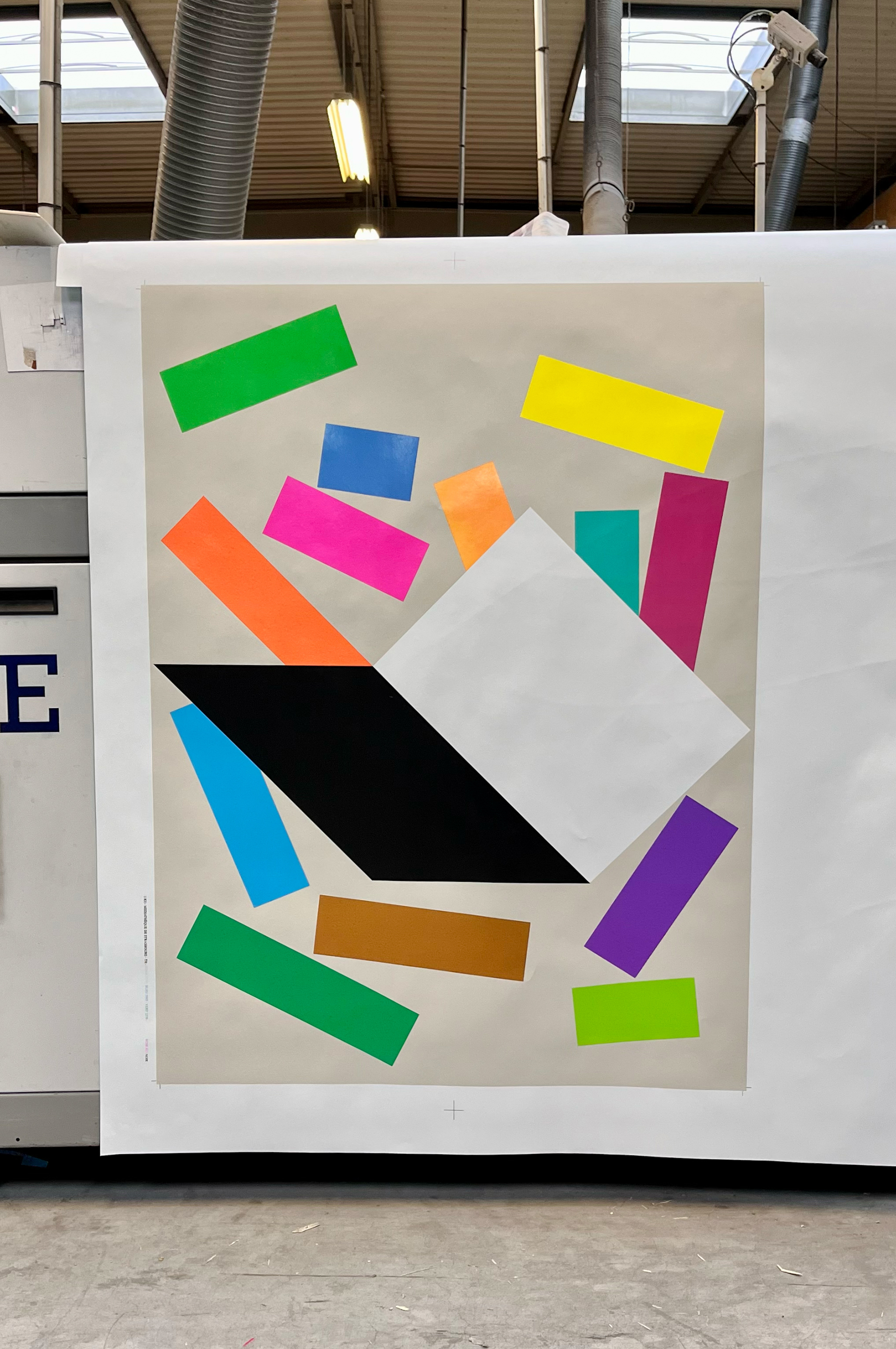
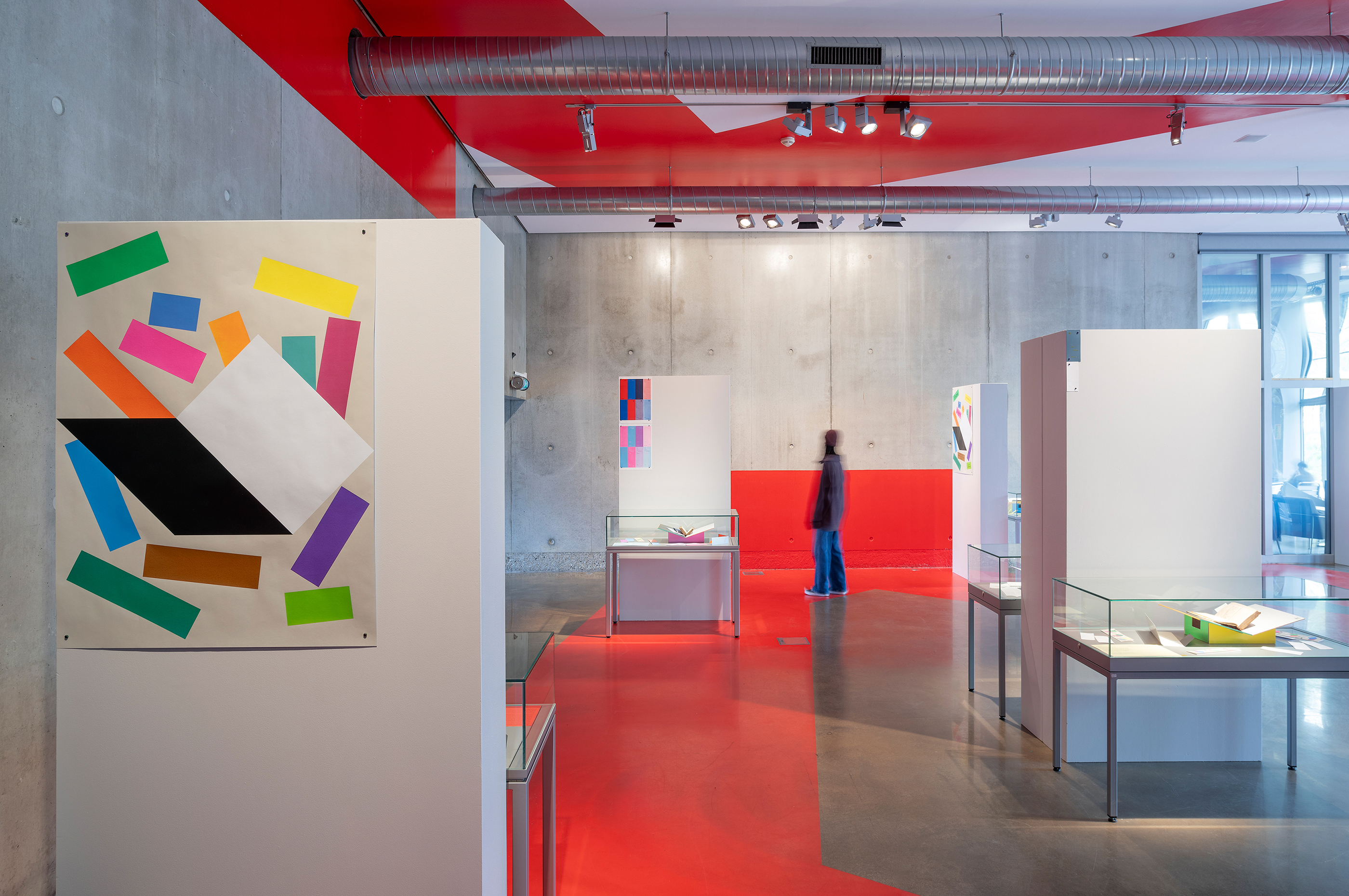
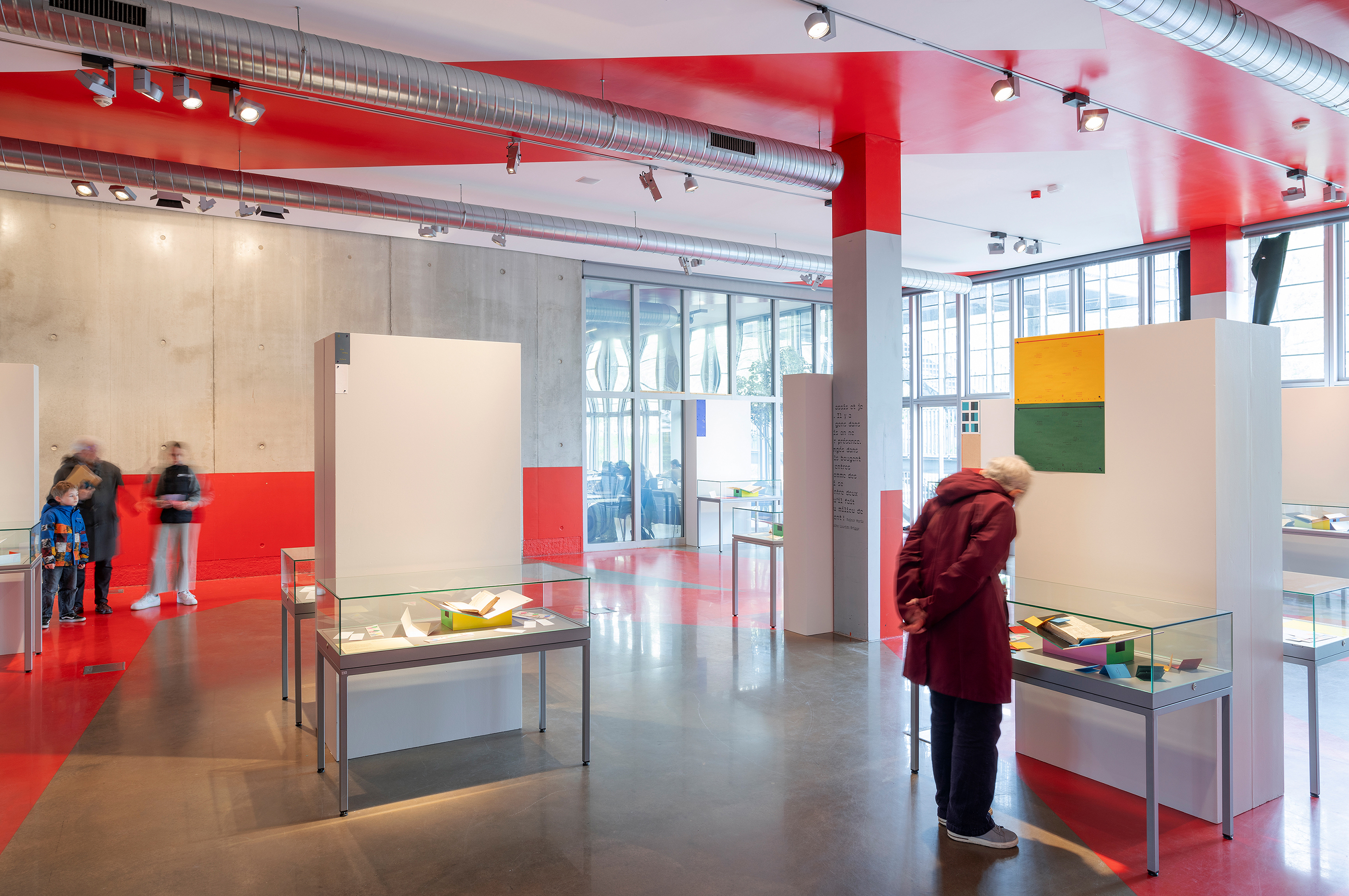
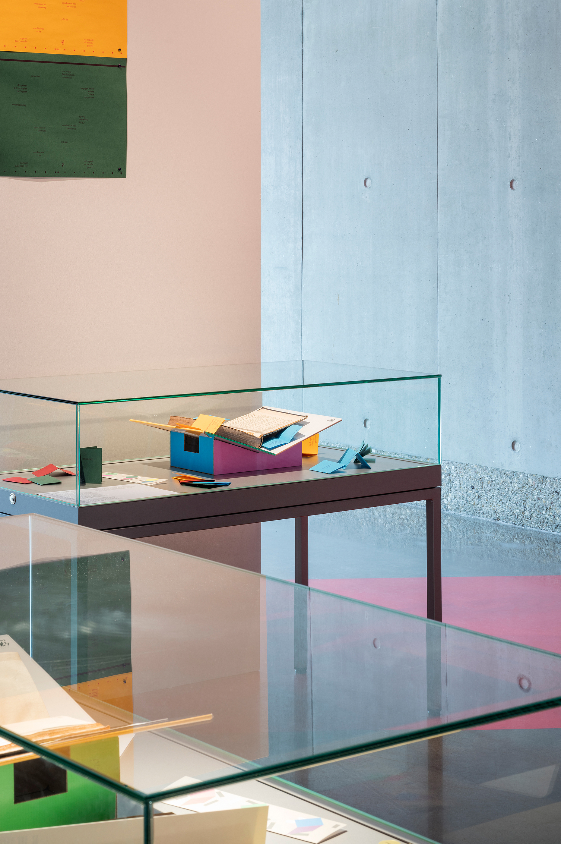
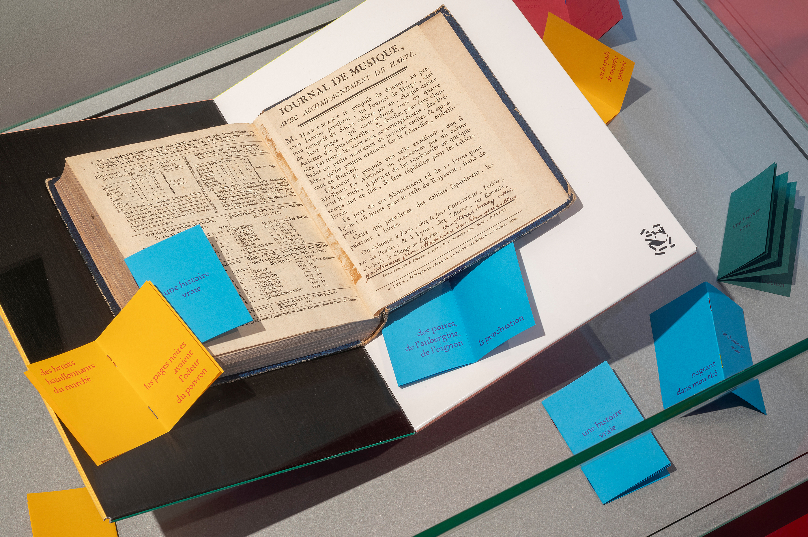
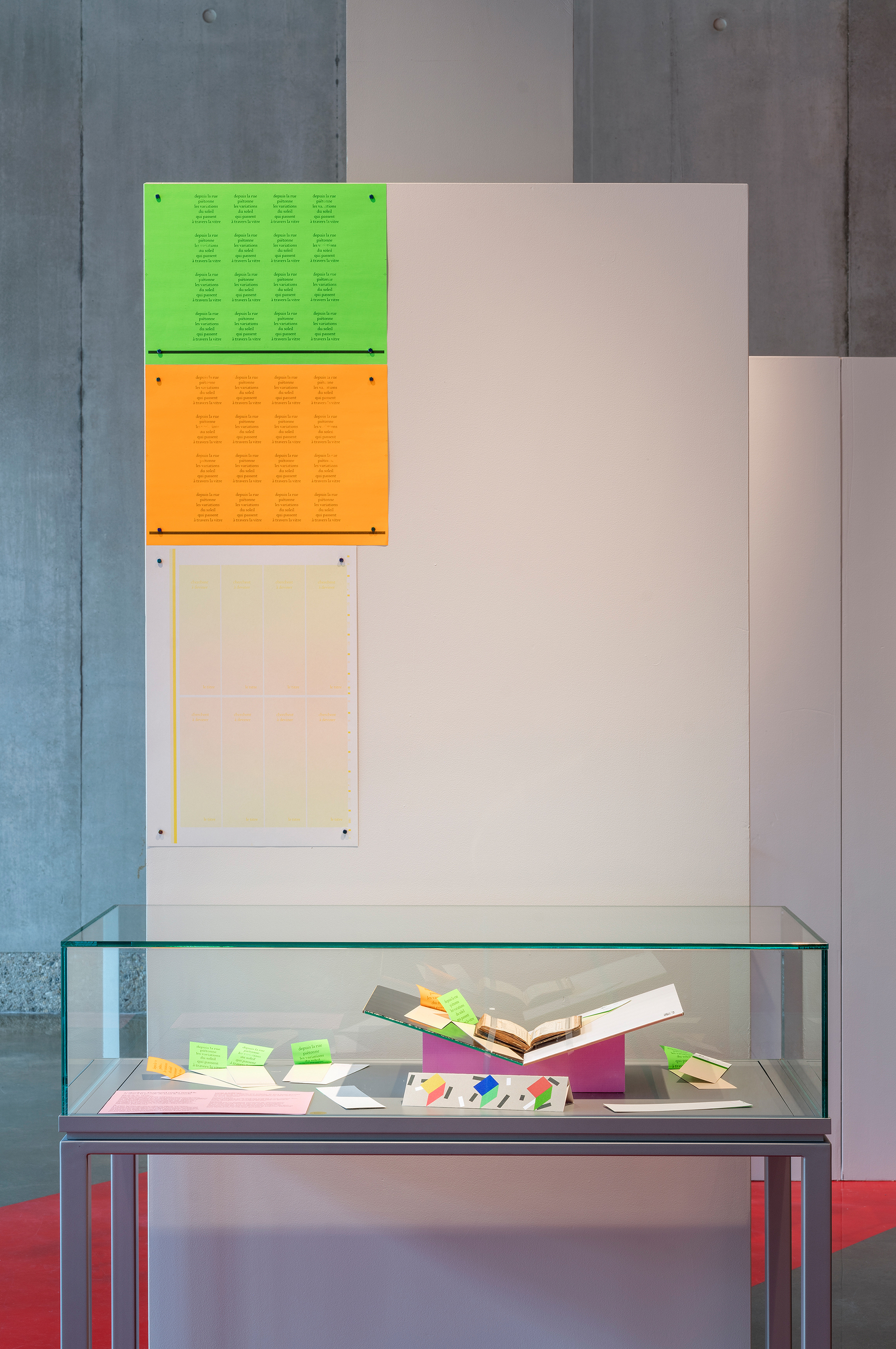
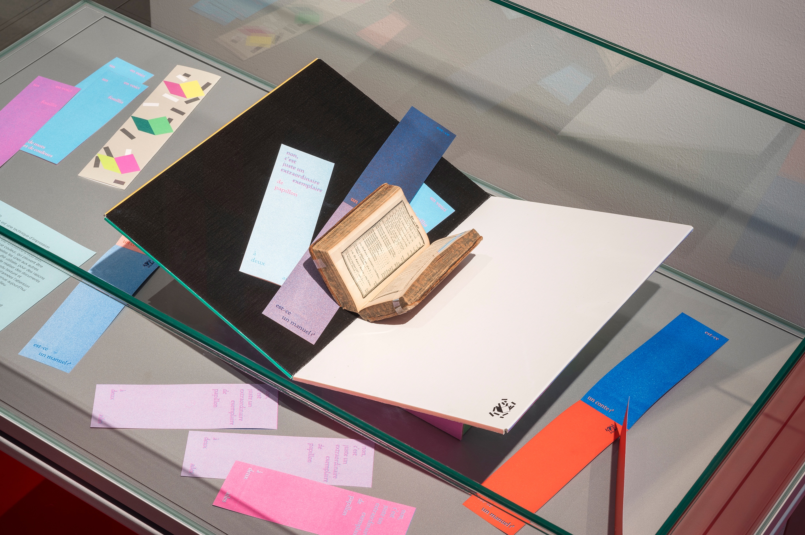
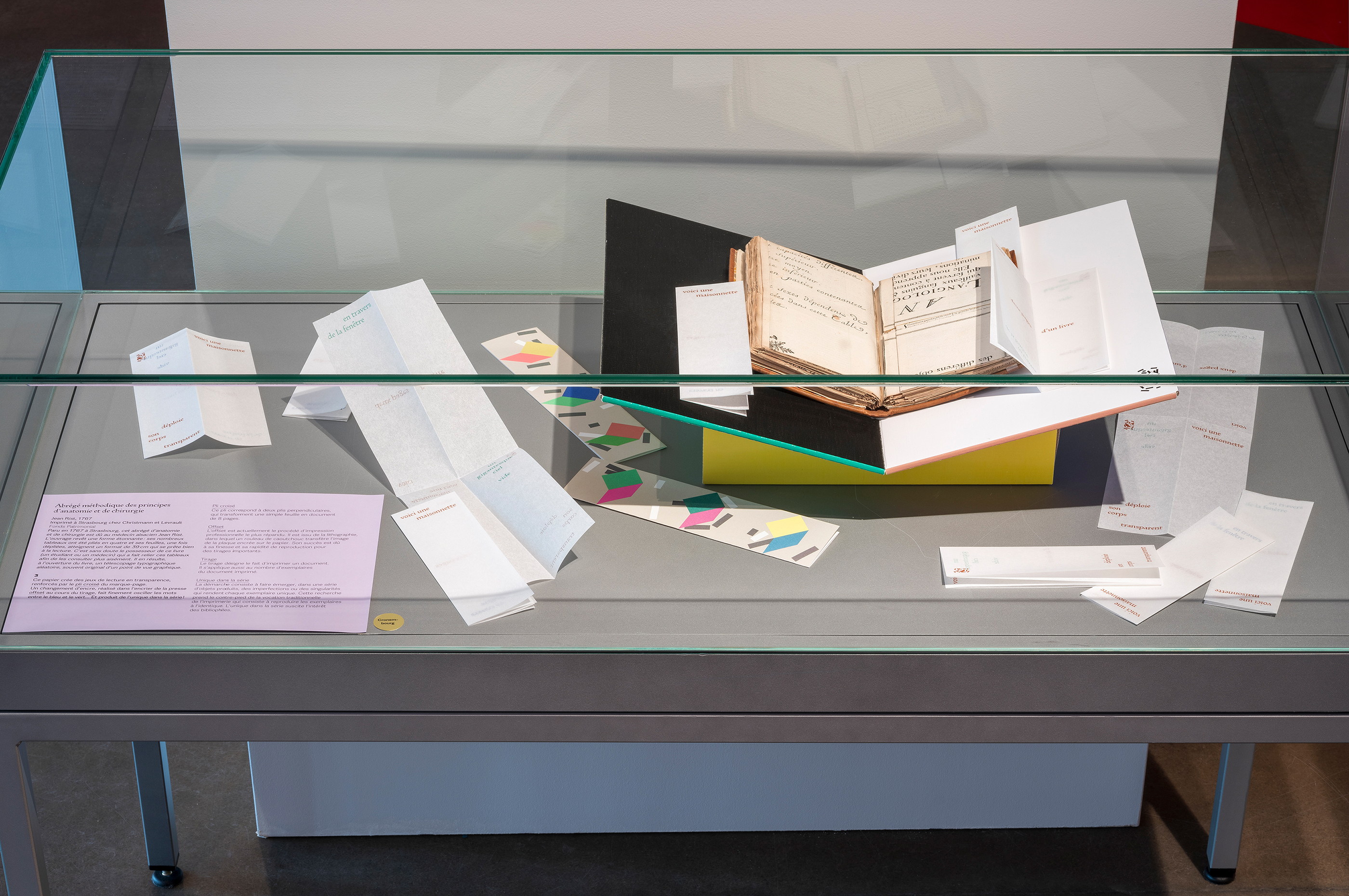
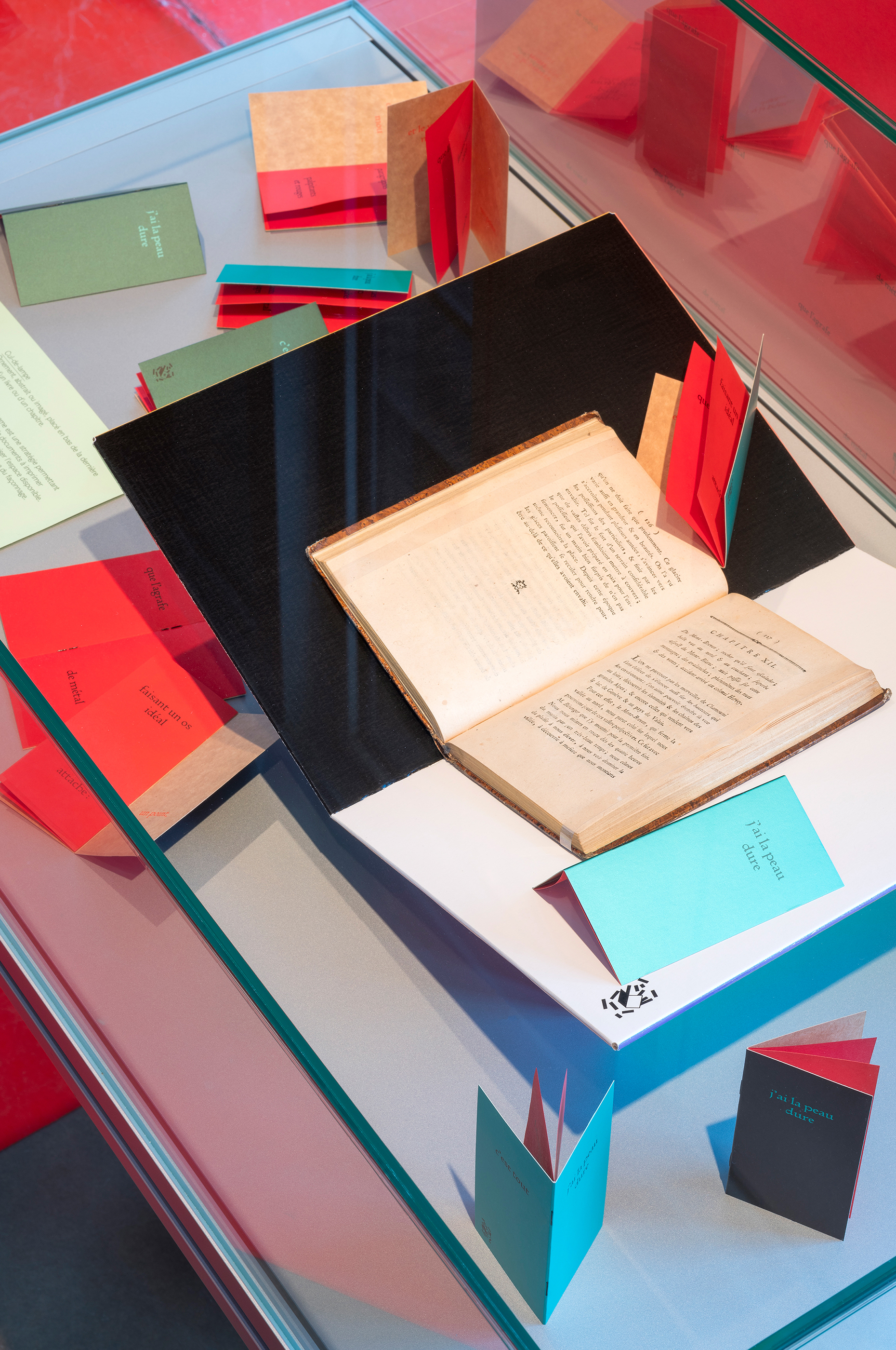
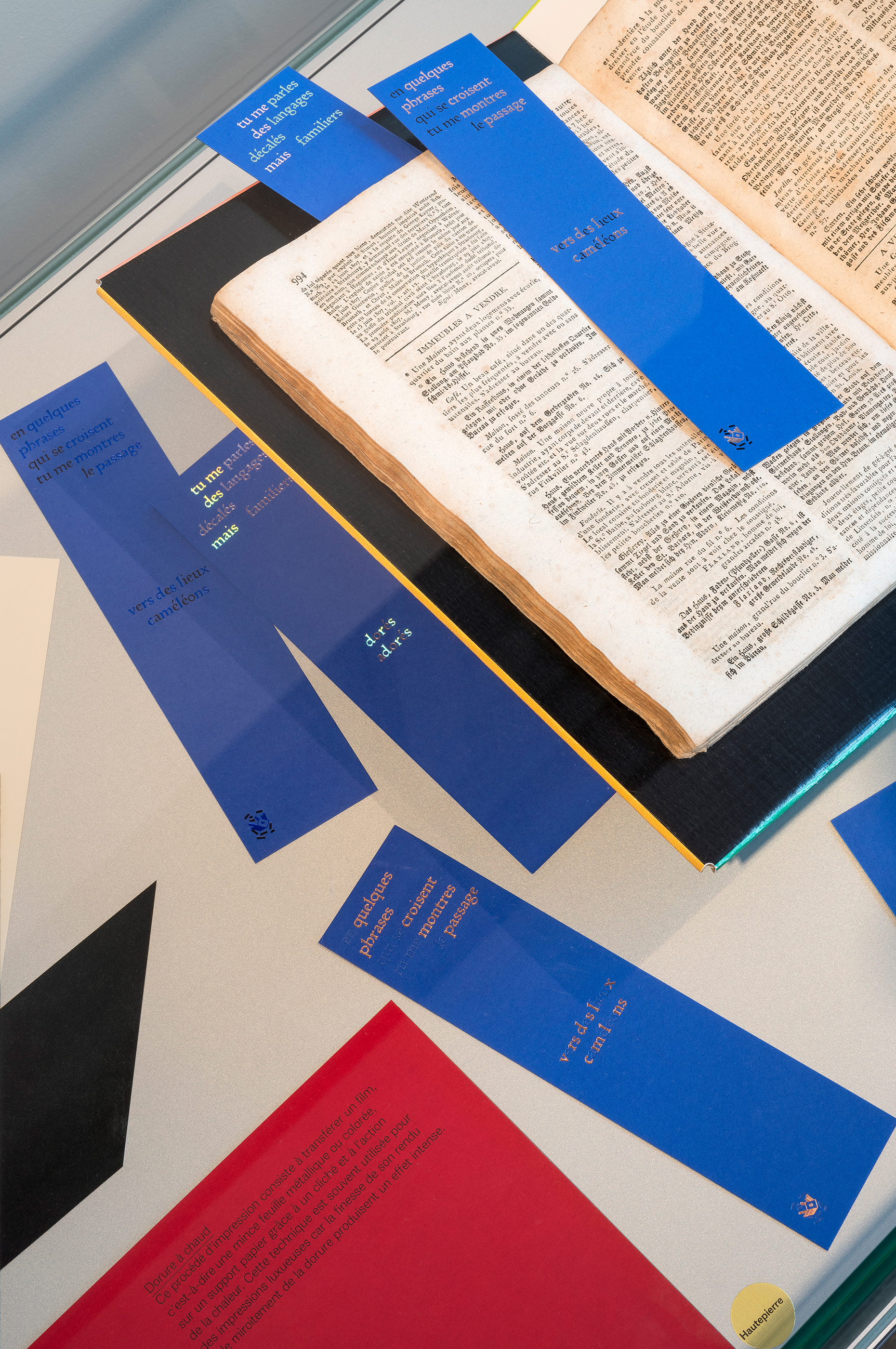
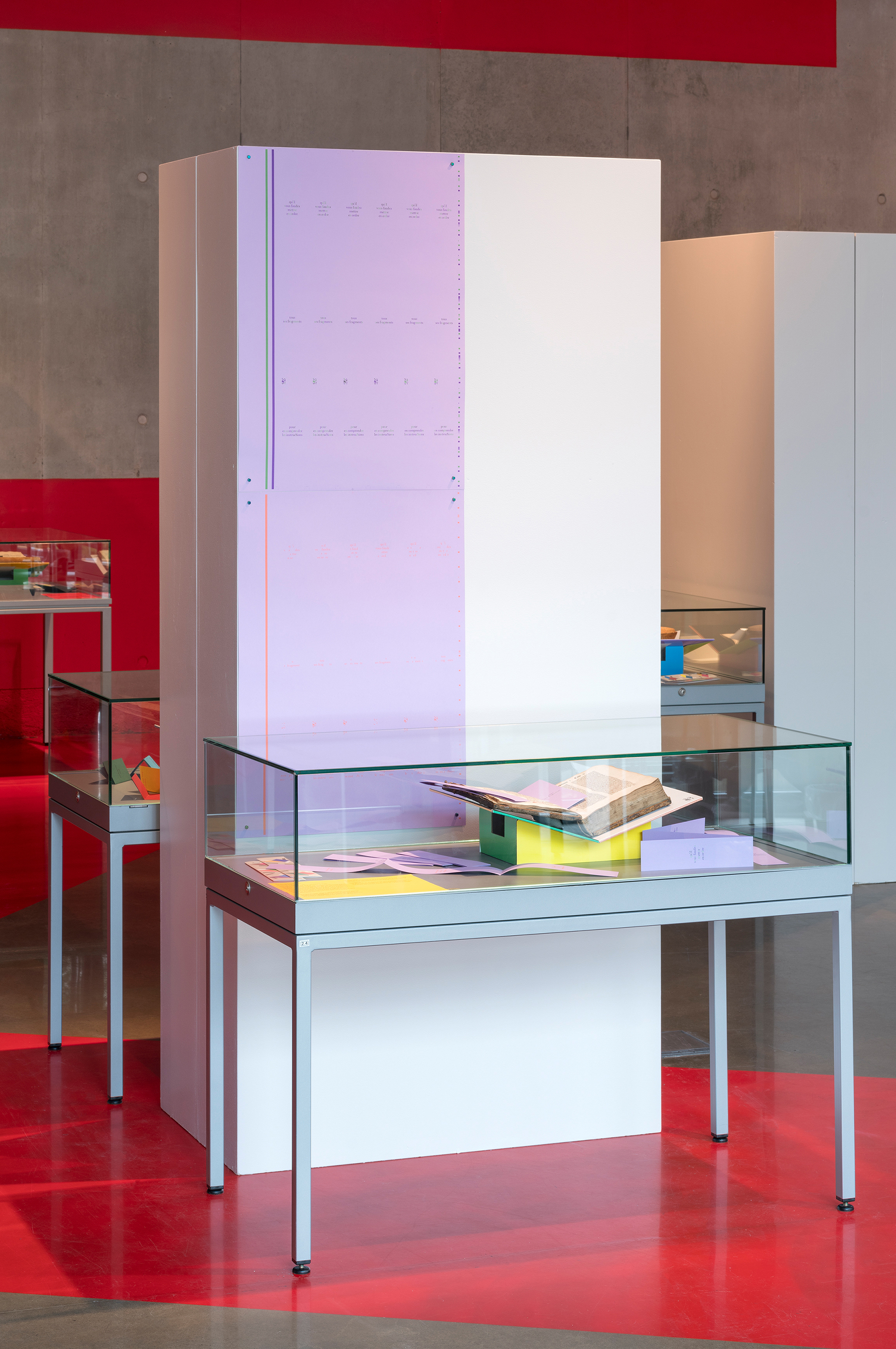
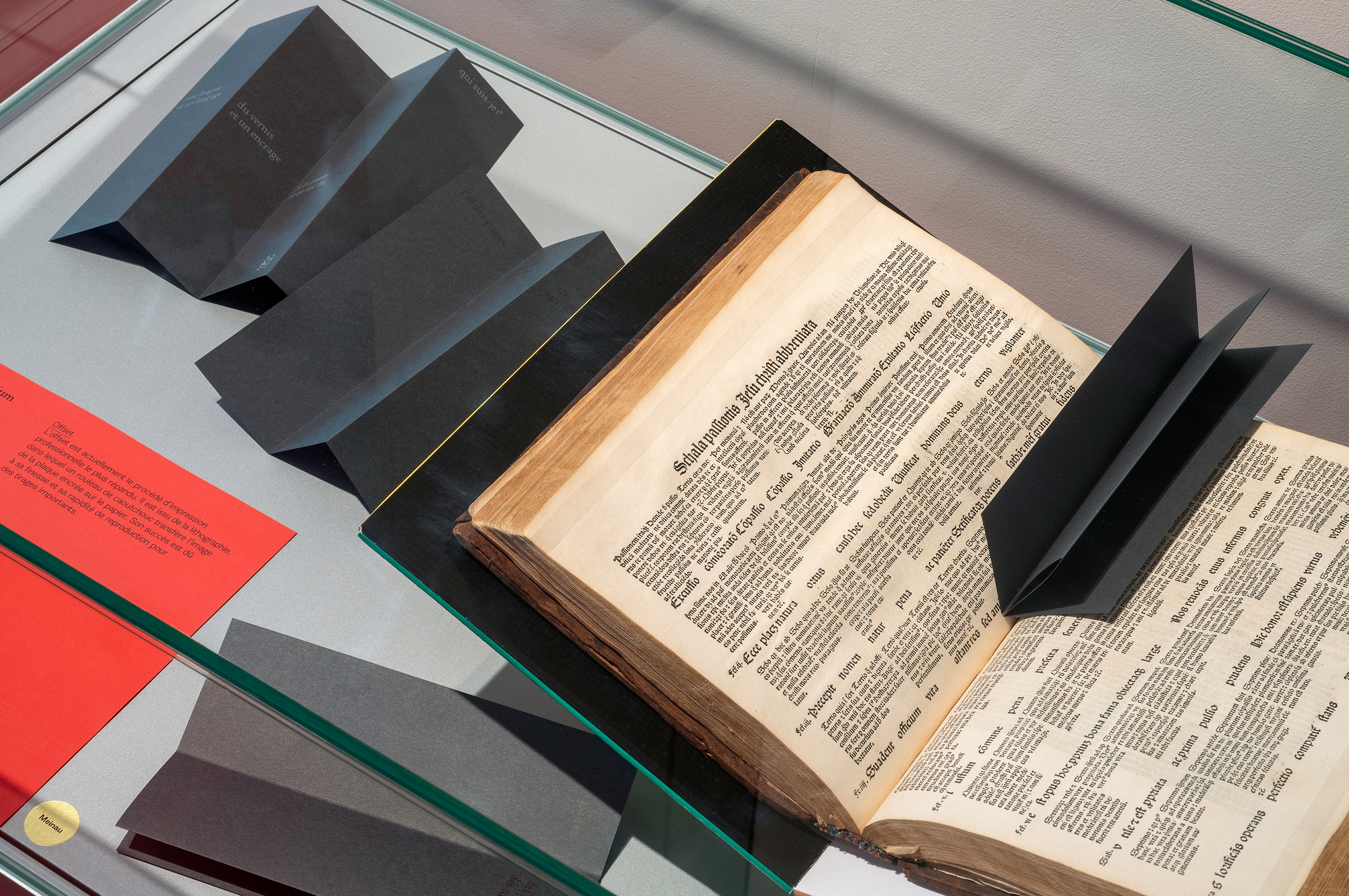
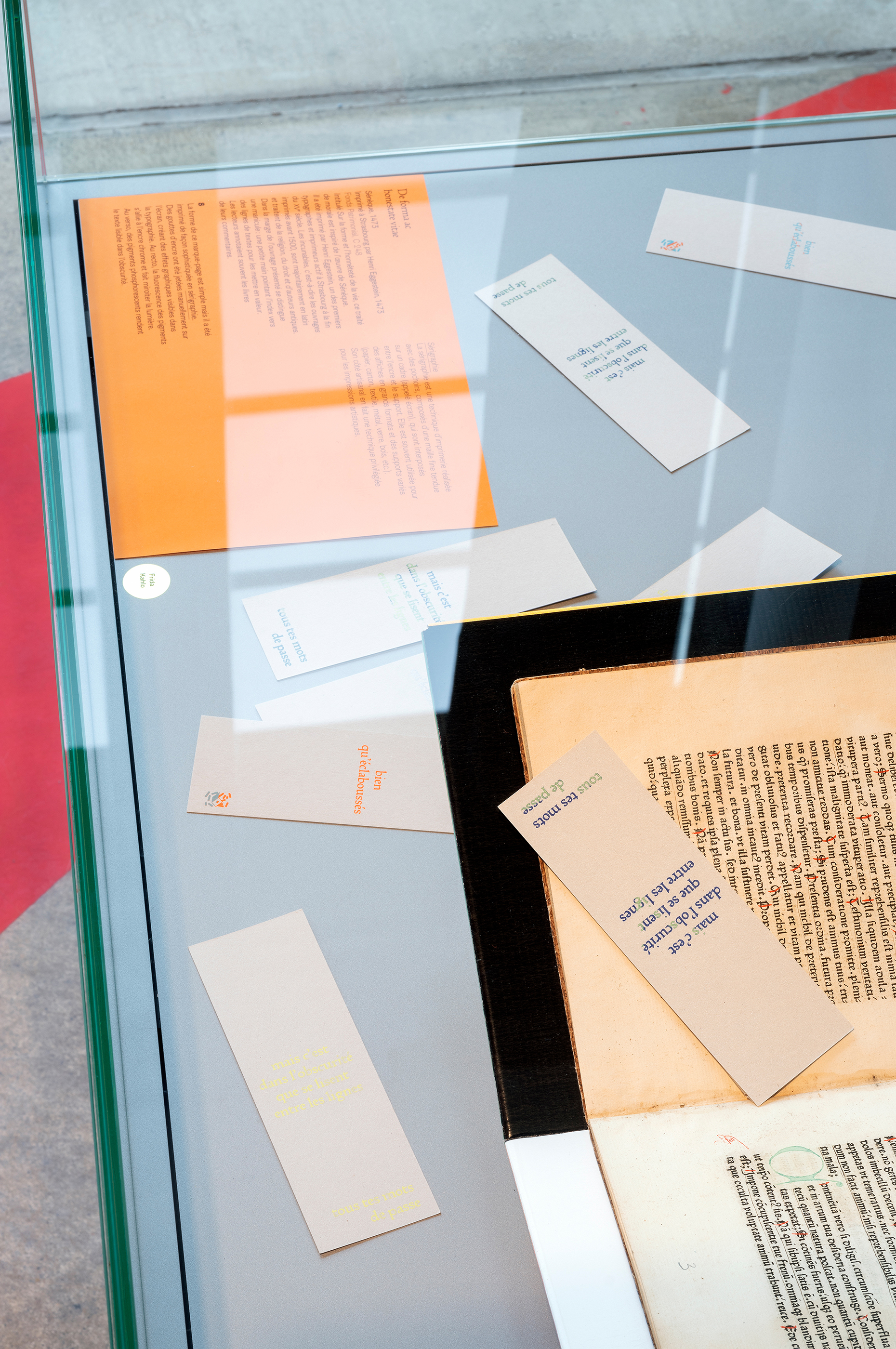
Invitée à intervenir dans le réseau des Médiathèques de Strasbourg, j’ai proposé l’exploration d’un support familier: le marque-page. En effet, si l’on considère les médiathèques comme des «maison des livres», le marque-page peut y trouver une place naturelle, en se glissant entre les pages… J’ai donc imaginé 13 objets imprimés, destinés aux usagers des 13 médiathèques, dont chacun se distingue par un format, une impression et un façonnage spécifiques. Ils sont le fruit d’un dialogue complice avec l’autrice Betty Bone, d’un va-et-vient entre écriture et forme graphique. Pour chaque signet, j’ai conçu un prototype, appelé maquette en blanc, dont l’autrice s’est inspirée. À rebours d’un design graphique au service du contenu, ses textes ont été écrits en écho aux papiers et aux encres, en rebond des formes et des couleurs. Comme des clins d’œil aux lecteurs, les phrases jouent avec le design et s’amusent avec le façonnage. Chaque signet devient ainsi un petit objet à la fois littéraire et graphique, au sein duquel contenu et forme se répondent dans un jeu de miroirs. L’impression a été envisagée comme le moyen de créer de la variation et non comme un processus de fabrication de supports identiques, rendant ainsi chaque exemplaire précieux et gratuit à la fois. Dans l’exposition, les 13 marque-pages ont été réunis et placés dans des ouvrages anciens sélectionnés parmi les collections patrimoniales strasbourgeoises, placés eux-même dans des lutrins de couleur. Histoire et création se répondent ainsi de façon insolite.
La typographie Rusch ‘R-Bizarre’, utilisée pour le projet Entre les pages, est un caractère Proto-Romain utilisé pour la première fois à Strasbourg par Adolf Rusch pour le livre De universo de Raban Maur vers 1467-74. La typographie a été re/dessinée durant un workshop à l’ESAL Metz et à la Bibliothèque municipale de Metz dirigé par Jerome Knebusch, en 2018. Le caractère a ensuite été développé par Alexis Faudot et Rafael Ribas à l’Atelier national de recherche typographique, puis par Thomas Huot-Marchand qui l’a finalisé pour le projet Entre les pages.
Invited to contribute to the Strasbourg Media Library network, I proposed an exploration of a familiar medium: the bookmark. After all, if we consider a media library as a “house of books”, the bookmark can find a natural place there, slipping between the pages... I decided to design 13 printed objects, intended for the users of the 13 media libraries, each being distinguished by a specific format, print and design. They came about as a result of close liason with the author Betty Bone, the writing and graphic designs passing to-and-fro between us many times. I designed a prototype – a blank mock-up – for each bookmark, the author taking her inspiration from this. In a reversal of the usual order where graphic design is at the service of the content, her texts were written in response to the different papers and inks, and the different shapes and colours. As if winking at the readers, the sentences play with the design and have fun with the shaping. Each bookmark thus becomes a small object that is both literary and graphic, in which content and form reflect one another as in a play of mirrors. Rather than a process of producing identical items, the printing itself was seen as a way of creating variation. In this way each copy became something both precious and free. In the exhibition, the 13 bookmarks were brought together and placed in old books selected from Strasbourg’s heritage collections. The books were then placed on coloured lecterns. An unusual interaction of history and creativity.
The Rusch R-Bizarre typeface, used for the Entre les pages project, is a Proto-Roman typeface used for the first time in Strasbourg by Adolf Rusch for the book De universo by Raban Maur around 1467-74. The typeface was redesigned during a workshop at ESAL Metz and the Metz Municipal Library led by Jerome Knebusch in 2018. It was then developed by Alexis Faudot and Rafael Ribas at the Atelier national de recherche typographique, then by Thomas Huot-Marchand, who finalized it for the Entre les pages project.